
Lip color
Free red lipstick test: blue red, true red or orange red?
Compare three useful red families on one stable portrait, then verify the winner with real lipstick, real light and a realistic wear check.
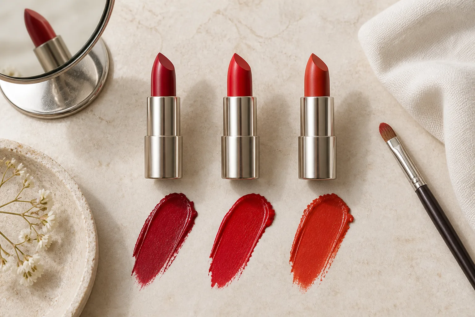
A free red lipstick test is most useful when it narrows one real decision: does your face feel more balanced with a cool blue red, a centered true red or a warm orange red? Red is not a single universal chip. The same tube can appear pinker, browner, brighter or more muted once natural lip pigment, complexion contrast, lighting and formula enter the picture. Instead of searching for a mythical perfect red, this guide builds a small comparison that reveals the direction you actually want to wear.
MaqAI can help organize that visual comparison, but it is a planning step rather than a shade matching promise. Use one clear portrait, change only the red family, save a short list and take the final decision back to real products. A preview cannot prove an exact shade, formula, oxidation, texture, comfort, transfer, wear, skin response or finished result. The useful outcome is a precise brief such as medium cool crimson with a satin finish, followed by a real lip test in the light and setting that matter.
Decide what the red needs to do
Start with effect rather than a rigid undertone rule. Do you want the lip to look crisp and graphic, warm and energetic, deep and grounded, or softly connected to the rest of the face? Note the occasion, clothing near the face, preferred eye makeup and the distance at which people will see you. A red that feels exciting for an evening photograph may feel too precise for a rushed morning, while a sheer warm red can succeed precisely because it is easy to reapply.
Set two practical limits before comparing color. Choose the depth range you are willing to wear and decide whether the finish should be sheer, satin or matte. If one sample is a pale glossy coral and another is an opaque deep crimson, the test is not only about temperature. Keep depth, opacity, edge and finish close enough that cool, balanced and warm red remain the meaningful difference.
Ignore claims that one skin tone is allowed only one red family. Undertone language can suggest a starting point, but contrast, natural lip color, hair, clothing and personal taste all change the effect. A deliberately contrasting red may be the most interesting option. The test should help you name that response, not convert your face into a color rule.
Read blue red, true red and orange red side by side
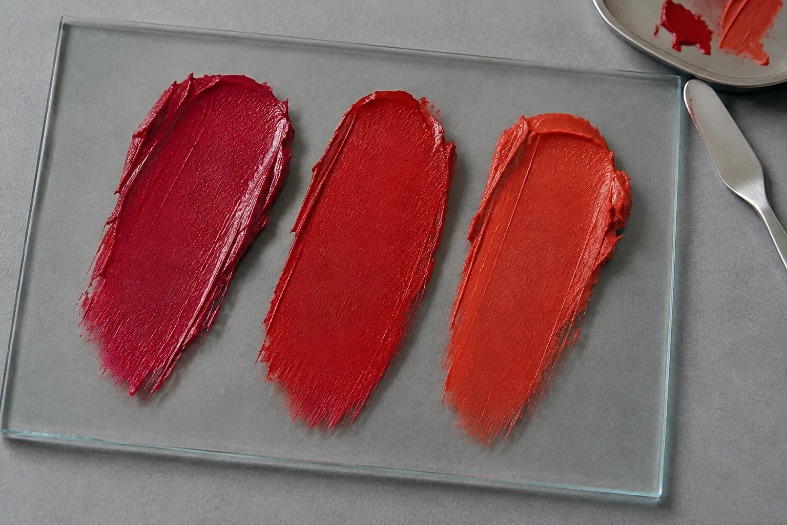
A cool red leans toward blue, berry or magenta; a warm red leans toward orange, coral or brick; a true red appears more centered between those poles. Product names are unreliable evidence because words such as cherry, scarlet and classic can describe very different colors. Compare actual swatches on a neutral surface and look at the relationship among them. The relative difference is easier to see than the hidden base of one isolated lipstick.
Match the three samples by approximate depth and saturation. A dark wine will naturally feel quieter and heavier than a vivid orange red, even if temperature is not the reason. If the cool candidate is berry dark, find a warmer candidate with similar value. If the warm option is translucent, either build it to a similar visual strength or make all three tests sheer. This control prevents intensity from choosing the winner for you.
The studio swatches show color families, not product recommendations or exact screen values. Displays, camera processing and ambient light change red dramatically. Treat the visible sequence as a map from cooler to warmer, then describe the direction in words. That description remains useful when a store tester, lipstick bullet or formula looks different from the photographed swatch.
Take one neutral portrait for a controlled comparison
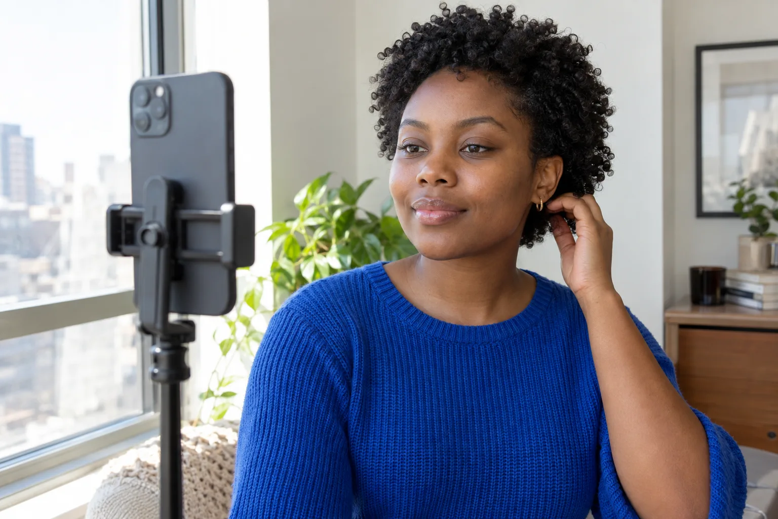
Use a front-facing portrait in diffuse daylight with the camera near eye level. Keep the full face visible, the expression relaxed and the lips bare or covered only with a clear, settled balm. Turn off beauty filters, portrait relighting and color effects. Strong existing blush, colored lamps or a bright top reflected into the face can change how a red appears against the skin.
Save one original and reuse it for every version. Do not retake the cool, true and warm options separately. A different smile changes lip area, a tiny head turn changes facial contrast and automatic exposure can make one image brighter. Those changes feel like color preference even when the lipstick is not responsible. The same portrait keeps the comparison about the intended variable.
A clear source does not need poreless skin or studio polish. It needs reliable edges, balanced exposure and natural color. The dedicated selfie guide explains camera distance, framing and light in more detail. If the portrait clips highlights, hides one side of the mouth or turns the skin strongly orange or blue, fix the source before generating more lipstick options.
Run the free red lipstick test in MaqAI
Begin with three directions: cool blue red, balanced true red and warm orange red. Keep lip shape, opacity, edge and finish as similar as possible. Do not let one option gain extra liner, gloss, whiter teeth, stronger blush or smoother skin. Return to the same source portrait for every version and save only the clearest candidate from each family. A small set is easier to read than a gallery of twenty almost identical reds.
View the whole face at normal screen size before zooming into the mouth. Notice whether the red brings the eyes forward, emphasizes warmth or redness in the complexion, creates a clean focal point, or seems disconnected from the rest of the palette. Then check the lip edge and depth. Write one sentence for each version without using good or bad: for example, cool crimson looks crisp and formal; true red feels balanced; orange red looks lively but asks for a quieter cheek.
Choose two finalists, not one digital winner. The screen cannot reproduce the base pigment, coverage or finish of a real tube, and virtual light does not behave like wax, oil or stain on moving lips. Save the color family, approximate depth, saturation, edge and finish. That five-part description becomes the shopping or makeup bag brief for the next stage.
Change one variable: same portrait, same depth, same edge and finish, three red temperature directions.
Read the face without turning undertone into a rule
Step away from the color labels and ask what happened to the complete face. A cool red can create clarity and contrast; a warm red can connect with golden, copper or earthy colors; a balanced red can keep attention centered. None of these outcomes belongs exclusively to a particular complexion. The strength of the result depends on the desired mood and the visual relationships already present.
Check nearby makeup. If the warm red appears wrong beside a cool pink blush, it may be the palette connection rather than the lip itself. Standardize the cheek or remove it from the portrait. If a cool red seems severe with a sharp black wing, soften the eye before rejecting the lipstick. A controlled comparison keeps supporting elements quiet enough that the lip family can speak.
If you want a broader method for color temperature, the undertone guide shows how to compare warm, neutral and cool directions while holding depth and finish stable. Use its language to document a preference, not to diagnose a permanent personal category. Makeup can harmonize, contrast or shift with clothing and occasion.
Compare makeup color temperature without rigid undertone rules
Verify the finalists on real lips
Find one or two real products that roughly match each finalist description. Swatch safely according to store and product guidance, and never apply a shared tester directly to the lips. Natural lip pigmentation can cool, mute or deepen a color; a liner can add brown, pink or purple; and a sheer formula allows the lip to remain part of the final shade. Judge the applied result rather than the color seen in the tube.
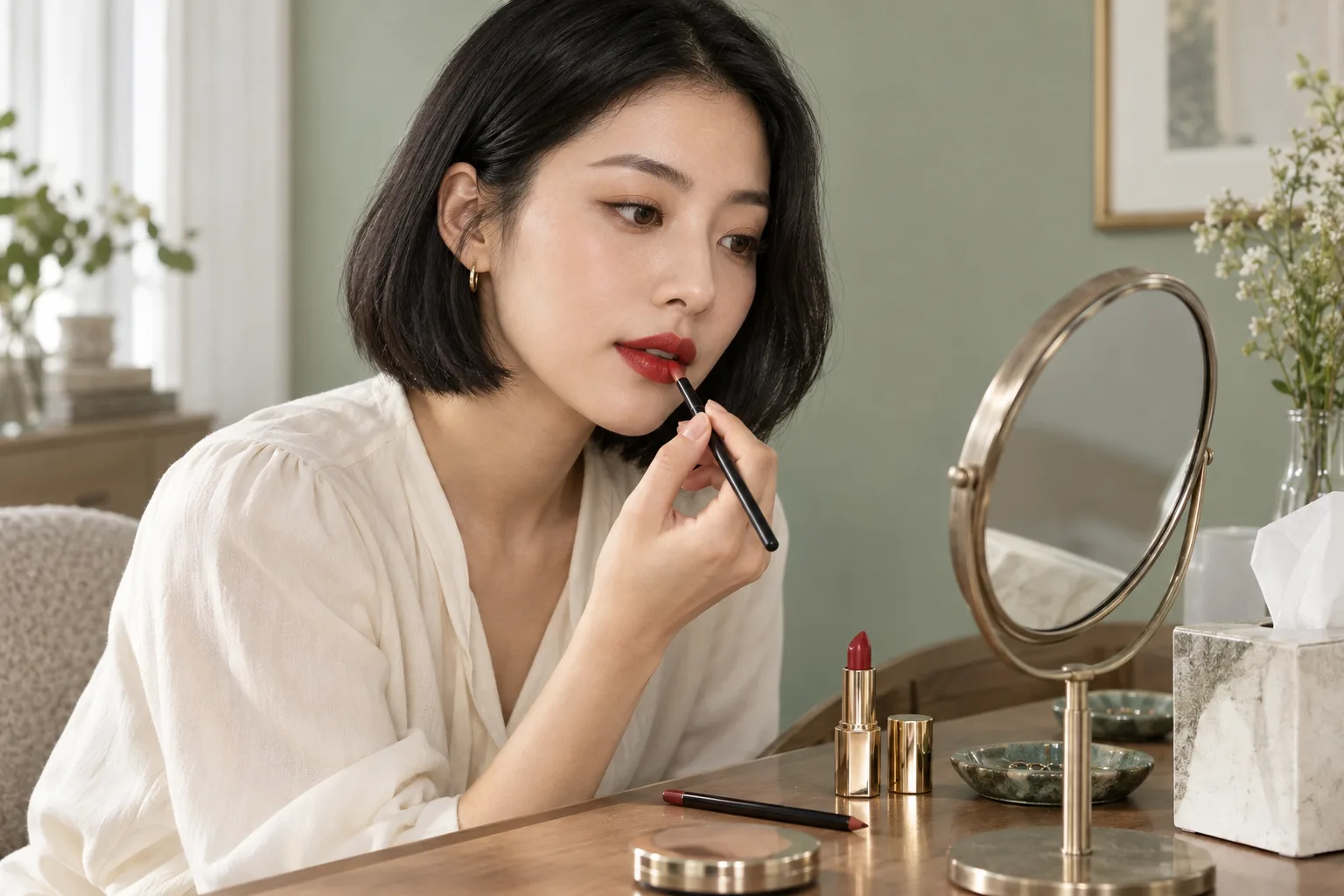
Prepare the lips gently. If they are dry or uncomfortable, prioritize comfort over a crisp matte experiment. The American Academy of Dermatology advises using nonirritating lip products and stopping products that burn, sting or feel uncomfortable. Do not aggressively scrub cracked skin to make a lipstick photograph smoothly. Let the lips recover, then test the color on a comfortable surface.
Apply one finalist with the edge and opacity used in the comparison. A lip brush can clarify shape, while direct application can preserve the formula's normal behavior. Photograph the result in the same neutral light from conversation distance, then inspect the edge closely. Compare the real lip to your written brief rather than demanding a pixel match with the preview.
Read dermatologist guidance for caring for dry or chapped lips
Separate color from edge, opacity and finish
A promising red can fail because the styling is wrong, not because the hue is wrong. Test the same product with a softly blurred edge, a natural direct edge and a precise penciled contour. Then compare one light layer with full opacity. A cool crimson stain can feel casual while the same family in dense matte coverage feels formal and graphic. Keep color stable while learning which treatment makes it wearable.
Finish also changes perceived depth. Gloss reflects highlights and can make the center look fuller; matte absorbs light and makes the color block read more clearly; satin sits between them. If you compare finishes digitally, treat that as another planning round rather than adding it to the temperature test. Verify the real formula because gloss migration, matte dryness and satin transfer are physical behaviors.
A sharp red edge deserves a separate technique plan. If color moves beyond the border, do not conclude that the shade is unsuitable. Reduce excess balm, apply thinner layers, blot when appropriate and use liner only where it helps. The clean-edge guide explains how to control feathering without burying the lip under product.
Wear the chosen red before buying another one
Give the finalist an ordinary wear test. Drink water, speak, smile and eat something similar to the planned occasion. Check after the first transfer, after a meal and near the end of the intended wear time. Note fading at the center, migration at the edge, dryness, stickiness and whether reapplication remains even. A color that wins in a still photo may lose if its maintenance does not fit your day.
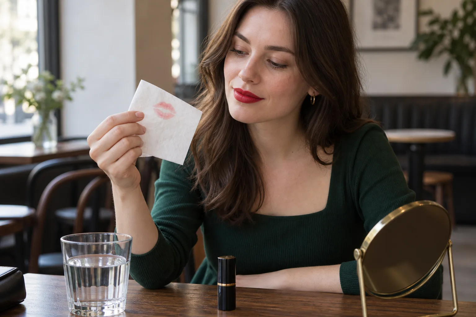
Blot once on plain tissue to understand transfer rather than trying to eliminate every mark. Decide what level is acceptable and whether a small mirror, liner or the lipstick itself belongs in a touch-up kit. Do not stack fresh pigment over crumbs, oil or a broken edge; clean and smooth the area first. Comfort and predictable repair are part of choosing a red, not secondary details.
Check the condition of older lip products before using them. The US Food and Drug Administration explains that air, heat, moisture and time can change cosmetic color, smell and texture and recommends clean containers and applicators. Follow the manufacturer's storage guidance and replace a product that has changed unexpectedly instead of trying to revive it with water or improvised mixing.
Record the final specification: cool, centered or warm family; light, medium or deep value; muted or vivid saturation; sheer, satin or matte finish; soft or precise edge; liner if used; and the light in which it worked. The result of the free red lipstick test is not one universal tube. It is a repeatable decision process and a shortlist you have verified on your own moving lips.
Review FDA information about cosmetic shelf life and storage