
Warm, cool, neutral—or visually mixed
Use the label to organize initial shade families, then verify it across more than one neutral-light photo and real product swatches.
Personal color analysis app
Explore visible undertone, contrast, and palette cues from a clear portrait, then turn the report into lipstick, cheek, eye, complexion, and hair-color comparisons.
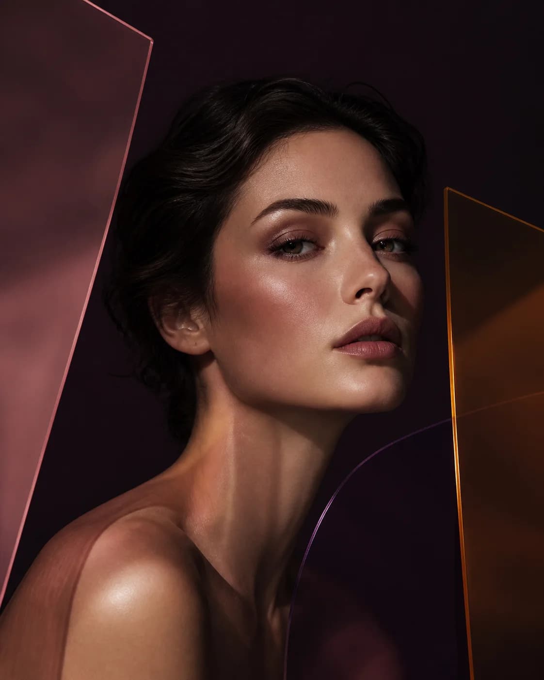
From report to comparison
A personal color analysis app can organize visible warmth, coolness, neutrality, depth, and contrast into a manageable starting palette. MaqAI connects that context to makeup shade families and virtual try-on.
Treat the report as a hypothesis, not a verdict. Compare one harmonious option with one deliberate contrast and keep the result that supports your taste and the effect you want.
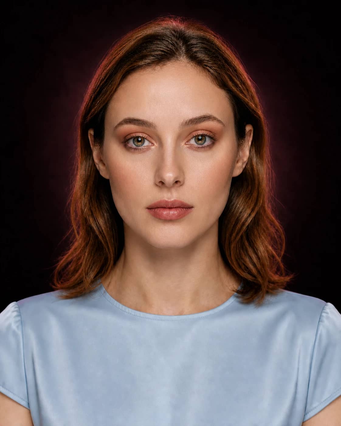
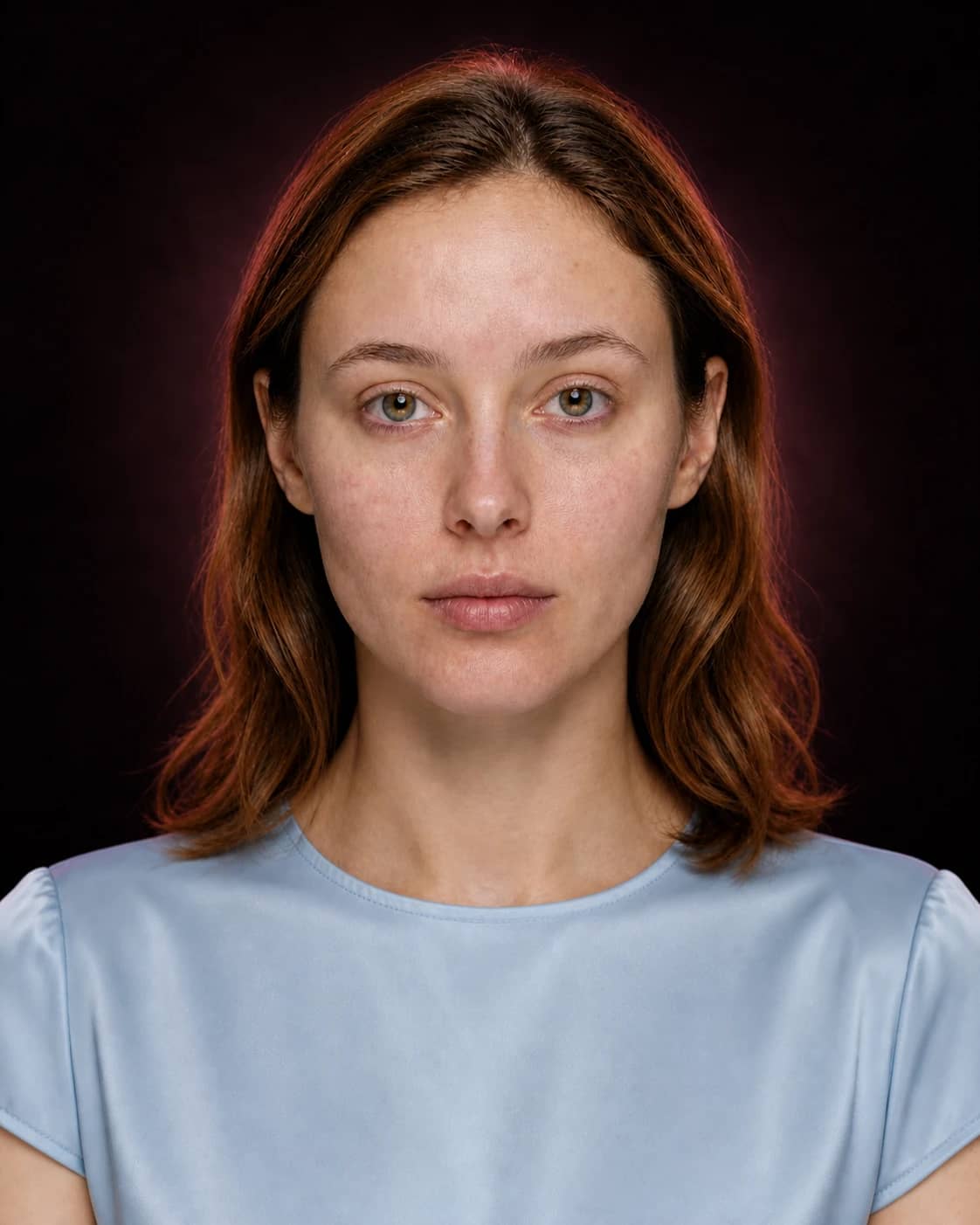
A better comparison
Change one meaningful variable at a time. You will know what made the result work—and what to test with real products.
Use the label to organize initial shade families, then verify it across more than one neutral-light photo and real product swatches.
Contrast can guide the distance between complexion, brows, eyes, cheeks, and lips without prescribing one correct intensity.
Try a palette close to the report and another that breaks the suggestion on purpose. Personal style often appears between both.
How to use it
Keep the input clear, the question specific, and the final check grounded in real light, products, and wear.
Use indirect daylight or neutral soft light, a visible face, minimal color cast, and no beauty filter.
Keep two or three useful observations about undertone, depth, contrast, and palette relationships.
Compare lip, cheek, eye, and complexion families, then verify real products under the conditions that matter.
Personal color analysis and makeup
Use palette guidance to group lipstick, blush, eyeshadow, bronzer, highlighter, and complexion directions. A warm result may suggest peach, terracotta, copper, or warm rose comparisons; it does not ban blue-red, lilac, silver, or any color you enjoy.
Makeup can harmonize with visible coloring or create deliberate contrast. Both are valid goals, so the useful question is which relationship supports the mood you are building.
Why AI color analysis can change
Phone white balance and colored surroundings can push skin warmer, cooler, lighter, or darker. Strong lipstick, blush, tan, hair dye, or reflected clothing can also alter the relationships an appearance-based report sees.
Use the clearest source available and repeat the analysis only when the input meaningfully improves. The result is styling guidance—not a scientific measurement, identity system, or medical assessment.
A focused comparison lab
A portrait can suggest visible warmth, coolness, depth, and contrast, but lighting and camera processing affect every signal. Treat the result as a structured starting set and deliberately test both harmony and contrast.
Use an unfiltered portrait with the face evenly lit. Bright clothing, colored walls, warm bulbs, and cool screens can cast color onto skin and change the apparent balance.
Do not force one seasonal label to explain everything. Note where the portrait appears warm, cool, or neutral and whether light, medium, deep, muted, or vivid comparisons remain readable.
Translate the analysis into lip, cheek, eye, and complexion families, then include a controlled alternative outside the safest palette. Personal style may prefer energy over seamless harmony.
Use clothing, unbranded color cards, and real product swatches. Check whether the effect remains intentional across daylight and the environments where the makeup will be worn.
Save a flexible palette note instead of a verdict: strongest neutrals, useful warm and cool families, preferred depth, comfortable contrast range, and colors worth testing for deliberate tension. Update it when hair color, tan, lighting, wardrobe, or taste changes rather than defending an old label.
Useful expectations
Use MaqAI to
Do not use it to
Good to know
Clear expectations before you upload a portrait, compare a result, or shortlist real products.
It uses visible color relationships in a portrait to organize undertone, depth, contrast, and palette ideas. MaqAI connects those cues to makeup shade comparisons and beauty guidance.
No. Lighting, white balance, screen processing, hair color, reflected clothing, filters, and existing makeup can change the visible cues. Use neutral light and treat the report as a starting hypothesis.
MaqAI can express palette direction through familiar color-analysis language, but the practical focus is on flexible undertone, contrast, and shade-family comparisons rather than enforcing a fixed label.
No. It can help organize complexion direction and visible undertone cues, but exact foundation matching requires real swatches, formula settling, and checks for oxidation, texture, and relevant lighting.
No. Compare a harmonious option with an intentional contrast. The app provides creative context; your taste and the effect you want make the final decision.
Turn color context into a real choice
Start with a neutral-light portrait, keep the useful color cues, and test the makeup families on your own face.