
Color guide
How to explore makeup shades for your undertone
Use undertone, contrast, lighting, and personal preference without turning color analysis into a rulebook.
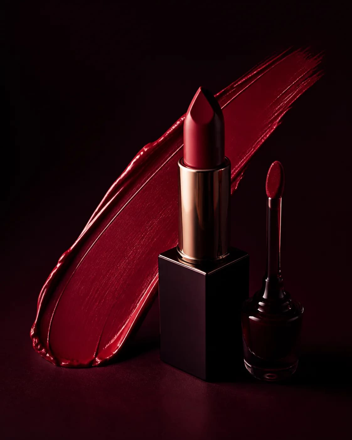
Undertone is one useful way to organize color, but it is not a verdict on what you can wear. Lighting, surface tone, contrast, hair color, outfit, and the effect you want can all matter just as much.
Use color analysis to build a small starting palette, then compare nearby shades on your own face and keep the one that creates the mood you want.
Start with warm, cool, and neutral directions
Warm directions often include peach, coral, terracotta, caramel, warm rose, bronze, and gold. Cool directions may include berry, mauve, plum, blue-red, taupe, lilac, and icy pearl.
Neutral palettes sit between them and often mix rose-brown, balanced nude, champagne, and soft cocoa. These are families—not exact product matches.
Notice contrast as well as undertone
A shade can match your undertone and still feel too quiet or too intense. Compare its depth and saturation with your brows, eyes, hair, and the contrast level you want.
Low-contrast looks repeat nearby tones for a cohesive effect. High-contrast looks use a stronger lip, liner, or eye shape to create a focal point.
Test one category at a time
Keep the rest of the look stable while changing only the lip, blush, or eye color. This makes it easier to see what the shade itself contributes.
Save one familiar choice and one more expressive alternative. Side-by-side comparison is more informative than an endless gallery.
- Lips: compare depth and warmth
- Cheeks: compare placement and saturation
- Eyes: compare contrast with iris and brows
- Complexion: compare finish separately from shade
Translate a preview into a real product test
A screen preview cannot reproduce a formula, opacity, oxidation, reflectivity, or wear time. Use the result to name a shade family and finish, then swatch real products in neutral light.
If you are matching foundation or concealer, always verify on skin and allow time to see whether the formula changes after application.
Treat MaqAI as a visual shortlist. Real products still need a real-world shade and formula check.
Check the palette in more than one context
A shade that feels balanced beside a black top may feel quiet beside cream, bright beside a saturated dress, or different after a hair-color change. Compare the same makeup direction with the outfits and lighting that matter for the occasion.
Do not chase consistency across every environment. Decide whether you want harmony, contrast, warmth, brightness, depth, or a deliberate statement, then choose the context where that goal matters most.
Let preference overrule the category
Seasonal palettes and undertone labels are navigation tools. If a supposedly ideal shade makes you feel muted, or a contrasting shade makes the look come alive, that reaction is useful information.
Save the recommendation and the exception. The pair will tell you more about your personal style than following a category without comparison.