
Brow makeup
Choose eyebrow pencil color by depth, then warmth
Compare restrained brow colors on one clear portrait, then check real pencil strokes against your brow hairs in daylight.

A brow pencil that looks soft in the package can become orange, gray or unexpectedly dark when it sits between your own brow hairs. To choose eyebrow pencil color, look first at those hairs and the amount of definition you want on your face. Dyed head hair is useful context, but it is not a command to copy the exact shade onto the brows. The central question is whether a few marks fill gaps while the original brow still looks like part of you. Keep the shape and stroke density steady as you compare color. Otherwise a fuller drawing may seem more flattering simply because it is fuller.
Use one clear, unfiltered portrait to preview two or three nearby color directions in MaqAI, changing depth before warmth. Save at most two candidates, then test comparable real pencil strokes in sparse areas under familiar light. A screen can help plan relative contrast; it cannot identify an exact retail pigment, predict wax texture, oxidation, wear, sensitivity or a finished result on skin. The actual pencil and your comfort decide. This is a color decision, distinct from deciding where an arch, start or tail belongs.
Choose eyebrow pencil color from your brow hairs, not a tube
Brush the brows into their ordinary direction and inspect the hair at the front, center and tail in neutral light. Many brows are a mixture: darker central strands, softer ends, a few pale hairs and skin visible in gaps. A solid swatch on the back of a hand hides that mixture. Note whether your current pencil disappears into those hairs, gives them a soft shadow, or draws an obvious line on the skin. That observation is more useful than a label such as brunette or ash brown on a shelf.
Decide the effect before comparing shades. You might want a discreet tail that remains visible when you speak across a table, or a deliberately stronger brow to balance deep eye makeup. Look at the whole face and your usual hair framing. If you recently colored your hair, avoid assuming your natural brow must change to match it. A calm neutral pencil can connect both colors without becoming a replica of either. If your brow hair is sparse, compare how the shade behaves on bare skin as well as through hair; pencil deposit can appear more saturated on skin.
Separate depth from warmth in a small color set
Choose three color directions close in darkness: perhaps cool taupe, balanced brown and a subtly warm brown. First compare a lighter and a deeper version of a similar neutral direction, then keep the better depth while judging warmth. Comparing a pale cool powder with a dark warm wax pencil mixes depth, color and formula into one confusing result. Adobe explains the distinction between hue, saturation and brightness; you need not follow a rigid color wheel, but naming each variable makes the test easier to interpret. Taupe is a family of muted colors, not a single universal solution.
Ask whether the candidate makes individual hairs more legible without drawing a broad stripe. An overly dark mark can dominate even if its warmth is close. An overly warm mark may look reddish beside cool natural hairs, while an overly cool mark can appear gray on some faces. Neither conclusion follows automatically from skin undertone alone. Keep a short note in ordinary language: 'depth close, too red,' 'soft enough, tail vanishes,' or 'neutral but too opaque.' That is a workable brief for a physical pencil test, not a definitive personal-color label.
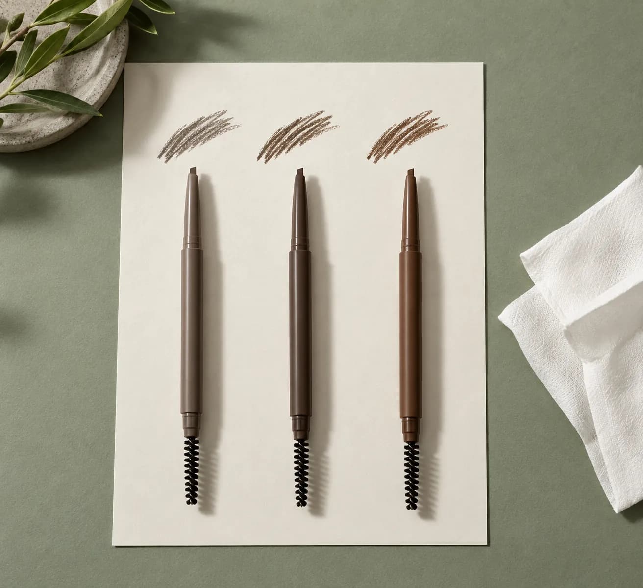
Read Adobe’s explanation of hue and brightnessCompare makeup colors with your own undertone
Make one useful source portrait for a brow comparison
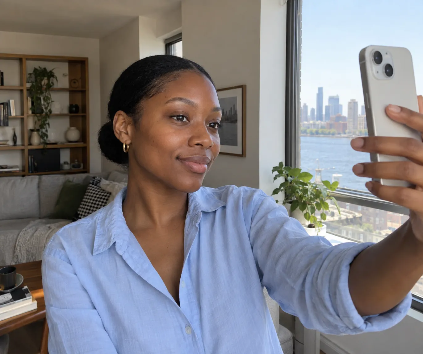
Stand near a window where the same soft light reaches both brows. Use the ordinary phone camera without a beauty filter and hold it near eye level. Pull stray hair away from the brow edges, relax your expression and include the whole face instead of a tight forehead crop. A close-up can make a tiny tail difference look enormous while concealing the relationship to eyes, hair and lips. Keep the brows bare or in a familiar minimal state; a fully filled brow may hide the original hair color you are trying to compare.
Choose one source photo and keep it fixed. Changing white balance, exposure or head angle for each candidate can make one shade seem harmonious for reasons unrelated to the pencil. If the image turns skin orange or erases the brow hairs, retake it once before the test and stop adjusting. Save the original beside any preview. Our source-selfie guide describes how to hold framing and light steady. The portrait is a planning reference; it is not a color-calibrated swatch, and camera processing cannot tell you how pigment will sit on individual hairs or skin.
Preview one change at a time in MaqAI
On that fixed portrait, compare a neutral brow slightly softer than your natural hair, then a nearby deeper neutral. Keep the brow start, tail length, arch, stroke density and the rest of the makeup as stable as the preview allows. Depth is the first variable. Once you know whether the softer or deeper direction supports the face, hold that apparent depth and compare cooler and warmer versions. Do not switch from fine strokes to an opaque filled-in block between images; you would be judging drawing style as much as shade.
View each preview at normal phone size, then zoom only to check where the color appears. Ask whether the brow still has visible hair texture and whether the two sides balance the rest of the face. Save no more than two visual candidates, labelled by the actual choice: 'soft neutral' and 'slightly deeper cool,' for instance. MaqAI previews help you make a shortlist. They cannot promise an exact pencil color, coverage, wax behavior, oxidation, wear, skin response or final shape after a real hand applies strokes. The next step must happen in a mirror with real products.
Test the two pencil directions on real brows
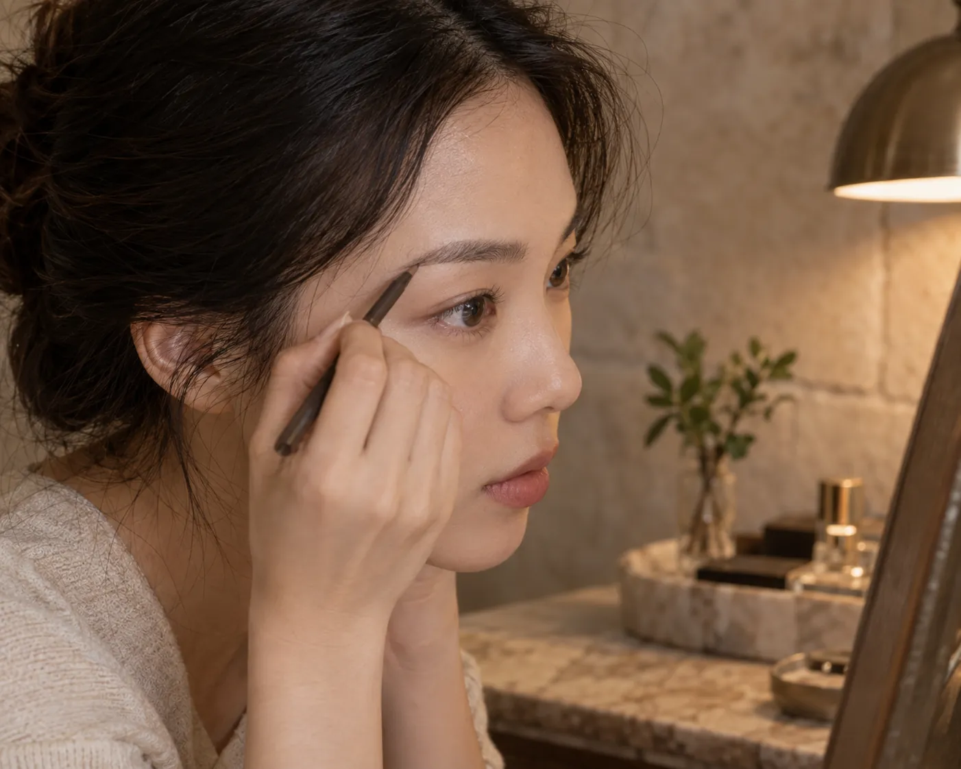
If you can test two physical pencils, use clean tools and apply a few short hairlike marks in the same sparse zone on separate brows or on separate days. Do not fill one brow from start to tail while barely touching the other. Keep stroke pressure, number of marks and any brow gel constant, or leave gel out until the color choice is clear. Comb through with a clean spoolie to see how much pigment remains on skin versus hair. The shade in a product core can differ from the thin mark it leaves, and real brow hairs may make a pencil look lighter or deeper.
Check the front and the tail separately. A pencil that is plausible at the dense center may look stark on bare skin at the outer edge. If the tail disappears, you may need a little more depth or simply a few more fine strokes; test those changes separately. If the front becomes a solid dark rectangle, reduce density before rejecting the color. This is why a physical comparison matters even after a convincing preview. Stop using a product if it irritates the eye area, and do not share an eye-area pencil or spoolie. A look is useful only if it is comfortable and repeatable.
Use hair color as context rather than a fixed rule
Head hair frames the brows, but its roots, lengths and highlights may all differ. If you have very dark hair and slightly softer brows, matching the hair’s deepest part with a black pencil can make every gap look stamped on. If you have light or colored hair, making the brows equally light may erase their structure. Observe the relationship you prefer from conversation distance. A neutral or muted direction can bridge different hair and brow colors; a warmer direction can be deliberate when it echoes the overall look. There is no prescribed one-shade offset that works for every face.
Consider whether you change hair color frequently. A flexible brow pencil that looks convincing with your natural roots may serve better than chasing each temporary tone in the ends. Try the finished brow with hair worn as you usually wear it, not only with hair pulled back for the test. Our hair-color coordination guide offers a way to compare the whole makeup palette without treating hair as a strict rule. If a bold hair color is part of your style, brows can remain quietly natural; they need not echo every red, copper or violet note literally.
Check daylight, finish and wear before deciding
Take the leading real pencil into another familiar light. Warm bulbs can make brown marks look redder, while a bright window can reveal gray or a too-dark edge. Step away from the mirror and look at both brows together. Check whether individual hairs remain visible, whether the front starts softly, and whether the tail has enough definition. A photograph can record the overall effect, but use the physical mirror as the primary judge. A screen image or preview may shift color according to white balance and display settings.
Let the product sit through a normal part of your day before calling it a winner. Some pencils fade from the skin gap while the hairs still look colored; others remain but soften after brushing. Do not claim wear from a ten-minute preview. If you add a gel, check it in a separate round because its tint and hold may change both color and shape. The FDA advises keeping eye-area cosmetics and tools clean and stopping use if irritation occurs. Choose a comfortable formula whose real marks meet your brief rather than relying on a pleasing digital color alone.
Keep a two-shade decision note and stop when it works
Write down the two finalists in terms of effect rather than marketing names: for example, muted neutral for everyday gaps and a slightly deeper brown for a stronger evening eye. Record the real pencil, stroke pressure, amount of gel, daylight result and any discomfort. This keeps the next comparison anchored to something you actually wore. If one shade works on the face at ordinary distance and survives a useful real-life check, you can stop searching. A theoretical perfect match to every hair strand is unnecessary, especially when those strands naturally vary.
If the result is still off, change one thing at a time. A heavy front may need fewer strokes rather than a paler pencil. A red-looking tail may need a less warm direction at the same depth. A brow that disappears in photos may need more contrast or a different light check. Shape is a separate question: do not lengthen the tail while evaluating color. MaqAI helped narrow the visual direction; the real hair, real mark and real light made the decision. Your small note turns the process into a routine you can repeat without guessing from a product cap.