
Lip makeup
Choose a nude lipstick that keeps your lips visible
Compare lip depth and color direction on one clear portrait, then verify two candidates on your own lips in ordinary light.
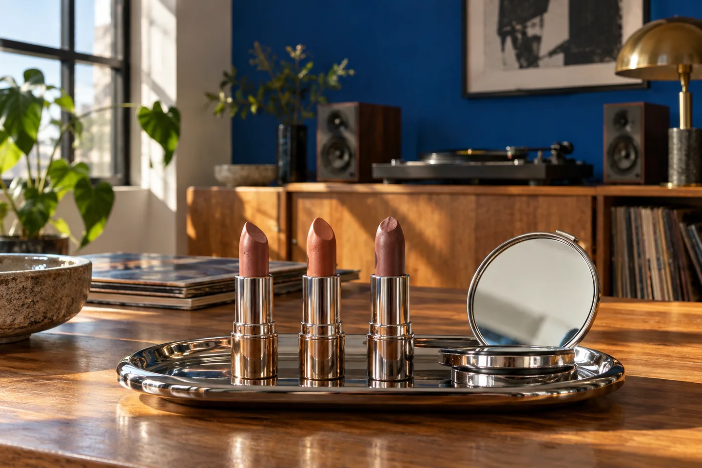
You can choose a nude lipstick that looks quiet without making your mouth disappear. The shade in a tube is a poor stand-in for the color on your lips: natural lip pigment, surrounding skin, light, opacity and finish all change what you see. A beige that looks restrained on a product photograph may turn pale or gray on one face and warm pink on another. Buying another almost-identical beige rarely resolves that mismatch. First decide whether you want a softly defined natural lip, a warmer low-contrast lip or a deliberate muted statement, then compare colors at a consistent depth and finish.
The workflow starts with a clear, unfiltered face photo, uses MaqAI to preview one color direction at a time, and keeps only two promising candidates. A preview is a planning aid, not a guarantee of exact shade, pigmentation, texture, oxidation, wear, comfort or how a formula settles on your lips. Check the finalists with real products and an ordinary mirror under two familiar lights. The physical result, and the look you actually prefer, override any screen image.
Choose a nude lipstick by defining what nude means on your face
Nude is a relationship, not a single beige. Look at your bare lips and the skin immediately around them in neutral light. Some lips are naturally rosy, brown, mauve or uneven in pigment. Decide how much contrast you want at conversation distance: a lip close to your natural color with a little more definition, one slightly deeper to hold its outline, or a intentionally pale editorial look. A muted rose-brown can read understated on one face while a warm caramel does that job on another. There is no universal nude assigned to a skin-depth category.
Describe the aim before looking at products. If you say only 'natural,' you may switch between color families and finishes without noticing why a comparison changes. A useful brief might be 'my lip shape stays visible, color slightly deeper than my bare center, soft satin finish.' Write down that brief with one current lipstick you find too pale or too orange. The unflattering example gives you a boundary, not a verdict about your undertone. You are choosing an effect on a whole face, not a perfect match to a product bullet or a wrist swatch.
Separate depth from warm, cool and muted color directions
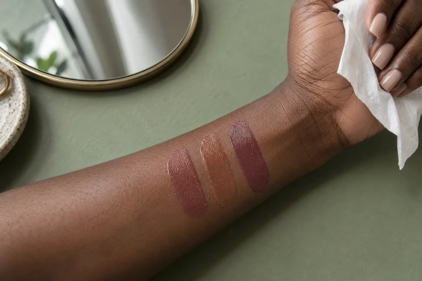
Choose two or three directions that are similar in darkness before judging color. A peach-beige, rose-brown and muted mauve-brown can show how warmth changes the face while depth remains fairly steady. If you compare a pale glossy peach with a deep matte plum, hue, darkness and finish all move together; you cannot tell what you liked. Adobe's explanation of hue, saturation and brightness is a useful vocabulary here. You do not need to obey a color-wheel rule, but naming the variable makes your experiment intelligible.
At the same depth, notice whether one option makes the mouth more present and another blends so far into the complexion that the lip edge becomes vague. Do not assume the warmest or coolest option is automatically correct because of a wrist-vein test. Your natural lip pigment may shift a sheer formula toward pink or brown, while an opaque bullet may cover it almost completely. Keep notes in ordinary words: too peach, too gray, comfortably rosy, or clear border without a harsh outline. Those observations lead to a better shortlist than a universal undertone chart.
Use Adobe's explanation of hue, saturation and brightnessCompare makeup colors with your own undertone
Make one honest source photo before using a preview
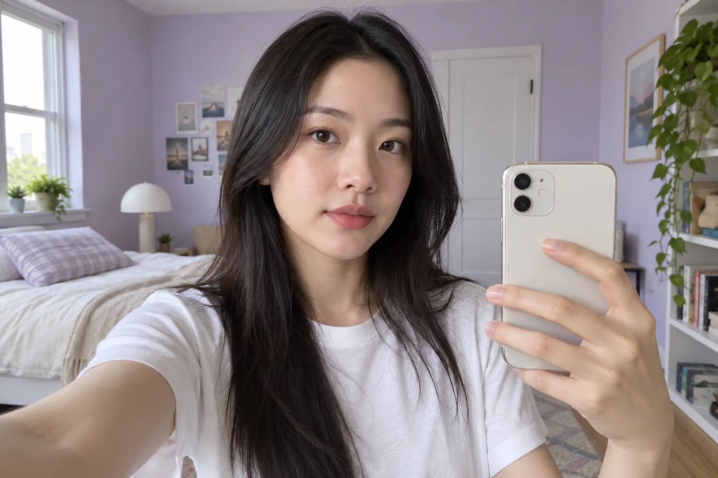
Stand near a window with soft light reaching the whole face. Use the standard camera, keep the phone near eye level and face forward with a relaxed mouth. Avoid a beauty filter, a colored lamp and a shadow crossing the lips. Show the full face and bare or familiar neutral lips, rather than a tight mouth crop. A close crop can make tiny hue differences feel enormous while hiding how the color relates to cheeks, eyes and hair. Keep the source image sharp enough to see the real lip outline without sharpening or smoothing it afterward.
Use that one photo for every preview. Changing the image, exposure or expression between candidates can make a lipstick appear more harmonious without changing its color at all. If your lips look unusually pale or orange in the source, take another photo before comparing, then stop changing the setup. Our source-selfie guide explains how to hold light, angle and framing steady. Save the original beside the variations so that a polished preview cannot quietly replace your actual starting color. The image is a planning reference, not a calibrated pigment measurement.
Compare one lipstick variable at a time in MaqAI
On the same clear portrait, preview a muted rose-brown, a warm caramel-brown and a cooler mauve-brown near the depth you defined. Keep apparent coverage, finish, lip shape, rest of makeup and image light as stable as the preview permits. Change hue first. If one candidate immediately seems too pale, adjust depth in a separate round instead of also switching from matte to gloss. Label each preview by its actual difference, not by a vague favorite number. Looking at three controlled possibilities is more useful than generating a gallery of nearly identical colors.
Check each preview at normal phone size, then inspect the lip border once. Ask whether the mouth remains visible from a step back and whether the color supports the entire face. A screen can show an appealing direction but cannot know the exact pigments in a retail formula or how your natural lip color will show through. It also cannot certify oxidation, texture, comfort, transfer or wear. Save at most two candidates: perhaps one quiet everyday shade and one with a little more contrast. A small shortlist makes the real product comparison practical.
Test the two color directions on real lips
Find physical shades that approximate the two saved directions; the product names and tube colors do not need to match the preview literally. Test with clean lips and follow the product's directions. Apply a small, even layer to the full lips so you can judge the actual color and border. If you use a liner, keep it constant for both trials or leave it out; a darker liner can rescue one shade and distort the comparison. Keep the rest of your makeup similar, and compare on separate occasions if repeated removal begins to irritate your lips.
Look at the center and the naturally darker rim separately. A sheer nude may mix with your pigment so the center becomes pinker while the edge stays brown. An opaque beige may hide the center but leave a stark border against deeper skin. Neither effect is automatically wrong; decide whether it matches the brief you wrote. If a shade is too pale, try a deeper direction rather than layering more of the same color. If it is too warm, compare a similarly deep cooler option. One real application tells you more than many digitally perfected previews.
Let finish and comfort change the decision
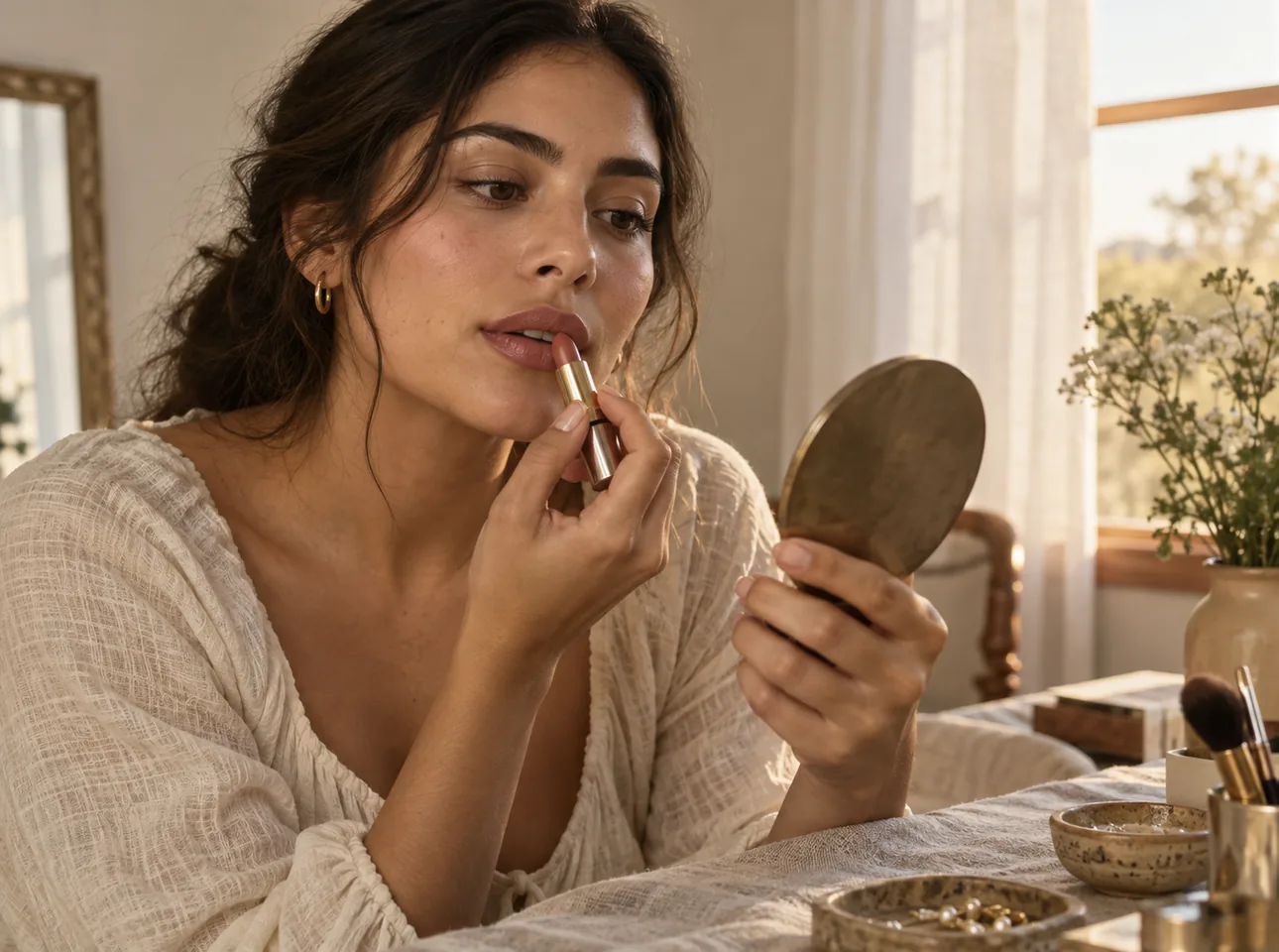
Once color is reasonably close, assess finish separately. A satin nude may reflect enough light to keep the lip shape readable, while a matte formula can sharpen the border and make the shade appear deeper. A gloss can lighten or soften the visual edge but also changes transfer and maintenance. Do not infer any of those behaviors from a preview alone. Try the actual formula, speak for a few minutes and notice whether the product feels comfortable. If it stings, burns or worsens chapping, stop using it rather than treating discomfort as a normal price for the color.
The American Academy of Dermatology advises choosing non-irritating lip products and stopping a product that causes burning or stinging. Keep that practical boundary even if one shade looks exceptionally good. Condition visibly dry lips in your usual way, but remove excess slip before a test so one candidate is not judged through a heavy balm and the other on bare lips. If the two formulas have very different finishes, run a second comparison after the color decision. Color, comfort and wear are separate questions; let a promising hue lose if the physical product does not feel right.
Check the choice in the light and outfit you will use
Take the leading lipstick to a second ordinary light source, such as a shaded outdoor spot or a desk near a window. Warm indoor bulbs can pull a beige toward orange; cool daylight can expose a gray cast. Look at the whole face and one usual outfit color, not just the lips in a magnifying mirror. A nude may support a strong eye look but seem too quiet with almost no other makeup, or the reverse. That does not mean you need a different identity or undertone label. It means you have identified the context in which the shade works.
If you usually coordinate cheek and lip color, keep the cheek unchanged during the first lip comparison. Change it only after selecting a lip direction, so it does not become a hidden variable. A single unfiltered photograph under your real light can help you remember the overall effect, but judge the physical mirror first. Note whether the lip outline is still legible from conversation distance and whether the shade feels intentional rather than concealer-like. The final choice can be modestly deeper than the first digital favorite if real pigmentation requires it.
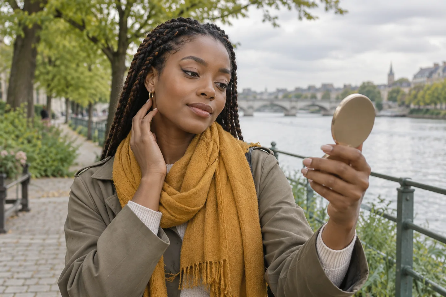
Keep a two-shade note and separate color from wear
Record the two finalists by effect: rose-brown satin for a quiet workday, for example, and deeper caramel for an evening outfit. Include the real formula, liner choice if any, light tested and one comfort observation. You need not keep buying toward a theoretical perfect nude. If the current shade meets the brief and remains pleasant to wear, the search can stop. When you later want a different finish, compare it against that reference rather than starting with a large random display. A small, honest note makes the next choice faster and less driven by photographs of other people's lips.
If the color looks right initially but disappears after eating, solve wear as a separate problem. Our lipstick-wear guide explains thin application, blotting and ordinary meal checks without claiming any product lasts through everything. Do not replace a good hue simply because one formula transfers, and do not praise a long-wearing formula whose color makes the lips vanish on your face. The finished routine is a real shade in a real context, backed by a controlled preview and a physical check. MaqAI narrows the visual decision; your lips, light and comfort make the final call.