
Lip makeup
Red lipstick with a red dress: choose the relationship
Compare two lip-color directions beside the actual dress in Hair Muse, then decide with real products and ordinary light.
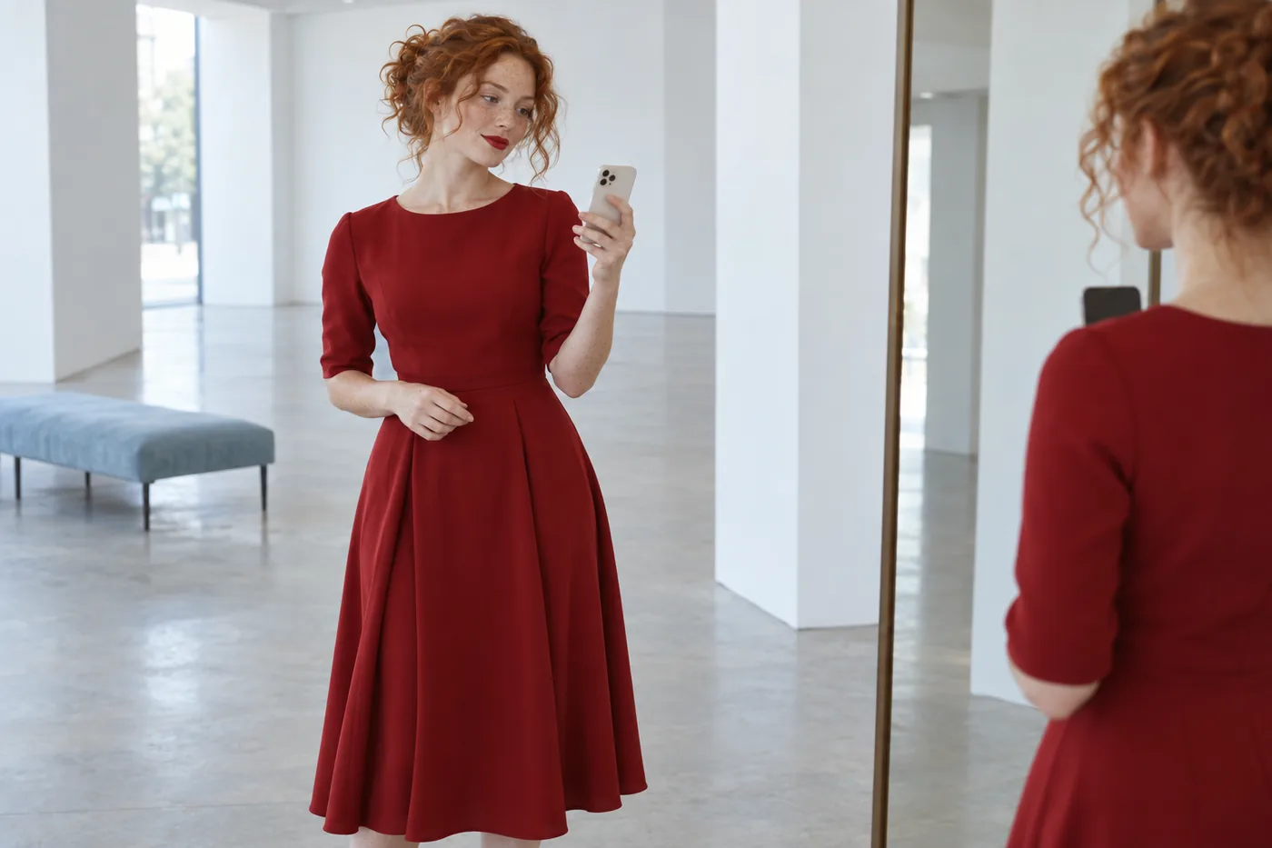
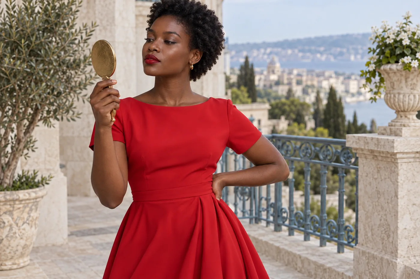
Red lipstick with a red dress can look closely coordinated or deliberately different. You do not need a perfect match to wear the combination. The useful question is whether you like the relationship between the two reds when the actual dress is near your face. A lipstick that looks familiar on its own may seem warmer, darker or quieter beside a large area of fabric. Start with the dress you will wear, rather than a color name on a shopping page or an isolated lipstick photograph.
This guide narrows that relationship with one clear outfit portrait in Hair Muse, then checks two plausible directions with real lip products and real light. MaqAI publishes the guide; Hair Muse is the app used for the visual planning step. A generated image cannot verify an exact shade, formula, oxidation, texture, wear or comfort. Its job here is to make the comparison specific enough that you know what to try. The finished choice belongs to your whole outfit and your preferences, not a rule that red lips must either copy or avoid red clothing.
Red lipstick with a red dress: define the relationship
Choose a starting intention before comparing shades. You might want the lips to repeat the dress’s color direction, creating a connected red theme. You might prefer a slightly deeper lip that remains distinct, or a related red with a different degree of warmth. Fabric folds and lip surfaces receive light differently, so demanding a pixel-for-pixel match sets a target that an ordinary mirror cannot meaningfully confirm.
Keep the first comparison narrow. If you already like the lip color against your face, use it as a reference beside the dress instead of replacing everything immediately. The linked lip-color comparison guide explains how to hold a face and outline steady. Today you are adding one important context: a substantial area of red fabric. A tiny red accessory, a black dress and a full red neckline do not create the same composition. Decide whether the lip should join the dress visually or remain a smaller distinct red accent, then test that intention without changing your entire makeup look.
Read the actual fabric before choosing a label
Place the dress in ordinary even light and examine the area nearest your face. A shadow inside a fold may look much deeper than the flat fabric, while a bright satin reflection may appear almost pale. Choose a representative area rather than the darkest crease or brightest highlight. Describe what you see in practical terms: a red leaning toward orange, a red leaning toward berry, a muted red or a strong bright red.
Separate color direction from depth and intensity. Adobe’s color explanation distinguishes hue, saturation and brightness; these provide helpful vocabulary rather than a prescription for clothing. A lipstick can be deeper without being cooler, or more muted without becoming a different color family. For the first trial, keep depth, opacity and finish reasonably similar while changing the color direction. If you compare a sheer shiny tomato tint with an opaque dark berry matte, you will not know which difference changed your response to the outfit. Note the fabric’s reflection separately and return to it after choosing two plausible color directions.
Photograph the face and enough of the dress
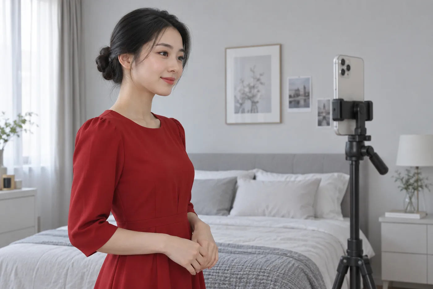
Take one clear portrait that includes the face, neckline and a useful area of fabric. A head-only crop hides the very context you want to judge. Use even light, a relaxed expression and an angle that shows the natural lip outline. Keep distracting colored lights and beauty filters out of the setup. If the dress changes markedly between two camera positions, simplify the lighting before taking more pictures. The linked source-photo guide gives practical framing advice. The aim is a readable reference, not a studio color measurement or a flattering image at any cost.
Wear the actual dress if convenient, or hold its neckline in the position it will occupy without covering the face. Keep the same framing for both options. Do not replace the dress between previews with a different red garment that happens to share a color name. Camera processing may still shift the fabric, which is why the final decision must return to the real object. Preserve the original photo beside the visual candidates. If a preview changes the garment’s hue or makes its texture brighter, you need that reference to notice that the comparison has moved away from your intended question.
Set up two controlled lip-color directions
Start with a red close to the dress’s apparent direction and one alternative you can describe. That alternative might lean slightly more berry or slightly more orange while staying in a comparable depth range. Keep the lip shape, apparent opacity, finish and edge as similar as possible. You are not asking which complete makeover is more attractive. You are asking which relationship you prefer between a small red lip area and the larger red garment. Two well-defined directions will usually answer that more clearly than a large collection of unrelated styles.
Use familiar words and avoid pretending the image identifies a specific lipstick. A note such as similar depth, satin finish, slightly cooler red is more actionable than a demand for an exact commercial shade match. If the two ideas end up almost indistinguishable at full-face distance, that is useful information: the precise hue difference may not be the main decision. You can then investigate depth or intensity as a separate next comparison. Do not change those variables at the same time just to force the first pair to look more different.
Compare the outfit in Hair Muse and keep a shortlist
In Hair Muse, use the same source photo to explore your two red-lip directions. Keep the request focused on lips and explicitly retain the dress, other makeup and light. Inspect each candidate against the original. A changed neckline, smoother face, stronger cheek color or altered garment makes it harder to isolate the lip decision. Reject an unsuitable result or narrow the request. A visually pleasing image is not automatically evidence that a certain red works better with the real dress. You need the relationship to remain visible while the surrounding comparison stays reasonably consistent.
Look at the whole image before enlarging the lips. Does the lip color feel connected to the dress in the way you intended? Does the face remain readable as part of the outfit? Keep two useful candidates with short descriptive notes rather than accumulating near-duplicates. If the app cannot keep fabric color stable, record that limitation and use the images only as general lip ideas. You can finish the choice in front of a mirror.
Translate the visual ideas into real lip trials
Find two suitable lip products that approximate the directions you saved, starting with what you already own. They need not match the preview exactly. Check each actual product, its instructions and its condition. Use clean hands and appropriate clean tools, and avoid sharing lip cosmetics. The FDA’s safe-use advice supports those basic handling practices; it does not validate any shade pairing. Follow the product rather than improvising mixtures in its container. The generated illustrations in this guide explain the planning process and are not evidence of a physical formula test.
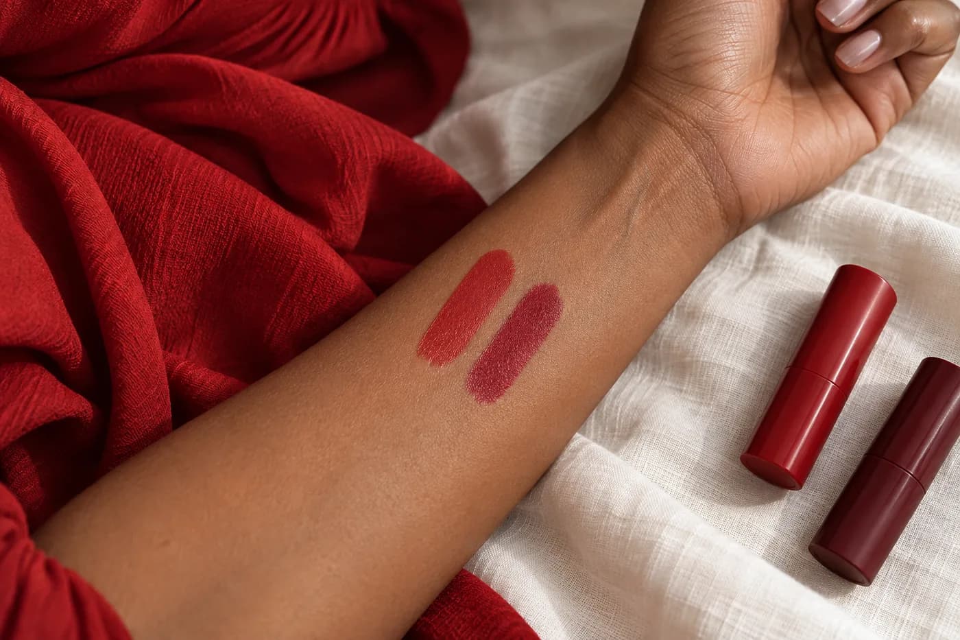
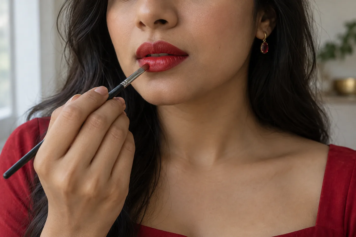
Apply a small repeatable amount within your normal lip outline, then view it beside the real dress. Keep liner and finish steady as far as practical. If a product needs a different preparation or a very different application to look even, record that instead of attributing the entire effect to color. A hand swatch can help you find a candidate, but the real lips and outfit are the deciding context. Remove the first trial gently as directed before trying another, and stop if the lips feel uncomfortable. You can compare on separate occasions rather than repeatedly applying and removing several colors in one sitting.
Check both reds together in ordinary light
Stand at a comfortable mirror distance with the neckline visible. Check indirect daylight and the indoor light relevant to your plans. Turn slightly to see a normal range of fabric reflections, then return to the same front view. Do not judge the lip only against one dark fold of the dress. A pairing may remain coherent even when neither material looks identical from every angle. Describe the actual difference you prefer: lips a little deeper, dress brighter, or a closer shared color direction. That description is more useful than declaring the combination matched without explaining what you saw.
If the relationship changes under another lamp, decide which lighting context matters most rather than chasing one universal red. A photograph can document the outfit, but exposure, white balance and screen settings may alter the comparison. Use it as an additional view, not the final authority over the real dress and lips. Do not sample a photograph’s pixels to claim an exact lipstick match. If both candidates do, choose the one you find simpler or more comfortable to apply instead of generating increasingly subtle variations.
Include finish, upkeep and the dressing sequence
Once the color direction is clear, consider whether the chosen finish fits your routine. A moving highlight can draw attention differently from a quiet surface, even when the red is close. Treat a finish change as a new practical check rather than assuming the preview proved the formula’s behavior. Wear the real lipstick through an ordinary period of speaking and, when relevant, a drink or meal. Note the first repair needed. The image cannot establish transfer resistance or how your particular lip surface will feel after several hours. A beautiful initial pairing still needs an application you are willing to maintain.
Think about the neckline while dressing and touching up. Applying the lip after pulling the garment over the head can avoid unnecessary contact; follow the dress’s care instructions if an accidental mark occurs. If the preferred direction requires effort you dislike, try a familiar related shade or a lighter application as a separate choice. The useful outcome balances color relationship, actual formula and everyday handling, without promising that a coordinated look will stay unchanged all evening.
Record one decision you can repeat
Keep the original outfit photo, two visual ideas and a short note about the real trial. Include the actual lip product, approximate amount, finish, light and the fabric area you compared. Separate what the preview suggested from what you observed physically. For example, berry-leaning red felt distinct from the dress is a visual preference; the formula needed a repair after a drink is a wear observation. Neither statement becomes a general ranking of red lipsticks or a rule for everyone wearing a red dress. The notes should help you repeat your own choice without starting the comparison again.
Revisit only an unresolved point. If the hue relationship works but the lips feel too prominent, test a smaller change in opacity or depth rather than switching eyes, cheeks, dress and lipstick together. If the outfit changes, use that new context rather than treating the previous choice as a permanent identity rule. When one real application gives you a relationship you like and a manageable routine, the planning is complete. Red lipstick with red clothing can be close, contrasting, restrained or bold. You have a method for making the combination deliberate, with the real garment and your own preference as the final references.