Lip color guide

How to compare lipstick shades on your own face

Compare warmth, depth, saturation, edge, and finish without mistaking a screen preview for an exact product match.
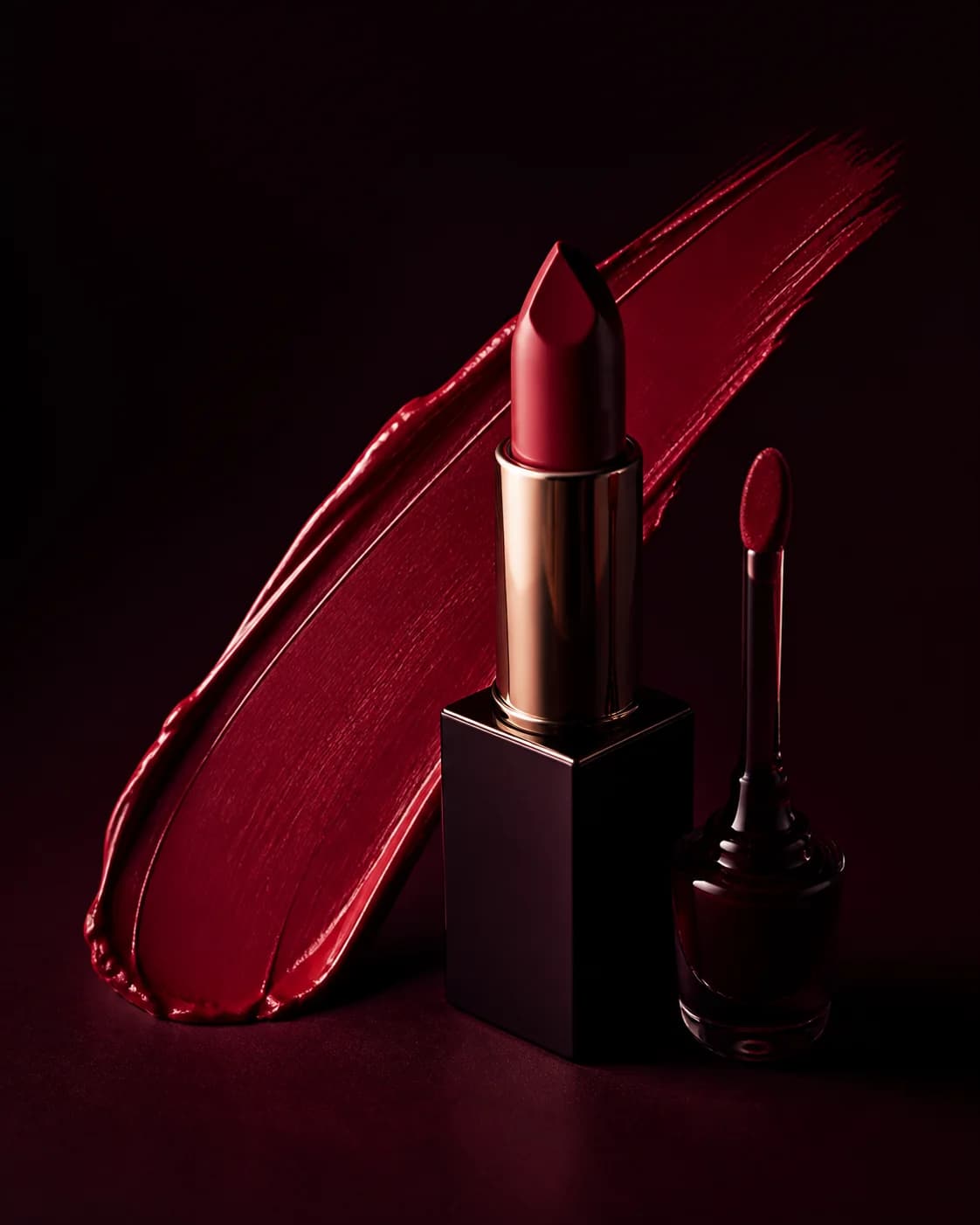
Classic red lipstick and pigment photographed on dark glass

Quick read

Know what you are testing before you start.

This lip color guide focuses on one practical question: Compare warmth, depth, saturation, edge, and finish without mistaking a screen preview for an exact product match. Use the summary to decide whether that is the uncertainty blocking your next makeup decision.

The decision

Define the uncertainty.

Compare warmth, depth, saturation, edge, and finish without mistaking a screen preview for an exact product match. Start with “Compare three families at matched depth.” Finish with “Move the finalists onto real lips.”

The method

Run one controlled experiment.

Find the lip family first, then refine depth, edge, and finish. Follow the four stages below in order: round one, round two, shape, swatch.

The reality check

Know when the answer is clear.

You have a specification, not a mystery shade. The shortlist can be described by family, depth, saturation, opacity, edge, and finish. That description remains useful across brands and product launches.

Lip color can change the apparent balance of an entire face, but random swiping makes it difficult to understand why one option works better than another. A useful comparison changes one property at a time.

Begin with a stable portrait and a familiar shade. That baseline helps you separate genuine preference from the novelty of seeing a stronger color.

Build a small color family shortlist

Choose three clearly different families before exploring tiny variations: for example rose-brown, coral-red, and berry. If you already know the family, compare warm, neutral, and cool neighbors within it.

Keep the rest of the face stable. A new cheek and eye with every lip makes it impossible to tell which element created the effect.

Compare depth before chasing undertone

A lipstick may feel wrong because it is too pale or deep rather than too warm or cool. Test light, medium, and deep versions at similar saturation to learn how much contrast you prefer around the mouth.

Then compare temperature inside the depth that feels balanced. This two-step method is clearer than moving through unrelated colors.

Notice saturation and visual weight

Muted colors share more gray or brown and often integrate quietly with the face. Clear, saturated colors create a stronger focal point even at similar depth.

Neither is universally more flattering. Decide whether the lip should lead the look, support the eyes, or repeat a soft color already present in the cheeks.

Separate color from edge and finish

The same shade can read polished with a precise outline, relaxed with a blurred edge, fresh as a tint, or dramatic in a reflective gloss. Compare the treatment after choosing a promising color family.

If a preview feels too formal, soften the edge before abandoning the shade. If it feels too quiet, increase opacity or shine before making it darker.

  • Tinted and diffused: low visual weight
  • Cream and satin: balanced definition
  • Matte and precise: stronger structure
  • Glossy and reflective: added volume and light

Check the lip in the full look

Return the eye and cheek direction you actually plan to wear. A lip that felt dominant on a bare face may become balanced with liner and blush, while a quiet nude may disappear beside a smoky eye.

Also compare the color with the outfit, hair color, and lighting of the occasion. Context changes the relationship without changing the lipstick itself.

Translate the preview into product testing

Describe the winner as a family and finish—such as medium muted rose-brown satin—not as an exact hex color. Screen calibration, source light, natural lip pigment, opacity, and formula can all shift the real result.

Swatch the actual product, view it in neutral and relevant lighting, and wear it long enough to understand comfort, migration, and color change.

Use MaqAI to narrow the counter to a few useful tests, not to replace the real swatch.

Run the experiment

Find the lip family first, then refine depth, edge, and finish.

Comparing many unrelated lipsticks at once turns color, contrast, opacity, and texture into one reaction. A two-round test reveals which variable is actually driving the preference.

01 · Round one

Compare three families at matched depth.

Try a warm, cool, and neutral direction with similar opacity and a satin finish. Keep cheeks, eyes, liner, and lip outline unchanged.

02 · Round two

Refine only the winning family.

Test one lighter and one deeper version while preserving temperature, edge, and finish. Stop if the original depth remains strongest.

03 · Shape

Test edge separately from color.

Compare blurred, natural, and precisely lined versions of the preferred shade. Edge can make the same color feel casual, polished, romantic, or graphic.

04 · Swatch

Move the finalists onto real lips.

Natural lip pigment, liner, opacity, formula base, and lighting alter the result. Wear the real products long enough to check comfort, transfer, and how the color settles.

Success signal

You have a specification, not a mystery shade.

The shortlist can be described by family, depth, saturation, opacity, edge, and finish. That description remains useful across brands and product launches.

Refine when

Reset when one option wins because of gloss or liner.

Match the finishes and outlines again. Lip color cannot be compared cleanly when one candidate also receives more reflectivity or definition.

Photograph the real finalists in daylight and the light in which you plan to wear them. Note whether liner, balm, layering, or blotting changed the effect. Keep the result that stays convincing beyond the preview screen.

Good to know

Questions about this guide

Straight answers about the app, AI previews, privacy, and what to expect.

Should lipstick match my undertone?

It can create harmony, but deliberate contrast can be equally effective. Compare a related shade and a contrasting neighbor instead of treating undertone as a rule.

Why does the same shade look different on me and a reference?

Natural lip pigment, surrounding makeup, skin contrast, lighting, camera processing, and product opacity all change the visual result.

Can MaqAI match a lipstick brand exactly?

No. Use the preview to identify color family, depth, saturation, edge, and finish, then test real formulas.

Put the guide into practice

Test one clear change on your own portrait.

Use Live AR & Shade Finder to compare the direction from this guide, save the result that works, and carry it into a real product or technique test.

Coming soon to theApp Store★★★★★Free download