
Lip makeup
Lip liner color: match your lipstick or show the edge?
Separate depth, warmth and intensity, compare two border ideas in Hair Muse, then test the real pencil with your lipstick.
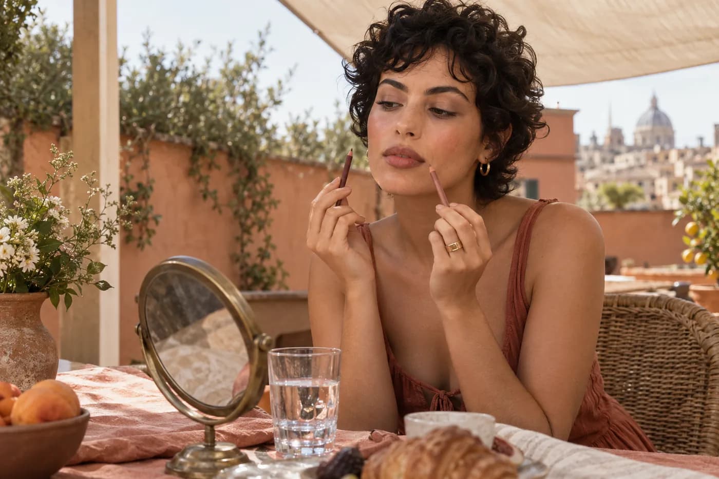
Lip liner color can make a familiar lipstick look quietly finished or suddenly outlined. A pencil that appears ideal on your hand may become orange, gray or much darker around your mouth. That does not automatically mean you chose the wrong lipstick. The border and the center are two separate color areas, and their relationship changes with your natural lip pigment, line width and the opacity of the product on top. Decide first whether the pencil should disappear into the lipstick or remain a visible part of the look.
MaqAI publishes this guide; the makeup features are available in Hair Muse. Use a clear portrait to explore the amount of lip-border contrast you want, compare one variable at a time and keep a small shortlist. Then test real pencils with the lipstick you actually wear. A digital preview is a planning aid: it cannot identify an exact shade, confirm a formula, predict oxidation, texture, wear or skin reaction, or guarantee the finished result. This guide chooses color relationships rather than ranking products or promising larger lips.
Lip liner color starts with the job of the edge
Set a specific goal before looking at shade names. For a nearly invisible border, compare the pencil with your lipstick after it has been applied, rather than with the solid bullet. For definition under a sheer balm or gloss, use the natural lip boundary as the reference. For a visible outline, decide how much separation you want between edge and center. All three are valid choices. None requires a pencil for every lipstick you own, and none makes liner compulsory. If the lipstick already gives the edge you want, another layer may add no useful change.
Try describing the goal without a shopping term: a soft rose boundary that blends into a satin center, or a deeper brown edge with a muted pink center. This distinguishes an intentional contrast from an accidental ring. Keep the rest of the face familiar while deciding. A stronger brow, darker mascara or different blush can change how prominent the mouth feels, making a pencil appear unsuitable when the actual change happened elsewhere.
Separate depth, warmth and intensity
Compare how light or dark the pencil looks before judging its warm or cool direction. Two rose-brown pencils can have similar hue yet produce very different borders because one is deeper. Once depth is plausible, check whether the line leans orange-brown, neutral rose or mauve. Finally assess intensity: a bright, vivid pencil may stand away from a muted lipstick even when both are described as pink. These are separate questions. Adobe's explanation of hue, saturation and brightness provides a useful vocabulary for keeping them apart.
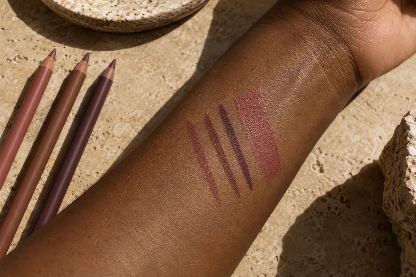
Make a small swatch next to the lipstick on clean skin, with comparable pressure and stroke width. This helps eliminate an obviously different color family; it does not reproduce the appearance on your lips. Natural lip pigment still contributes beneath a sheer product, while an opaque lipstick may cover part of the pencil. Do not choose solely from a packaging cap or an online color tile. Record what the applied mark looks like, then move the best candidates to the actual border. If one mark is much thicker, redraw it before judging which color is stronger.
Choose your reference: lipstick, bare lips or contrast
For a coordinated lipstick edge, keep the applied center color fixed. Start with a pencil near its depth and color direction, and soften a short mark inward. Exact product names need not match. A pencil called nude can be visibly browner than a lipstick called nude; a rose label may conceal a violet cast. Look at the joined colors rather than their names. With clear or lightly tinted gloss, the natural upper and lower lip may be different colors, so one uniform pencil can create a visible border even when it resembles one part of the mouth.
For deliberate contrast, begin with a modest depth difference and keep the hue relationship understandable. A muted brown line with a dusty rose center is a different choice from an orange line around a cool berry lipstick. Neither needs to be forbidden, but both should be chosen knowingly. Keep border position stable during the color comparison. Drawing farther outside the lip changes shape and area as well as color, so it prevents you from identifying what the pencil itself contributes.
Make one source portrait useful
Take a level portrait in soft, even light, with your mouth relaxed and the full lip boundary visible. Avoid a strong sideways shadow, beauty filter or portrait setting that smooths the mouth. A neutral expression gives a more repeatable starting point than a pursed pose. Use the same source image for each comparison, and keep your baseline makeup and planned lipstick direction consistent. Our source-photo guide explains how to prepare a readable portrait when lighting or camera distance makes the boundary unclear.
Look at the image at full-face scale before zooming into the lips. The useful question is how much definition you want at ordinary distance, not whether every pixel forms a perfect contour. Keep display brightness steady and disable dramatic color filters if possible. A screen setting cannot make the preview an exact color sample, but changing it between options adds another variable. If the source image makes the natural lip border difficult to distinguish, retake it rather than asking a generated result to reconstruct information that was never clear.

Compare the border in Hair Muse, then narrow it
Use Hair Muse's makeup preview workflow to explore a softer or more defined lip edge around the same center color. Aim to keep lip shape, lipstick depth, finish and the rest of the face as consistent as possible. Change only the intended edge contrast first. Review the actual output: if the preview also changes the mouth's shape, adds gloss or darkens the lipstick center, it is no longer an isolated liner comparison. Repeat the comparison or use it only as a broad mood reference. Do not interpret a generated contour as evidence that a particular pencil will reproduce it.
Save no more than two useful directions. Write a short description beside each: near the lipstick, quiet rose-brown, thin blended line; or visibly deeper, neutral brown, softened inward. Compare them at the same size and ask which edge fits the whole face. This is a specification for a physical trial, not a product shade code. The app can help you organize the visual decision; the real pencil must still demonstrate its color, pressure, comfort and behavior with your chosen lipstick.
Translate the shortlist into real swatches
Gather pencils you already own before expanding the search. Place each beside the lipstick and inspect the applied marks in the same light. A broad display of ten similar shades can obscure the decision, especially when the marks were made with different pressure. Test two plausible candidates, using a small clean section of skin for orientation, then a light section of your actual lip boundary. Personal pencils and clean tools make the comparison simpler. Follow each product's instructions rather than assuming that every tip or formula behaves in the same way.
A pencil may feel harder, softer or more waxy than the preview suggests; those physical differences affect how wide and opaque the line becomes. Note the pressure needed for one readable pass. A color that works in a delicate stroke may look much darker after repeated passes, so do not increase the layer count simply to match a photograph. Judge the joined pencil and lipstick on the mouth. If the center covers the border completely, the pencil may support application without adding a visible color relationship; that can still meet your original goal.
Apply a small test without forcing the result
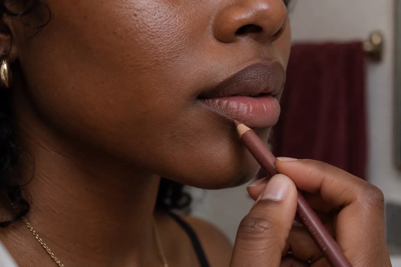
Use light, short strokes along the actual lip boundary, keeping the mouth relaxed. Begin with a limited section so you can assess color and pressure before outlining everything. Soften the inner edge with a clean suitable tool when a blended result is the goal, then add the usual amount of lipstick. A wider band changes the visible area of the darker color; keep it narrow during the first trial. Compare after the two products meet, rather than judging an isolated outline before the center is filled.
Comfort takes priority over finishing the test. The American Academy of Dermatology advises stopping a lip product that burns, stings or feels uncomfortable. Do not treat that sensation as proof that a pencil is working. If the lips are sore or cracked, postpone the color trial. When the issue is dragging rather than color, check product condition and directions before applying harder pressure. A preview cannot settle whether a real formula suits your lips.
Check ordinary light, movement and wear
Step back to conversation distance and inspect the whole face in open shade or your usual indoor light. Then speak, relax the mouth and smile naturally. The border may look different when stretched, particularly at the corners. Check whether the line still blends with the center or creates a separate band you did not intend. A quick photograph can document the trial, but mirror and camera impressions should be considered together. Do not replace one overprocessed image with another as the sole measure of success.
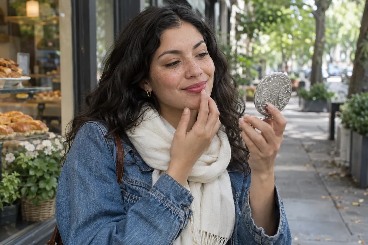
Check again after a normal drink or some ordinary wear. If the center fades first, the same pencil can become more prominent without changing color. That is a wear relationship, not necessarily a shade mismatch. Decide whether you are comfortable with the remaining edge and with a small center touch-up. If pigment migrates beyond the border, use our lipstick-bleeding guide for that different problem. Color selection alone cannot prove that a liner prevents feathering or guarantees a fixed number of hours of wear.
Repair the variable that actually changed
An orange-looking edge suggests reassessing color direction while keeping depth and width stable. A gray-looking edge may be too muted for the lipstick, or may simply look different in the current light; verify it in another ordinary setting before replacing the pencil. A heavy ring calls for a thinner band, less pressure or a closer depth match. If the edge disappears and you wanted visible definition, increase one contrast variable slightly. Avoid changing the lipstick, pencil, line width and gloss together, because you will lose the explanation for the improvement.
For a practical final decision, compare the two saved directions with their real trials. Suppose the near-matching option joins the lipstick smoothly, while the deeper option looks good initially but remains alone after a drink. Choose according to the routine you actually want: a quiet border with little checking, or a deliberate outline with planned touch-ups. Record pencil, lipstick, line width, light and the later appearance. That small note is more useful for repeating the look than chasing an exact screen shade. Keep the successful combination and stop comparing once it meets the job you defined.