
Lip color
Purple lipstick: a sheer wash or continuous color?
Compare how much natural lip color remains visible, then test a small shortlist with real cosmetics, ordinary light and expression.
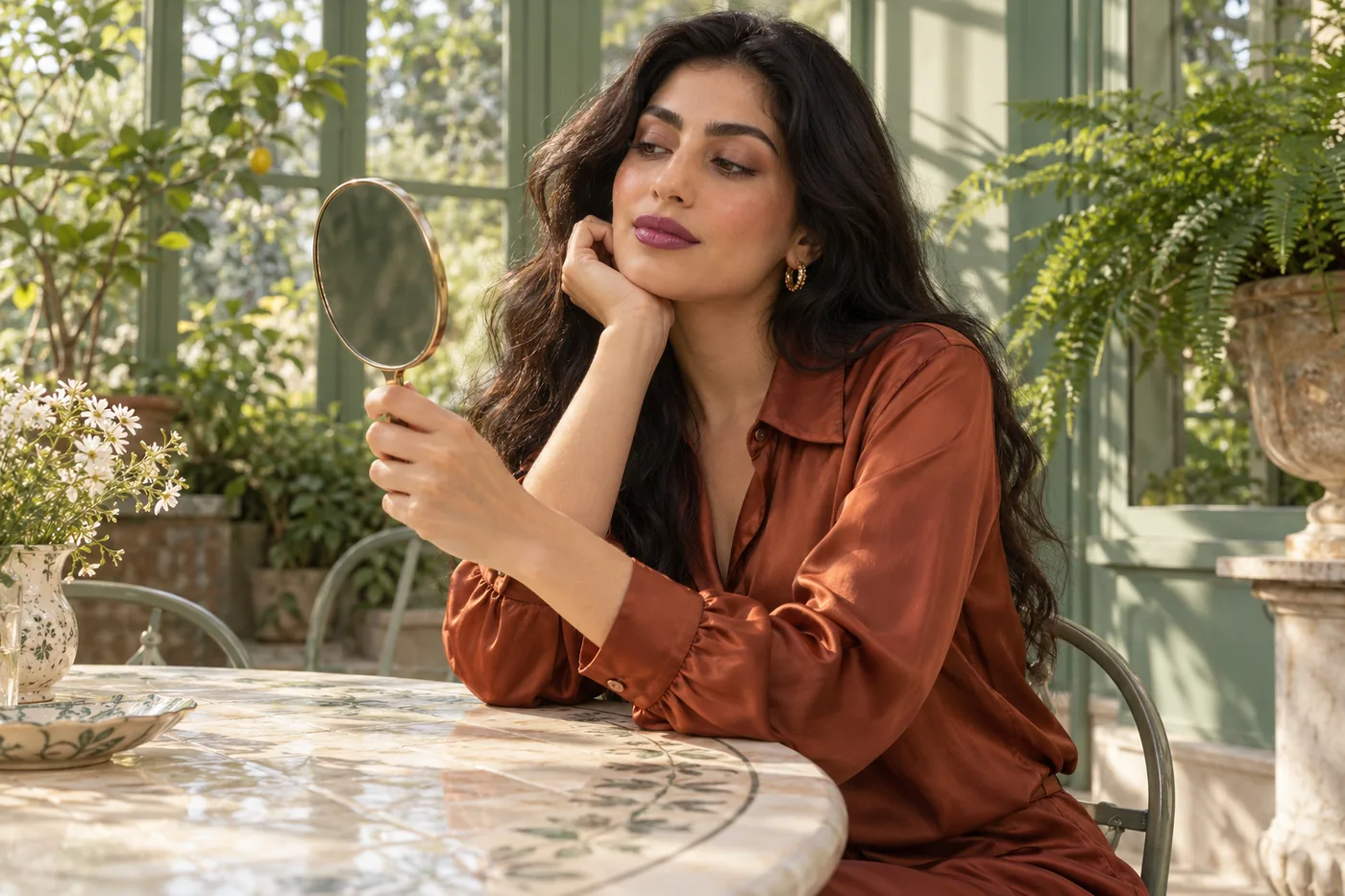
Purple lipstick can look like a quiet violet tint in one photograph and a solid statement in another, even when the color name barely changes. Before searching for a different shade, decide how much of your own lip color you want to show through. A translucent layer and an opaque layer create different relationships with the rest of the face. Neither is a required starting point or a more confident choice.
MaqAI publishes this guide. Hair Muse is the app for exploring makeup ideas on a portrait; MaqAI remains the website. The method below compares two coverage directions on one clear photograph, keeps the natural outline and reflection as consistent as possible, and then checks a small shortlist with actual lip cosmetics. A generated image cannot identify a matching product, predict comfort or prove that an extra coat will reproduce its color.
Purple lipstick: choose coverage before another shade
Write the decision in one sentence: “I want a violet wash that lets my lip color participate” or “I want a more continuous violet surface.” This makes the question about coverage rather than whether purple suits a particular face. Pale lilac, blue violet and reddish plum are different color directions. Choose one approximate direction first so that the comparison does not accidentally become a contest between three unrelated shades.
Coverage is also different from finish. A transparent product can reflect strongly, while an opaque one can look softly satin. For the first comparison, aim for a similar amount of visible reflection. Otherwise you may prefer the brighter highlight rather than the coverage. Keep the lip boundary in the same place too. A larger shape can dominate the portrait even if its color layer is relatively sheer.
Your natural lip pigment remains relevant. A violet tint over a pink, brown or unevenly pigmented surface need not resemble that tint on another person. This is not a flaw to erase. The useful question is whether the resulting relationship is the one you wanted, and whether you enjoy seeing that variation through the color.
Start with comfortable lips and a suitable product
Use cosmetics intended for lips and follow the particular product's directions. Purple eye pigment is not automatically a substitute for lipstick. Keep personal tools clean and avoid sharing the product. The FDA's general cosmetic-use guidance supports reading directions, washing hands and keeping cosmetics personal; it does not validate a particular purple shade, application sequence or preview result. Its linked advice provides a useful boundary around the creative experiment.
If your lips feel sore, cracked or irritated, postpone the color experiment instead of using extra coverage to hide discomfort. Do not scrub until the surface looks featureless. A still image can conceal the very sensation that should make you stop. A product that feels unpleasant is not made more suitable by how well its color photographs.
For the later physical trial, choose a familiar preparation that you can repeat. Adding a different balm, primer, pencil and gloss at once makes the result harder to understand. Let the actual product's instructions guide preparation and layering. Record what you use so that tomorrow's successful application does not depend on remembering an accidental combination.
Make one portrait that preserves the starting color
Take a relaxed, front-facing photograph in even light, with your lips visible and your mouth gently closed. Use a plain enough background that a strong colored wall does not dominate the scene. Avoid colored light and beauty filters. A photograph is still an interpretation, but a stable starting point makes a comparison less confusing than switching between different cameras, poses and expressions.
Keep the original. Check that the camera has not smoothed away lip texture, altered the outline or exaggerated a bright reflection. If an existing lip product obscures the starting pigment, a later comfortable bare-lip photograph may be more useful. Do not repeatedly remove makeup solely to obtain a perfect reference when that makes the surface uncomfortable.
The linked portrait checklist explains the broader setup. For this decision, the most important detail is that the same lips remain recognizable in every version. Use one source portrait in Hair Muse rather than choosing a separate flattering photograph for each coverage idea. If you change the photograph, restart the pair so that the comparison retains a common starting point.
Compare a violet wash with a continuous color surface
Create one direction that leaves some natural lip pigment visible and a second that reads as more evenly covered. Ask for the same approximate violet family, natural outline, expression and restrained satin reflection. Keep eyes, cheeks, base and hair unchanged. These are targets for reviewing the output, not a promise that the app will vary only the requested attribute.
Look closely for changes outside the requested area. A different lip shape, brighter teeth, smoother surrounding skin or altered face proportions can make one image seem more appealing for the wrong reason. Discard that comparison and try a clearer brief. If the tool cannot preserve a fair pair, use the ideas as separate references and make the actual coverage decision with real cosmetics.
Do not force a translucent layer to have exactly the same apparent color as an opaque one. Underlying pigment contributes to what you see, so some shift is expected in the concept. Preserve the general violet direction and compare how much of your own lips remains part of the result. Name the two versions “wash” and “continuous color,” rather than attaching a product name you have not verified.

Judge the whole face before zooming into the lips
First view both portraits at ordinary face size. Ask whether the lips feel connected to your existing eye and cheek makeup, whether you like their prominence, and whether the overall expression still feels familiar. There is no requirement to make the eyes quiet whenever lips are purple. A restrained eye can simply make the coverage decision easier to read during this first experiment.
Then inspect the lips more closely. With the wash, decide whether the visible underlying variation looks intentional to you. With the denser surface, check whether a continuous color area is what you prefer, rather than assuming that coverage means an airbrushed surface. Neither version should require the removal of normal fine lines or a newly invented outer boundary.
Finally compare at the same screen brightness. Do not increase brightness for one version or use a warmer display setting halfway through. If the difference disappears at normal viewing distance, you may not need two separate routines. Choose the simpler idea and move to an actual trial instead of generating many nearly identical portraits.
Translate the chosen coverage into a small physical trial
Save no more than two useful references. Beside each, write the violet direction, the amount of natural pigment showing through, the approximate reflection and the boundary you want to retain. This brief is more actionable than asking a retailer for the exact lipstick in an AI image. The linked routine guide explains how to turn a visual reference into separate product and application decisions.
Choose a suitable real lip product whose intended coverage is reasonably close to the goal. Follow its application directions and begin with a manageable amount. A sheer formula does not necessarily become evenly opaque through repeated coats; a dense formula does not necessarily become an even tint when spread extremely thin. If the first small trial fights the intended behavior, reconsider the product rather than forcing more layers.
Use your own natural outline as the starting boundary. Apply with the product's applicator or a suitable personal lip brush, then pause to inspect the actual deposit. Check both corners and the transition toward the inner lip without extending color onto wet tissue. The saved reference guides the visual aim; the physical product, surface and handling decide what is achievable.
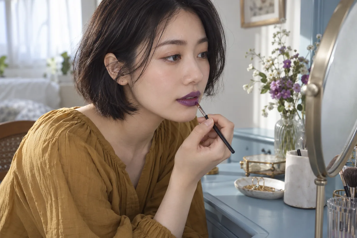
Separate color changes from coverage problems
If the real wash looks more pink or brown than the reference, note that observation before adding more. The difference may involve the actual shade, your underlying pigment, light or the way the formula deposits color. One additional compatible layer can be a separate trial if the instructions permit it, but it is not proof that more product is always the answer.
If a denser layer looks uneven, identify whether you see a missed area, a lifted layer or an uncomfortable surface. Correct only a small manageable spot, or remove the product gently according to its directions and restart later. Do not convert a simple coverage comparison into an endless sequence of rubbing and rebuilding. A uniform photograph is not worth an unpleasant application.
If the coverage looks right but the reflection differs, record finish as the next decision. Do not immediately add gloss while also switching the violet shade. That would answer a new question. Keeping the first trial narrow helps you decide whether the problem belongs to color, coverage, reflection or application, rather than rejecting purple lipstick as a whole.
Check speech, ordinary light and a realistic refresh
Look in a mirror near even daylight, then in the indoor light where you expect to wear the look. Keep the comparison practical: you are checking whether you still like the visible color, not trying to prove one light is perfectly neutral. A phone photograph can be a useful record, but do not treat its automatic adjustments as a more reliable judge than your own comfortable viewing experience.
Smile and speak normally. Check whether the boundary and inner transition still look acceptable to you and whether the product feels comfortable. Drinking or eating can change a real lip layer in ways a preview cannot predict. Observe the particular formula rather than promising that a darker, denser or more matte appearance will last longer.
Try the refresh you would actually carry out. A wash might need a small controlled reapplication; a denser surface might need a local correction or a fresh start. Neither is automatically easier. Your useful measure is whether you can maintain the result with your own time, tools and patience, without repeatedly covering discomfort or accumulating an unwanted thick layer.
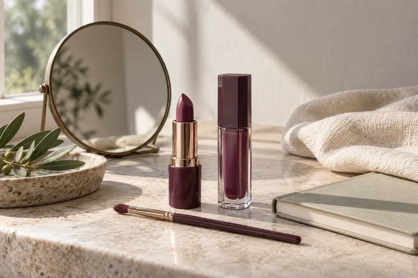
Keep a short record that makes the choice repeatable
Record the actual product and shade, preparation, application tool, first amount and observation under two lights. Add one note about expression and one about refresh. Keep the two saved ideas only if they represent different routines you would genuinely use. Delete misleading comparisons that changed your lip shape or skin instead of the requested coverage.
A useful conclusion can be specific: “I prefer a violet wash with my own pigment visible for this look” or “I want a more continuous surface and accept the extra edge check.” It can also be that neither available product achieves a comfortable result today. You do not need to buy a new formula to complete the exercise or label one version as universally flattering.
Next time, change one decision deliberately. You might keep the coverage and explore a warmer violet, or keep the shade direction and review reflection. The first comparison has done its job when you can describe what you want, recognize it on your own lips and repeat the real application without treating a generated portrait as evidence of a product's behavior.