
Blush color
Pink or coral blush? Compare the color, keep the placement
Choose a cheek-color direction without letting stronger pigment, extra shimmer or a different placement decide for you.
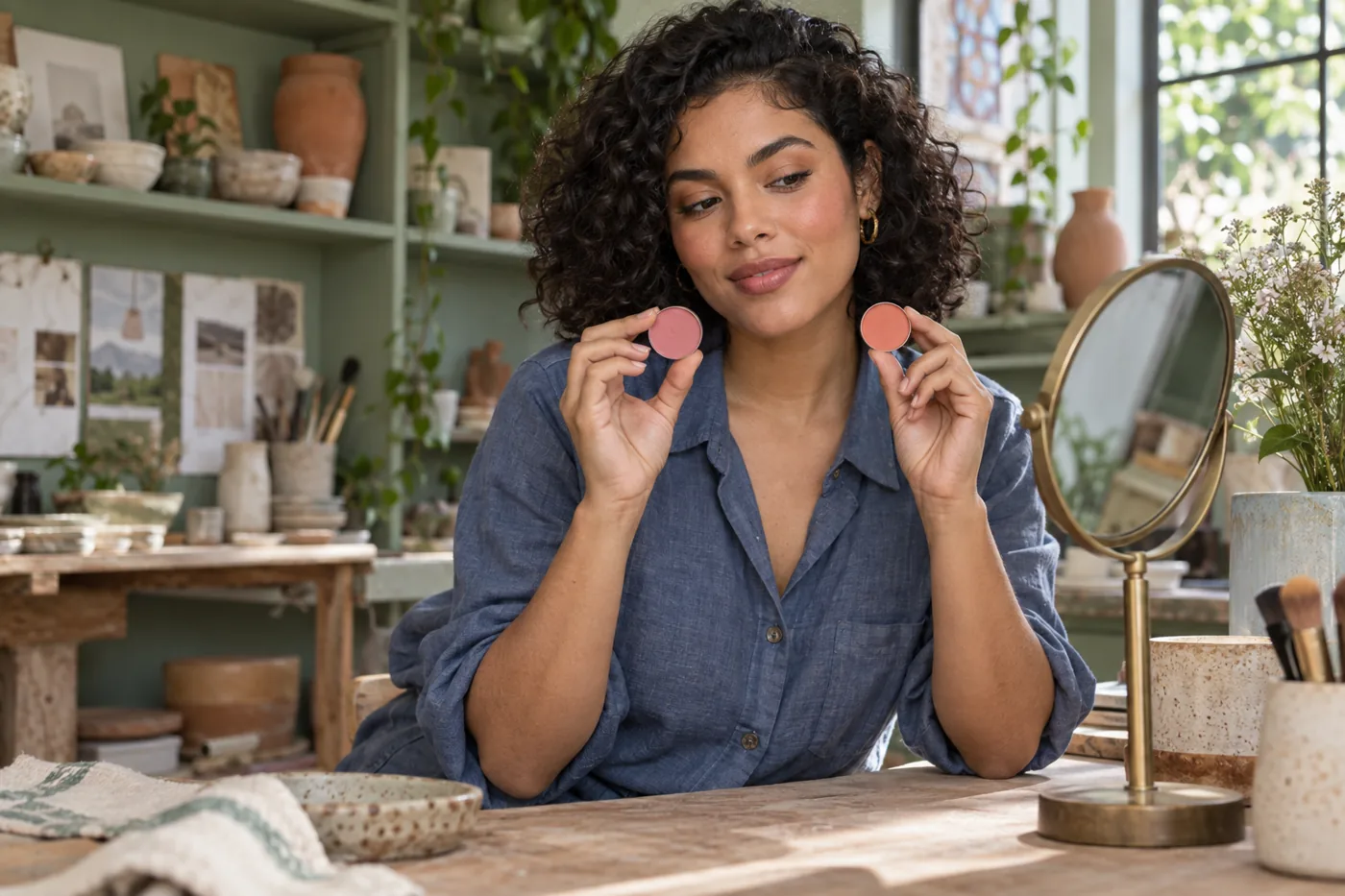
Pink or coral blush can look like a simple choice until the pink disappears on your cheeks and the coral looks unexpectedly orange. The pan names tell only part of the story. A pale, chalky pink and a rich satin coral differ in depth, opacity and reflection as well as hue, so comparing them straight from the compact can answer the wrong question. Start by deciding whether you want a rosier impression or a little more peach-orange warmth. Keep the amount, cheek area and finish similar before judging which direction belongs in your everyday makeup.
This is a cheek-color test, not a universal warm-skin or cool-skin rule. One clear portrait can help you compare pink and coral at a controlled intensity, and MaqAI can serve as a planning aid for that shortlist. It cannot guarantee an exact product shade, formula, oxidation, texture, wear, skin response or final result. MaqAI is not yet available in the App Store; the method below also works with written notes and careful real-product trials. Finish with two candidates on actual skin, in the light where you expect to wear them, before deciding whether to buy anything.
Pink or coral blush: name the difference you want to see
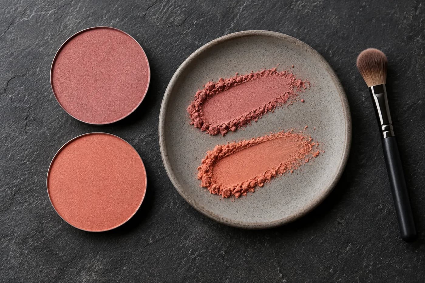
Pink is a broad family, from soft rose to vivid fuchsia and muted mauve. Coral usually sits between pink and orange, but one coral may be nearly peach while another is redder and much brighter. Neither word promises a particular depth or a natural-looking effect. Put two candidate colors beside each other and describe the visible difference: more orange, more rose, brighter, darker or more gray. That description is more useful than deciding that one family is automatically correct for your complexion.
Choose a modest goal for the test. You might want your cheeks to look gently rosy without competing with a neutral lip, or you might want warmth that connects with a bronze eye. Do not combine those goals with a new lifted placement, a stronger glow and extra coverage. Adobe's explanation of hue, saturation and brightness provides a helpful distinction: color direction, intensity and lightness are separate controls. It is a digital-color framework rather than a makeup prescription, but separating those controls makes the comparison easier to interpret.
Make one reliable starting portrait
Take a front-facing photo at eye height in soft, even daylight. Keep both cheeks visible and avoid a strong side window that puts one cheek in shadow. A plain top and neutral background reduce distracting color reflections. Use a clean camera lens, a relaxed expression and the same crop for every version. Avoid beauty filters and automatic smoothing when you can disable them. If your phone adjusts exposure between captures, make the comparisons from the same source photo rather than several separately processed selfies.
Your baseline should resemble the look you will actually wear. If you normally use a thin base, photograph that base without blush; heavy coverage can hide the skin color that influences a sheer cheek product. Keep brows, lips and eye makeup quiet and unchanged. Do not try to erase normal texture or natural cheek redness in order to create an ideal canvas. Note visible redness so that you can judge whether a rosier blush supports it, amplifies it or simply becomes difficult to distinguish. The aim is a stable reference, not a perfect face.

Compare hue while holding the cheek shape steady
Plan two versions on the same portrait: a medium-soft rose pink and a peach-pink coral of comparable depth. Ask for the same cheek location, area, opacity, edge softness and satin or soft-matte finish. Keep the base, contour, highlight, lip and eye makeup fixed. If a preview adds glossy skin, reshapes a cheek or strengthens the lashes, reject that version rather than letting the extra change win. An apparently better blush may actually be a better photograph or a more dramatic complete look.
Compare the full face first, then inspect the cheek detail. At ordinary viewing size, ask where your attention goes and whether the color remains connected to the rest of the face. A small crop is useful for seeing the edge but can exaggerate pigment that looks gentle at conversation distance. With MaqAI, retain only versions that preserve the source features well enough for this decision. A preview can suggest a direction, but it cannot measure the pigment concentration needed from a particular bottle, stick or powder pan.
Fix pale, loud or muddy results before rejecting a family
If the pink looks pale or chalky, the first suspect may be its lightness or opacity rather than its coolness. Try a deeper rose at the same small amount, keeping the edge soft. If coral looks loud, reduce saturation or opacity before moving the color somewhere else. A softer coral can still provide warmth. When either option looks muddy, check whether the color is too muted, whether it overlaps a strong contour or whether the base underneath has changed. Alter one of those factors, then repeat the original comparison.
Skin depth affects how much contrast a pale pigment creates, but it does not dictate one permitted color. Deeper skin can compare deeper pink and coral candidates rather than two very light shades; light skin can compare sheer applications without assuming that only pastels work. Natural redness, freckles and base coverage also influence the effect. Use undertone labels to narrow an initial search if they help, then test your actual face. A label cannot replace the observation that a certain amount of color looks balanced in the setting you chose.
Keep two finalists with a usable specification
Save no more than two directions, and describe each in practical terms. For example: muted medium rose, thin satin layer, soft edge on the upper cheek; or peach-pink coral at similar depth, slightly sheerer, in the same area. Avoid notes such as perfect shade or best blush, which hide the conditions that made the option work. A usable specification helps you find a plausible product already in your collection and tells you which control to adjust if the real result differs from the screen.
If both colors work, choose according to the role of the cheek today rather than forcing a permanent winner. Rose might make the face feel clearer beside a quiet eye, while coral might connect with a warmer palette. Once the cheek decision is stable, introduce your usual lipstick and look again without rebuilding the blush. Our blush-and-lipstick guide addresses that later coordination step. It is a separate question from this test: first select the cheek direction under comparable conditions, then decide how the rest of the look supports it.
Move from a saved direction to a real cheek
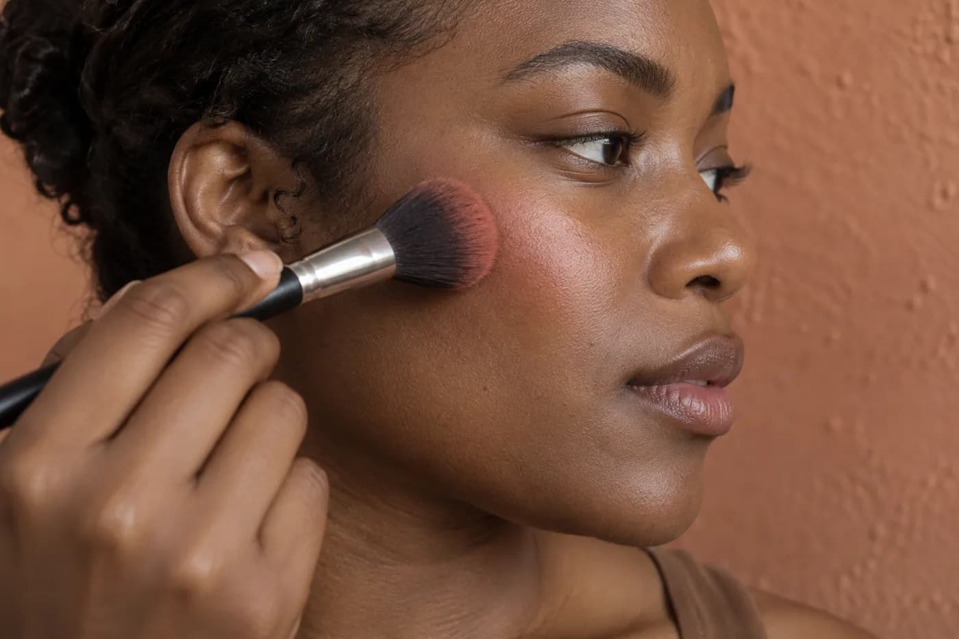
Choose a familiar formula close to each finalist when possible. A hand swatch can reveal color and sparkle, but it does not show the effect of your cheek's surface, base and natural color. Apply a small amount with a clean tool over your usual settled preparation. For a powder, distribute the load through the brush before touching the cheek; for a cream or liquid, begin with less than you expect to need and follow its intended application method. Build a second thin pass only after checking the first at normal distance.
Do not test a pink powder on one side and a glossy coral cream on the other and call it a pure hue comparison. Use similar finishes, or test the colors on separate days with the same routine. If you try opposite cheeks, remember that window position and facial asymmetry can influence the result; swap sides in a later trial. New formulas deserve a cautious suitability check before full-face use. The American Academy of Dermatology explains how to test a new skin product. A digital preview cannot predict irritation or prove that a cosmetic agrees with your skin.
Check light, movement and the first hour of wear
Look beside a window and in the indoor lighting relevant to your day. Avoid deciding under only a warm bathroom bulb or a strongly tinted sunset. Keep the phone settings and framing as consistent as possible if you record photos, and compare those photos with the mirror rather than treating a camera rendering as the truth. Turn your head slightly to see whether shimmer becomes a bright stripe. Smile and relax to check that the color still sits intentionally across the moving cheek.
After a representative period of normal wear, note what changed. A shade may remain appealing while its formula becomes patchy, transfers or exposes the base; that is a wear problem, not evidence that pink or coral is wrong. Conversely, a long-lasting layer may be visually stronger than you wanted. Record both color and behavior separately. Do not add more pigment automatically when one light makes it disappear. Recheck under the original light, then decide whether the smallest local touch-up is needed. Stop using a product if it causes irritation rather than continuing for comparison's sake.

Choose a repeatable recipe, not another drawer of blush
Your result should be a small recipe: color family, depth, saturation, finish, cheek area, tool, approximate amount and the light used to verify it. Add one sentence about the complete-face effect and one about comfort or wear. Keep the original portrait and the two saved directions as references, but let the real cheek decide which formula belongs in the routine. If neither candidate works, change the earliest clear mismatch, such as a pink that is too pale or a coral that is too saturated, rather than collecting five unrelated shades.
Repeat the winning application once before buying a second product or planning a special occasion around it. The goal is to know how to reproduce the balance, not to prove that your complexion belongs to one color camp. You may keep both directions for different looks, provided each has a clear role and a tested amount. A successful comparison leaves you able to explain why the cheek works, what was held steady and what still requires a real formula check. That knowledge is more useful than a flattering preview without an application plan.