
Color guide
How to match blush and lipstick colors without making the look flat
Build a cohesive cheek-and-lip palette by comparing undertone, depth, saturation, finish, and the feature you want to lead.
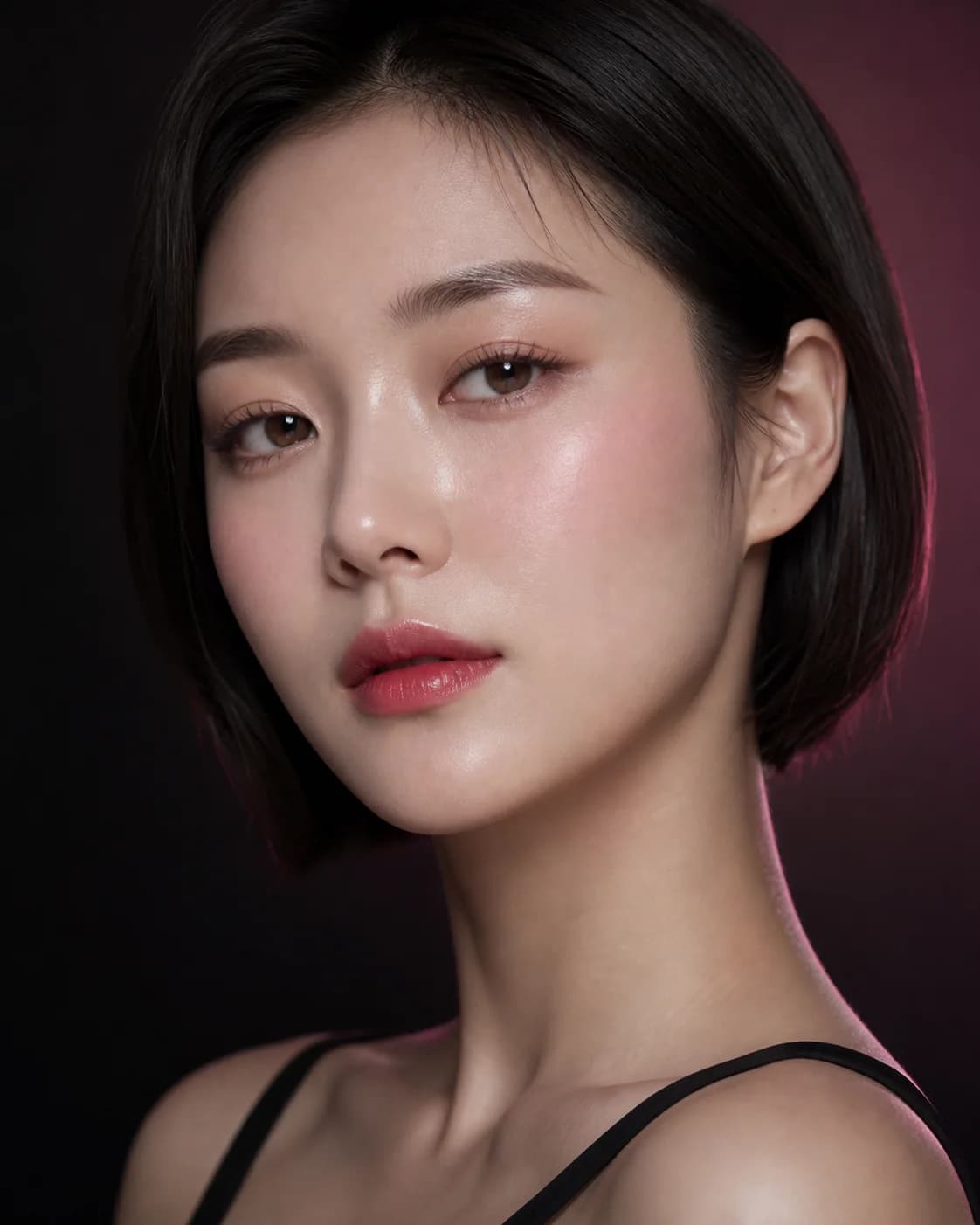
Blush and lipstick do not need to be the same color. They need a relationship that looks intentional. A muted rose cheek can support a berry lip; a peach blush can sit beside a neutral pink lipstick; a red lip may need only a quiet trace of warmth on the cheeks.
The useful question is not whether two shade names match. Compare temperature, depth, saturation, finish, and visual weight on the whole face. A virtual makeup preview can help organize directions, but the final decision belongs to real products, real skin, and the light in which you will wear them.
Choose which feature should lead
Decide whether the lip, cheek, or overall freshness should be the first thing people notice. If the lipstick leads, keep the blush quieter in saturation or placement. If the cheek leads, use a lip that repeats part of the color story without competing at the same intensity.
A balanced look does not require equal strength. It requires hierarchy. Photograph the full face at conversation distance before judging a close crop, because two attractive colors can still fight when both demand attention.
Start with one anchor and one supporting color. Matching intensity everywhere often makes a look feel heavier, not more cohesive.
Compare undertone before exact shade
Group each option broadly as warm, cool, neutral, or olive-friendly rather than relying on product names. Coral, brick, terracotta, peach, rose, mauve, berry, and red can each lean in more than one direction depending on the formula and surrounding colors.
Harmony can come from similarity or controlled contrast. A warm peach cheek with a warm coral lip is direct harmony. A neutral rose cheek with a cooler berry lip creates contrast while retaining a shared rosy base. Compare both approaches before assuming one undertone rule applies to every face.
Match depth and saturation separately
Depth describes how light or deep a color reads; saturation describes how vivid or muted it appears. A deep muted lip can work with a light muted cheek, while a vivid lip may need a softer cheek even when both colors share the same undertone.
Build three versions on one portrait: related depth, lighter cheek, and more muted cheek. Keep complexion, eyes, brows, placement, and lighting stable. The comparison reveals whether the problem is the color family or simply too much visual weight in one area.
- Soft everyday: related undertone with lower saturation on both features
- Lip-led: stronger lipstick with a quieter or more diffused blush
- Cheek-led: visible blush with a sheer, neutral, or softly stained lip
Use finish to connect or separate the colors
A glossy lip and luminous cheek can feel connected, but too much reflection may move attention away from color. A satin lip beside a soft-matte cheek can look polished because the finishes provide separation while the palette remains related.
Preview finish as a direction, then test actual formulas. Lip gloss, balm, powder blush, cream blush, skin preparation, and setting products change transparency and reflection. Do not reject a color family because one formula produces the wrong surface.
Check the combination with the rest of the face
Eye makeup, brow strength, hair color, clothing, and lighting can change how the same cheek-and-lip pair reads. A combination that feels balanced with a bare eye may become crowded beside heavy liner or a smoky lid.
Keep the cheek and lip pair stable while testing one eye direction. Then reverse the process: keep the eye stable and refine only cheek or lip intensity. This prevents a complete look from becoming a collection of individually strong ideas.
Confirm the palette with real products
Swatch the shortlist on the face, not only on an arm or screen. Natural lip pigment, skin preparation, base makeup, oxidation, sheerness, and product layering can shift both colors. Check near a window, in ordinary indoor light, and in a normal phone photo.
Wear the pair long enough to see fading and transfer. Record the product, number of layers, placement, and finish that created the result. A useful preview gives you a color specification to test; it cannot guarantee an exact shade match or wear result.
- Photograph the full face before zooming into cheeks or lips
- Let cream and liquid products settle before deciding
- Check how the lip fades and whether the blush remains visible
- Stop using any product that causes irritation or discomfort