
Eye makeup
Navy eyeliner or black for the same line?
Compare navy and black in the same shape, then check the actual liner in ordinary light.

Navy eyeliner can look almost black across a room and distinctly blue beside a window. If you want to know whether that change suits your look, compare it with black on the same upper lash line. Keep the line narrow or bold according to your preference, but use the same width and shape in both versions. A wider blue line and a thinner black one tell you about two different changes at once.
Hair Muse can help you preview where the color draws attention. A photo can suggest whether a deep blue is worth trying, but it cannot establish the shade, texture or wear of an actual pencil. Use the comparison to narrow the decision, then check your real products under the light where you will wear them.
Choose a reference you can repeat
Take a clear portrait at eye height, with the face relaxed and the eyes normally open. Keep the light broad and even so one lid is not hidden in shadow. Switch off skin smoothing and beauty effects if you can. Leave your existing shadow, brow and lash choices visible. If you plan to wear glasses, decide whether to include them in the reference, and keep that decision the same in both versions.
A sharp photo is more useful than a glamorous one when you need to check a narrow detail. If the original line is hard to see, move the light or take another photo before editing. Avoid a strong blue wall or a colored lamp that casts the same tint across the skin and the liner. A stable reference gives you something to return to if one preview makes the entire face brighter or adds contrast that was not part of the question.

Change the hue while holding the outline steady
In Hair Muse, use the same photo for two versions. Ask for a restrained black line on the external upper lid in one and a deep marine-blue line in the other. Describe the same start, end, width and edge in both. For example, both lines can follow the outer half of the upper lash line without extending past the corner. Keep the lash density, shadow, skin and exposure as close to the original as possible.
Check the previews at the scale of the whole face, then look closer to see what actually changed. If the blue version also has a longer wing, sharper corner or darker lashes, discard it and try again. The same applies if the iris shifts, the eye opening changes or a glossy reflection appears in only one version. Those differences can make one image more striking without telling you whether you prefer navy. Stop after a pair that is close enough to answer the color question.
Compare dark blue with black at normal distance
Put the images side by side at equal size if your device allows it. Look at one for a moment, then the other, without zooming into the eyes immediately. Notice whether the line draws more attention than the lashes or whether the two colors read similarly. If you only detect the difference at a close crop, decide whether that is a useful subtlety or an effect too small to matter for the occasion.
A deep blue can appear lighter than the black you are comparing it with. It can also be more reflective. Do not attribute every difference in contrast to hue. If you want a fairer comparison, pick two ideas with similar darkness and finish. A visibly lighter blue is a separate option you can explore later. Save no more than two useful references and note which feature made you keep each one. An image that looks polished but changes the rest of your face is not a useful reference for this test.
Check what your real products have in common
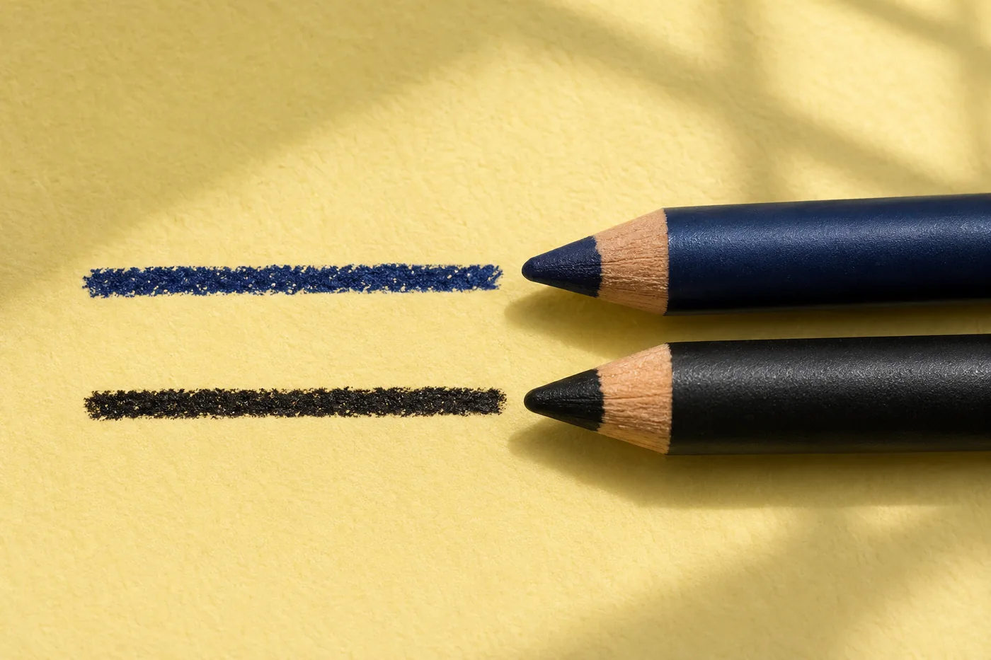
Read the directions for the actual eye cosmetics you will use. Start with personal tools and clean hands. Keep the comparison on the external upper lid and use products labeled for the eye area. The FDA's guidance on eye cosmetics explains why intended use and clean tools matter. Do not substitute a lip pencil or a craft pigment just because it looks like the right navy. If you cannot place the line comfortably, leave the experiment for another day.
Look at the finish and format before applying. A soft pencil can create a diffused boundary while a liquid may set with a crisp edge. If your navy and black products differ in format, record that the real test compares a combination of color and formula. On a clean, suitable surface, a small mark can help you see whether a pencil is very reflective or unusually bright, if the product directions permit it. It does not show how the liner will look or behave on the lid.
Try the same line with each shade
Choose the line you can place comfortably and repeat. In a stable position, follow the product directions and start with a small amount. If the first line comes out thick, avoid widening the second just to make them match. It is better to wait and repeat the test than to keep adding more product until the shape becomes something you would not normally wear. Keep the lower eye area unchanged so the difference remains easy to see.
If you test the two colors on different eyes, remember that the sides of a face are not identical. A window may light one side more strongly and the folds may cover different amounts of liner. You can compare the same eye on separate occasions in similar light to reduce those differences. Remove the product according to its instructions between trials. Stop if there is discomfort or irritation. Do not repeatedly remove and reapply around the eye for the sake of matching a preview.
Review the color in two ordinary settings
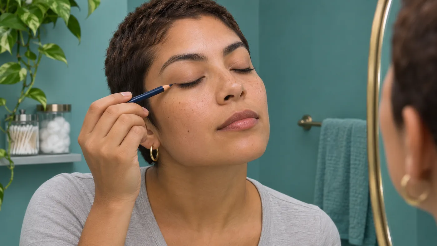
Start where you applied it, then look in the kind of light where you expect to wear it. A cool window and a warmer indoor lamp can make the same dark blue read differently. Keep the viewing distance about the same and relax your brows. Turn your head a little. Look for the line as part of the face rather than tilting into the one angle where it looks most saturated.
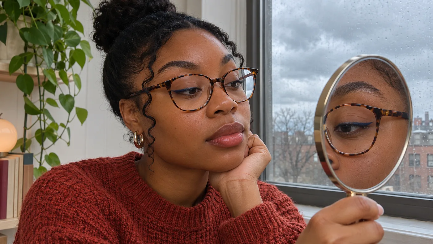
Put on your usual glasses if you wear them. A frame can provide another dark line near the eye, and reflected light can make a very subtle color harder to see. If the blue reads almost black under your usual conditions, you can still choose it for its quieter color close up. If the whole point was a visibly blue line, try a slightly clearer navy later while holding the shape steady. That is a new test, not a reason to widen or redraw every other part of the look.
Separate a photo check from the mirror check
If the look is for photographs, take one picture in the setting you actually expect. Use the same camera and distance for both trials. Some phones change exposure or white balance between frames, even with the same lamp. If the skin or background also changes color, treat the two pictures as a record of the scene rather than a precise shade comparison.
Compare the images with what you saw in the mirror. A line can look blue in one picture and almost black in a conversation, and either result may be useful. Decide which view matters for the occasion. For a daytime meeting, the mirror and normal distance may matter most. For a planned portrait, the camera test can matter more, provided you can repeat the setup.
Save the decision you can use again
Write down the actual product and the conditions that settled the comparison. For example, a note that the blue was visible at a window but read nearly black in the hallway is more useful than a note that navy is universally softer. Record the shape you tried and whether your glasses changed the impression. If you liked black better, keep that choice. The comparison did its job even when you return to a familiar color.
MaqAI publishes this guide and Hair Muse is the app for the optional preview. Use the saved image to remember the line placement and the direction of the color. Judge the actual shade, texture, comfort and wear with real makeup. A preview cannot establish oxidation, skin response or the finished result. A decision grounded in your own products and ordinary light is easier to repeat than the most vivid color on a screen.