
Lighting guide
The best lighting for comparing makeup color
Learn how daylight, warm bulbs, cool LEDs, side light, flash, and screen settings can change a beauty decision.
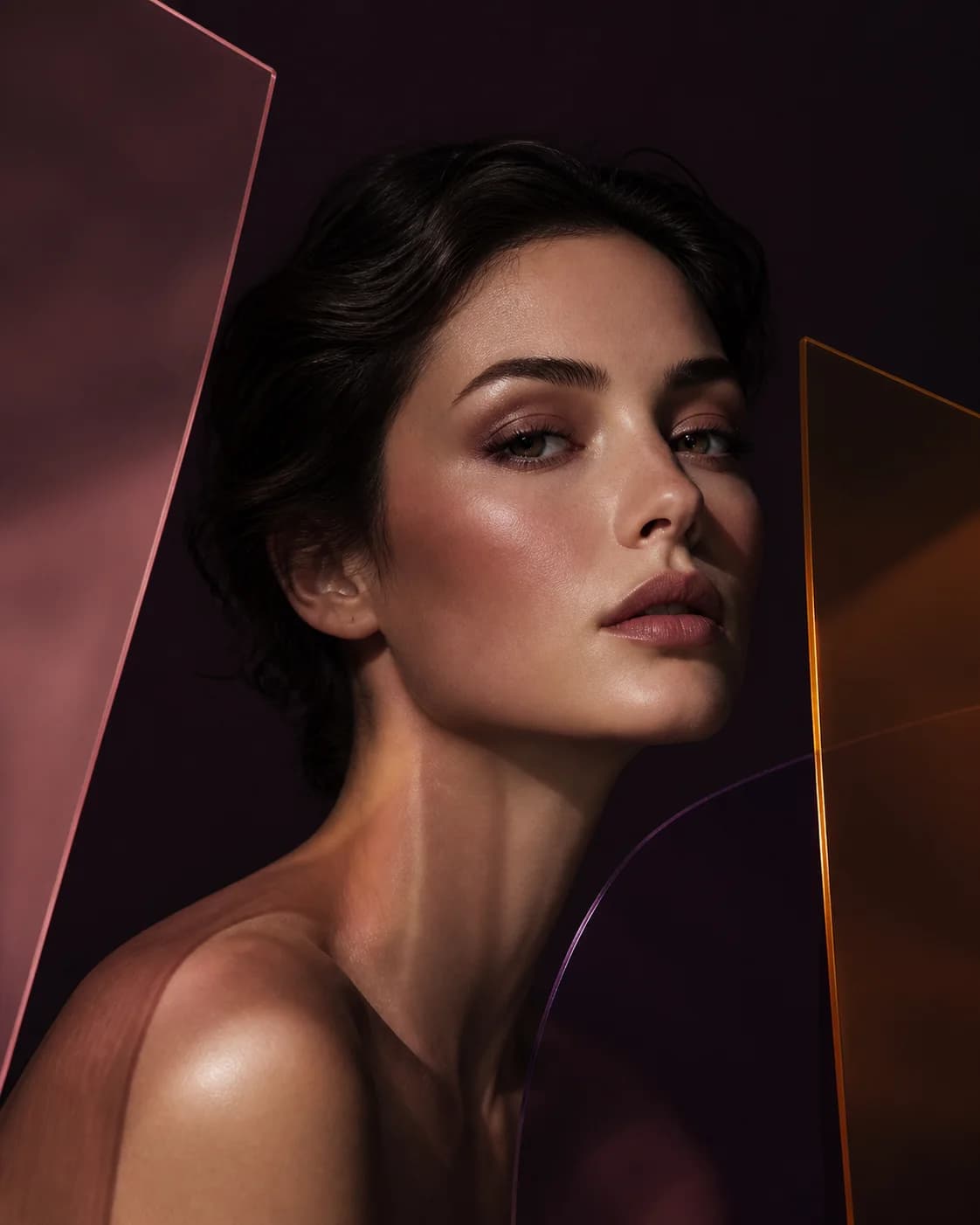
Color is always seen through light. A lipstick does not need to change formula to appear warmer under a yellow bulb, cooler under a blue LED, darker in side shadow, or flatter under direct flash.
For useful AI comparison, begin with soft neutral light. For a real decision, add the lighting in which the makeup will actually be worn.
Use soft neutral light as the baseline
Face a bright window without direct sun or stand in open shade. Keep both sides of the face evenly lit so one cheek or eye does not appear stronger because of shadow.
Neutral light makes undertone, saturation, edge, and placement easier to compare. It is not the only valid light; it is the clearest starting reference.
Recognize common color casts
Warm household bulbs can add yellow or orange, cool LEDs can add blue or green, and colored decorative light can transform every shade in the image. Camera auto white balance may correct some areas and distort others.
If skin, whites, walls, and clothing all look unusually warm or cool, treat the preview as a mood image rather than a precise color comparison.
- Warm cast: reds and bronzes may intensify
- Cool cast: mauves and blues may appear cleaner
- Green cast: skin and red pigments can look distorted
- Mixed light: different parts of the face may shift differently
Control direction as well as color
Hard side light deepens texture and creates asymmetry. Strong overhead light casts shadows under brows, eyes, nose, and lips. Direct front light flattens shape and can increase reflection.
Use diffuse frontal light for the source portrait, then test directional light later if it is part of the intended event or photography style.
Check the context that matters
After choosing a direction in neutral light, view the real makeup in office light, restaurant light, outdoor shade, stage light, or the venue where it needs to work. The best option may be the one that remains understandable across the important conditions.
You do not need one shade to look identical everywhere. Decide what should remain stable: the focal point, warmth, skin balance, or level of contrast.
Account for screens and cameras
Display brightness, color mode, HDR, camera processing, and social-app filters can all change the preview. Compare options on the same device and settings rather than trusting one isolated screen color.
When communicating a direction, use descriptive language alongside the image. Medium muted berry satin is more durable than a screenshot alone.
Neutral light creates the baseline; relevant light confirms the real decision.