
Coordinated makeup
Monochromatic makeup: one family, three different roles
Plan one color family across eyes, cheeks and lips, compare two directions in Hair Muse, then check suitable real products and ordinary light.
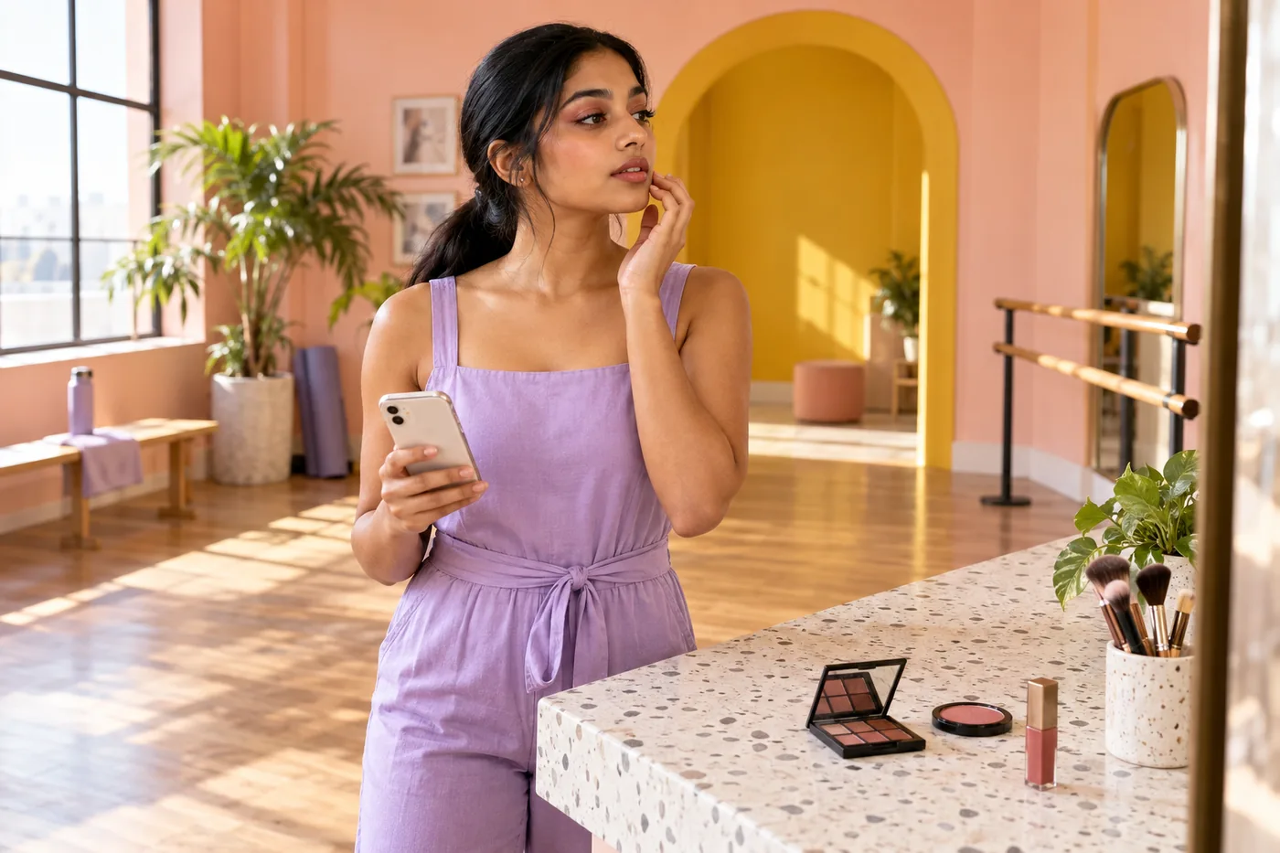
Monochromatic makeup can look connected without making the eyelids, cheeks and lips equally bright. The useful question is how one color family travels across three different surfaces. A rose lip may be deeper than a rose cheek; a terracotta lid can be quieter than the mouth. The relationship matters more than an exact match between products in their containers.
MaqAI publishes this guide. Hair Muse is the app used for the portrait comparisons described below. Start with a clear photo, compare two coordinated directions and then test the useful idea with real cosmetics. A generated image can suggest a color relationship, but it cannot verify a formula's coverage, comfort, permitted use, texture or staying power. Those decisions belong to the physical trial.
Define monochromatic makeup as a family, not a single pot
Choose a family you can describe simply: muted rose, soft terracotta, plum or a brown direction. These are working descriptions rather than fixed categories assigned to your skin tone. You can choose an understated interpretation or a deliberately vivid one. The goal is to recognize a common thread across the three colored areas, not to obey a rule about what you should wear.
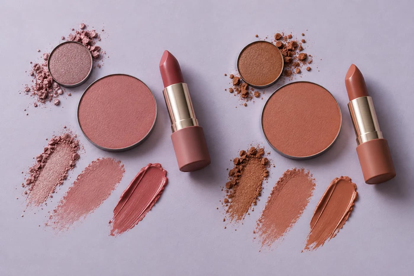
Separate hue, strength and depth. Adobe's linked explanation distinguishes hue, saturation and brightness; that vocabulary helps describe why related colors need not be identical. For example, a deeper rose mouth and a more muted rose cheek can share a direction while having different emphasis. A pale, strongly orange cheek may feel less related to a cool pink mouth despite both being called peach on their packaging.
This is a visual description, not a precise color measurement or shade-matching system. Surface color, coverage and reflected light change how actual cosmetics appear. Swatches organize a first shortlist, but the face decides whether the relationship reads clearly. Avoid treating shade names, screen pixels or matching packaging as proof that three products will look the same once applied.
Write a brief for three areas before choosing products
Name the eye, cheek and lip roles separately. You might want a soft wash on the lids, a restrained cheek and a more defined mouth. Another version could lead with the eyes and keep the lips translucent. Both can be monochromatic. Choosing a lead area is an editing aid, not a requirement that only one feature may ever be visible.
Keep your usual complexion coverage, brows and lash definition in the brief. If you change those at the same time as the palette, the comparison becomes harder to read. A darker brow or a large new wing can shift the whole balance even when the three color zones are unchanged. Leave familiar supporting details steady for the first test.
Write one sentence such as “muted rose in all three areas, lip deepest, cheek soft, lids simple.” It should describe an outcome you can later attempt with actual products. If a reference image attracts you, identify that relationship instead of copying every highlight or contour. The article's aim is a coordinated full-face plan, rather than merely matching blush with lipstick.
Prepare a portrait that shows the whole relationship
Use one clear, current portrait with both eyes, cheeks and lips visible. Face a broad, reasonably even light and keep the camera near eye level. Move hair away from the cheek areas if it hides them. A relaxed expression makes it easier to judge the normal mouth shape and the visible lid area without relying on a dramatic pose.
The linked source-photo guide gives a fuller setup. For this comparison, the essential point is consistency: keep the same portrait for both ideas. Avoid a beauty filter, strongly colored light or makeup that already dominates one zone. If you only have a photograph with a very vivid lip, recognize that a subtle generated change may be harder to interpret against it.
Review the source image before exploring color. Both eyes should be readable, the cheeks should not vanish into shadow and the lips should have enough detail to judge an outline. You do not need an expressionless identity photograph or perfect skin. You need a useful reference that preserves the features and ordinary expression you want the makeup to accompany.

Compare two color families in Hair Muse
Begin with the brief, then create two restrained alternatives in Hair Muse. For example, compare a muted rose family with a soft terracotta family across eyes, cheeks and lips. Keep the approximate areas, relative emphasis and reflective finish similar. The first variable is the coordinated hue direction, not three unrelated products or a completely different face in each picture.
Describe the relationship explicitly if a request makes one zone much stronger than intended. Ask for the mouth to remain the deepest area, the cheeks to stay soft and the lids to remain a light wash in both ideas. A family comparison is less useful if the rose version has glossy lips and heavy liner while the terracotta version changes to matte lips and a bare eye.
Look for unwanted changes beyond makeup. Reject a preview that alters facial proportions, erases ordinary lip lines, changes eye shape or invents a new light source. If the difference cannot be isolated with a reasonable second attempt, use the images as loose inspiration and return to the written brief. Repeated generation is not evidence that a formula or placement will work physically.
Choose the relationship, then adjust one emphasis
Look at the full portrait before zooming into details. Which direction gives you a common color thread that you would actually like to recreate? A smaller on-screen view can help reveal whether one area overwhelms the others. It cannot establish exact shade accuracy, but it can make the distribution of attention easier to describe.
Save at most two useful ideas alongside the unchanged source. If one family feels promising but the cheeks are too intense for your intention, keep that family and change cheek strength in a separate comparison. Do not also move the eyeshadow boundary, add shimmer and darken the lip outline. Refining one area after choosing the family makes the result easier to explain and reproduce.
There is no compulsory winner. You may prefer the rose plan for a quiet routine and terracotta for another occasion, or decide that only two areas should share the family. That is a valid editing choice. A monochromatic label is useful only if it clarifies what you want; it should not make you add color to a third zone you would rather leave alone.
Assign real products to their intended areas
Now translate the selected idea into separate eye, cheek and lip products you already know how to use. Start with suitable items you own. A similar color does not make a blush or lipstick appropriate for the eye area. The FDA's linked guidance says to use eye cosmetics intended for that area, keep tools clean and stop if irritation occurs. A persistent reaction needs medical advice.
Read each product's actual instructions, including any restrictions for placement and layering. A product advertised for several areas still needs to permit the specific use you are planning. Do not infer permission from a tutorial, a shade name or a preview. When the intended area is unclear, keep it out of that step until the manufacturer clarifies the label.
Set out a clean tool for each task rather than carrying a lip-coated brush to the lids. You do not need one universal cream to qualify for a monochromatic look. Three different formulas in a related family can be more practical for your routine. If you lack a suitable eye shade, adapt the brief or use fewer zones instead of improvising with a product meant for another area.
Rebuild the useful idea with small actual applications
Apply your familiar base in the way that normally works, following the products' directions. Then begin with the area that best anchors your brief. If the lips are meant to carry the deepest rose, a modest lip application can provide a reference for the softer cheek and lid. If you prefer to do eye makeup before the complexion, keep that workable order and compare the finished relationship afterward.
Build each colored area with a small amount and a clean tool. Keep the planned footprint restrained at first. Check with the eyes open as well as closed, and let the mouth rest naturally. A preview may show a broad wash that becomes much more noticeable on your real moving lid. You can reduce the area without abandoning the chosen color family.
Evaluate after each area rather than finishing every layer automatically. If the cheek reads more orange than the actual lip, first decide whether the hue relationship matters enough to change that product. Adding more of it usually changes strength, not its underlying direction. The linked preview-to-routine guide helps turn a visual idea into a manageable sequence without treating an image as a product recipe.
Check ordinary light, expression and later wear
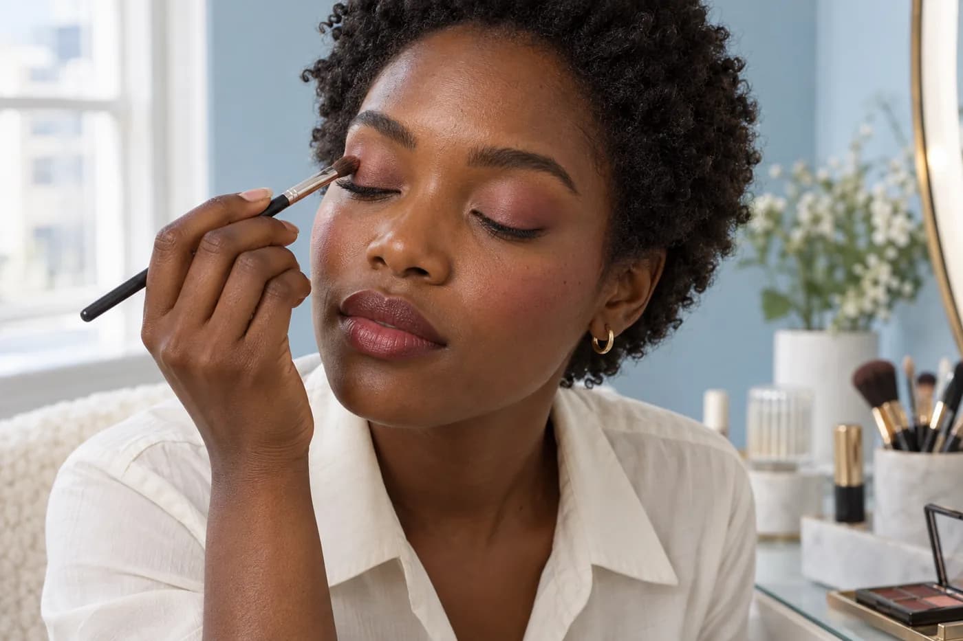
Move to indirect daylight when available, then check the light in which you will normally wear the look. Keep the whole face in view. A sparkling lid, shiny mouth or strongly lit cheek may attract attention for reasons other than hue. Do not interpret every change in reflection as a failure to coordinate the palette.
Speak, smile and blink normally. Look for comfortable movement and whether the relationship still makes sense when the face is active. Ordinary texture and expression lines are expected. If one product feels uncomfortable, remove it as directed rather than trying to preserve the color scheme at any cost. Related colors are an aesthetic option, not a reason to tolerate an unsuitable formula.
Wear gives information that a generated portrait cannot supply. Shadow can gather, cheek color can change in visibility and a lip formula can transfer or fade. Note which product or area changed first. A coordinated starting look does not guarantee coordinated wear, and you may need a simple touch-up plan or a lighter version for a longer day. Do not promise yourself the image will remain unchanged.
Keep a three-line brief you can use again
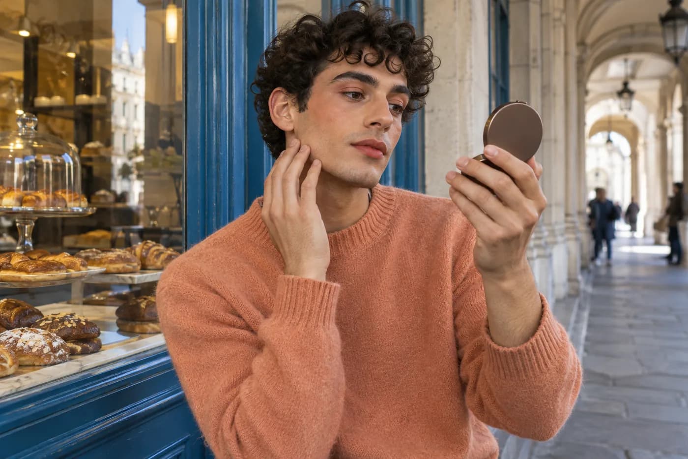
Record the family, the role of each area and the actual products that were comfortable to use. For example: muted rose; lips deepest, cheeks light, lids soft; then the three suitable formulas and a note about ordinary light. Add one thing you would change next time. That is enough to preserve the useful decision without collecting dozens of almost identical previews.
Keep the source photo and one or two planning images with those notes if they help. Name the difference in plain language, such as a softer cheek or less lid area. A screen comparison is most valuable when you can translate it into a small action with your own tools. Exact product shade, formula behavior and long wear still require real testing each time conditions change.
The repeatable result is a relationship you recognize and enjoy, not three surfaces made visually identical. You can use different depths, quieter supporting areas and a finish that suits the real products. Start from the family, keep the comparison controlled and allow the physical trial to revise the plan. Monochromatic makeup works as a flexible way to organize color, not a rule that overrides comfort or preference.