
Complexion
Makeup for freckles with selective coverage
Keep the detail you want, plan selective coverage and check two visual ideas against actual cosmetics, light and movement.
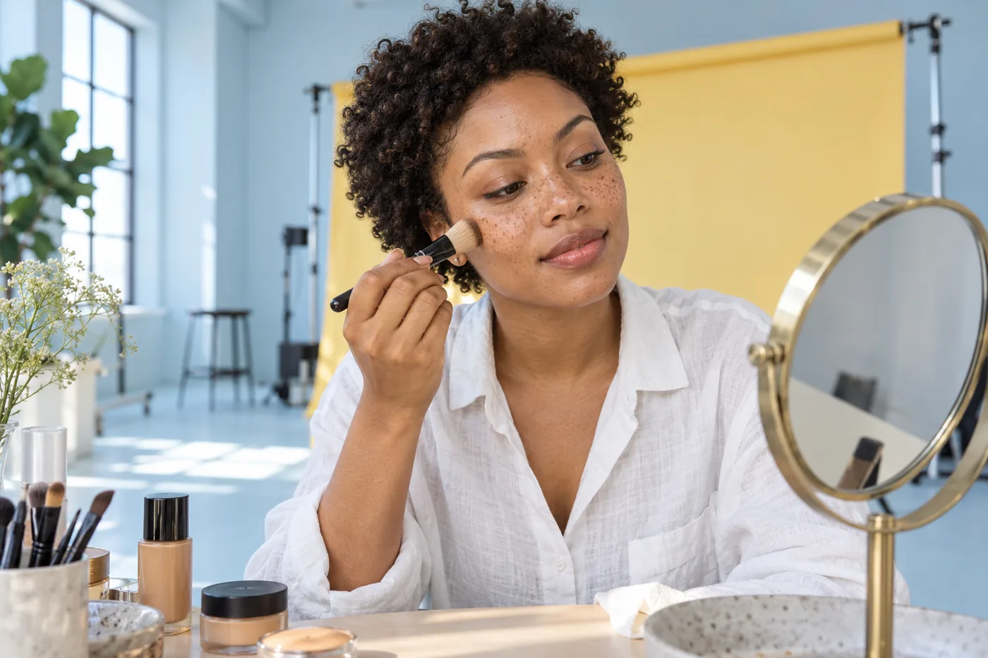
Makeup for freckles starts with a choice about visibility. You might want the small marks across your cheeks to stay clear while softening another patch of color, or prefer a little more overall coverage for a particular look. Those goals need different maps of product placement. A darker foundation is not a shortcut to either one: color and coverage are separate decisions.
MaqAI publishes this guide. Hair Muse is the app used for optional visual planning: keep one clear portrait, change the apparent complexion coverage and retain only two ideas. A generated picture may alter the freckles themselves, so it cannot verify their preservation or a foundation match. The useful result is a small application brief, followed by an actual cosmetic trial on your own face.
Makeup for freckles: define what should stay visible
Start at normal mirror distance before inspecting individual dots. Describe the result you want in ordinary language: freckles still readable across the nose, a quieter area beside the mouth, or a slightly more even overall background. There is no required amount of freckle visibility and no obligation to cover them. Choose a goal for this particular occasion rather than a permanent rule about your appearance.
Separate existing pigment from the makeup problem. If you like the freckles but dislike a broad patch of uneven base, adding coverage over every small mark makes the wrong thing disappear. Identify the larger area that actually bothers you. You can also decide that it does not need correction after seeing the whole face. A map of two limited areas is more useful than a list of every difference in your skin.
Write one sentence before opening the app: keep the cheek pattern visible and soften only the area beside the nose. That sentence gives you a stopping point. Without it, each closer inspection can invite another coat until the face no longer resembles the initial goal.
Keep color, coverage and reflection separate
Foundation depth describes how light or dark the color looks. Coverage describes how much underlying pigment remains visible. Reflection describes the light bouncing from the surface. A product can look shiny while covering strongly, or have a quieter finish while letting freckles show through. Do not use a glowing photograph as proof that the complexion layer is transparent.
Compare plausible shades against the background skin as well as the wider face and neck relationship. Matching only the darkest freckle can make the surrounding complexion look different from the rest of you. Actual shade selection needs real product in ordinary light. If the color seems wrong before coverage is assessed, resolve that first rather than spreading more of the same shade to make everything agree.
Keep your familiar preparation stable for the trial. Follow the product's directions rather than mixing foundation with another product to force transparency. Different mixtures may change how the layer behaves. The FDA's cosmetic-handling guidance supports reading directions and keeping hands and containers clean; it does not establish a universal formula or application sequence for freckled skin.
Make one portrait useful enough to compare
Choose a sharp, relaxed portrait in even light, with the cheek and nose pattern visible. Keep the camera at a comfortable face height and include enough of the neck to understand the overall relationship. Avoid a beauty filter, strong side light or an overexposed window that removes the very detail you want to evaluate. Move your setup before trying to correct a misleading photograph with makeup.
Use that same source in Hair Muse throughout the first comparison. Keep hair, clothing, eye definition and lip color as steady as possible. A new pose changes shadows and visible skin area, while a different lip color can change the apparent balance of the entire face. Those changes make it harder to tell whether the complexion direction helped.
Keep the original visible beside any saved idea. If the generated image replaces the freckle pattern, changes the face or smooths away normal detail, reject that comparison. Do not redraw every missing dot just to rescue an image. The task is choosing a manageable coverage direction, and the unedited photograph remains the reference for your actual features.

Compare two coverage directions, then stop
Ask for a light complexion direction with existing freckles visible, then a slightly more covered direction with the rest of the look similar. These are visual ideas rather than measured coverage levels. Check whether the output follows the request before comparing aesthetics. If both versions change the marks or lighting, they do not provide a useful controlled pair.
Evaluate the whole face first. Does one idea leave the nose looking connected to the cheeks? Does selective coverage feel coherent, or does an isolated opaque patch draw more attention than the original variation? Look at the boundary of the covered area, not just the center. The transition often determines whether the plan feels wearable.
Keep a maximum of two candidates and describe each without a product promise. For example, one could preserve most cheek detail with local correction, while the other uses a slightly more uniform thin veil. Do not attach claims about oxidation, comfort, wear or exact shade to either picture. Those properties have not been tested by generating it.
Turn the chosen image into a placement map
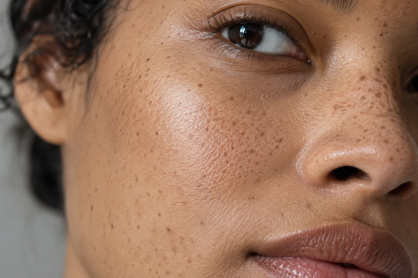
Divide the face into places that need no complexion product, places for a light veil and places for a small local correction. Your map need not be symmetrical. Existing pigment and the effect you want may differ from one side to the other. Equal quantities are less useful than a coherent result when viewed from ordinary conversation distance.
Choose which area to test first. A small cheek zone can show whether freckles remain readable, while an area beside the nose can show whether a separate correction creates an obvious border. Keep the chosen real product, tool and preparation constant for this first test. You are trying to understand one combination rather than proving that an entire category of foundation is right or wrong.
Convert the saved idea into three practical notes: where the layer begins, where it fades out and what should remain visible. A screenshot alone cannot tell you how much product your tool carries. If the image requires broad opaque coverage to look coherent but you want clear freckles, choose another direction before spending time recreating it.
Apply a small real layer and inspect its boundary
Use a clean personal tool that suits the actual product directions. Place a modest amount in the chosen trial area and distribute it without repeatedly loading the tool. Inspect the result before extending it across the face. The exact amount depends on the formula and contact, so an image of a brush cannot prescribe a universal dose.
Look at the transition between covered and uncovered skin. If the center looks acceptable but its edge is conspicuous, soften that limited boundary with the appropriate remaining product on the tool rather than adding a second full layer. If freckles disappear sooner than you wanted, stop expanding the application. More of the same layer will not restore their original visibility.
Allow the actual product to settle according to its instructions, then check again. A preview cannot tell you how a film will look as it settles, moves or encounters other cosmetics. Keep the first observation specific: the color is plausible, the cheek detail remains visible, but the lower boundary needs less product. That tells you what to change on the next attempt.
Correct one area without coating every freckle
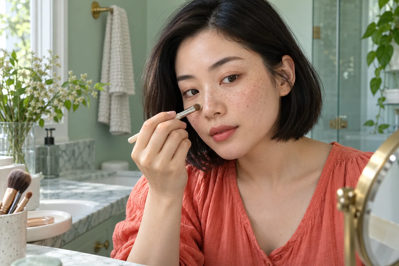
When local coverage is part of the plan, apply it only where the larger color difference needs attention. Keep the correction's edge small and review the whole face before increasing it. A little visible variation around the corrected area may be perfectly consistent with the result you chose. The goal is not automatically to erase every mark at magnifying-mirror distance.
If the correction is too opaque, decide whether a small compatible adjustment is possible or whether gentle removal and a smaller restart will be clearer. Do not chase each freckle with remover to reopen tiny windows through the base. Repeated spot work can disturb adjacent layers and make the map harder to maintain. Stop if the skin or product feels uncomfortable.
Keep the rest of the complexion routine separate while testing. Adding bronzer, blush and reflective powder together can hide what the first layer actually did. Once the base is understood, introduce one additional step and check its boundary. Freckles do not require a compulsory warm palette, a particular lip color or a single acceptable finish.
Review movement, light and ordinary viewing distance
Check the actual face from near enough to see the product edge, then step back. Smile, relax and turn slightly in familiar light. You may notice that a correction looks obvious only under one strong side light, or that a camera makes the freckles less visible than the mirror does. Record that difference instead of automatically adding more pigment.
Include the setting where the makeup will be worn when possible. A short indoor conversation check answers a different question from a close phone photograph. Keep camera exposure and screen settings consistent if you use photographs to record the trial. Otherwise a change in brightness can masquerade as a change in coverage.
Review comfort and the condition of the real layer over an interval useful for your plans. There is no promised duration in the saved preview. Note where the base moves or needs a touch-up and whether the extra step is worth keeping. If the lighter approach meets the goal, a more elaborate version does not become necessary just because it exists in your shortlist.
Save a routine you can repeat
Keep the useful idea, original portrait and a short real-world record together. Name the actual product and shade, the preparation you used, the tool, the tested zone and the first observation. Include what you left uncovered. That last note prevents a successful selective routine gradually turning into an all-over coverage habit you never intended.
Choose one variable for the next trial if something remains unresolved. Reduce the load, shrink the corrected area or reconsider the real shade, depending on what you observed. Changing all three at once makes the result difficult to interpret. A rejected image can still be useful if it helped you describe a boundary you do not want.
Finish with a routine sentence rather than a perfection score: light coverage across this area, a small correction there, freckles readable in ordinary light. The right amount can change with your preference and occasion. Hair Muse can help organize the visual direction; the actual products, your comfort and the mirror decide whether that direction is worth repeating.