
Eye color planning
Gold or silver eyeshadow: choose a color direction
Compare two metal colors on one portrait in Hair Muse, keep the shadow area steady, then check your finalists with real eye cosmetics and ordinary light.
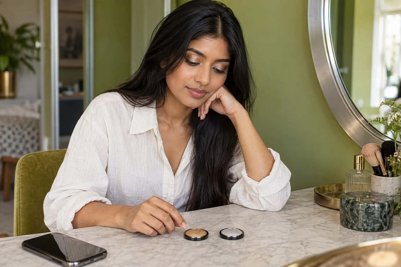
Gold or silver eyeshadow can change the mood of familiar makeup without changing its whole shape. Gold may read yellow, champagne or softly bronzed; silver may read pale gray, pewter or almost white. Choose between actual color directions rather than treating either metal as a compulsory match for your skin, eyes or jewelry. A small, comparable lid accent is a useful starting point.
MaqAI publishes this guide. Hair Muse is the app for planning a makeup direction on a clear portrait; a preview can help you narrow your choices before a real cosmetic trial. Keep the shadow area, depth and reflection as similar as possible while comparing gold with silver. Save only two useful ideas, then check appropriate eye products on your own lids. Neither a generated image nor a shade name can establish exact color, texture, comfort or wear.
Gold or silver eyeshadow: define the choice
Start by describing the effect you want in ordinary language. Perhaps your current eye makeup feels too yellow beside a gray shirt, or a pale silver accent seems more noticeable than you intended. Those observations give the comparison a job. “A softer metal color over the center of the lid” is easier to evaluate than a vague request for a flattering look.
Separate color direction from sparkle strength. Comparing a dark antique gold with a bright, opaque silver changes several things at once. The silver might attract attention because it is lighter, because it reflects more, or because its visible area is larger. Choose two examples with a similar amount of light and a similar boundary before deciding which color relationship you prefer.
The terms gold and silver describe families, not standardized shades. You can prefer a muted champagne in one formula and a smoky pewter in another. Write down the visible quality you like rather than expecting every product carrying the same metal name to reproduce it.
Prepare one portrait with readable lids
Use a current portrait with your face facing the camera and your eyes resting naturally. Indirect daylight can make the starting colors easier to read; avoid a strongly colored lamp or a bright window directly behind you. Keep the phone at roughly eye level and include enough of your face to see the relationship between eyes, brows and lips.
Move hair away from the area you want to compare. If you usually wear glasses, first make a readable source photograph without a strong lens reflection, then include your glasses in the eventual real check. A frame can change how much of the lid accent is visible, but that does not require a different source angle for every version.
Keep the same portrait throughout this decision. Changing the camera exposure, pose and lip color between images can make a metal seem preferable for unrelated reasons. If the source is too dark or the lids are hidden, improve it once before starting rather than compensating with increasingly dramatic edits.

Read color separately from brightness and shine
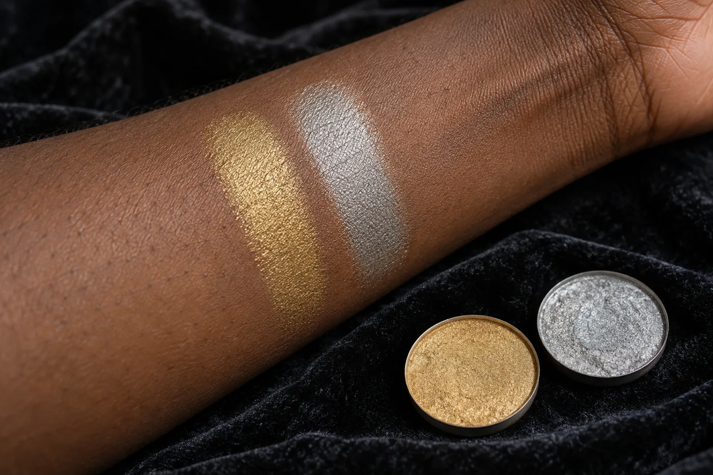
Adobe's explanation of color distinguishes hue, saturation and brightness. Those dimensions are useful vocabulary for describing the visible difference here, although they do not test cosmetic performance. A yellow-looking gold, a quieter beige gold and a pale silver can differ in more than the name printed on a pan.
Look first at the area that stays colored when the strongest reflection is not facing you. Does it appear yellow, beige, gray or slightly brown? Then notice the brightest spot separately. This prevents one attractive glint from standing in for the whole shade. A forearm swatch may help you describe a product, but its surface and angle do not predict the appearance of a moving eyelid.
Distinguish a color preference from a finish preference in your notes. “I prefer the gray direction, but the reflection is too strong” gives you two separate decisions. You can retain the gray direction and later look for a gentler real finish instead of abandoning silver altogether.
Compare two restrained directions in Hair Muse
Begin with one gold direction and one silver direction on the same portrait in Hair Muse. Keep the accent on the same part of the upper lid, with a similar visible footprint and similar depth. Leave brow color, lashes, cheek color and lips steady. This is an editorial comparison method, not a claim that every preview control can lock a formula or reproduce a particular product.
View the whole face before zooming in. Ask whether the colored accent supports the amount of emphasis you wanted. Then inspect the lid boundary: an option that spreads farther outward is no longer a clean color comparison. If the generated versions also change liner shape, skin texture or eye size, set those differences aside and make a simpler comparison.
Keep no more than two finalists. You might label them “soft yellow gold, small central accent” and “muted silver, same area.” Those descriptions remain useful when you move away from the screen. A large collection of slightly different images makes it harder to remember which variable actually mattered.
Use clothes and jewelry as context
Bring the intended neckline, glasses and jewelry into your thinking after the basic comparison. Matching every metal is optional. Gold shadow with silver earrings can be a deliberate mixed-metal choice, while silver shadow beside a warm brown outfit can offer a contrast you enjoy. Neither combination needs permission from an undertone category.
If one choice feels disconnected, name the cause before adding more makeup. It may be the size of the bright area rather than its metal color. A very pale accent can become the main focal point beside otherwise quiet features. Conversely, a low-contrast gold may be subtle enough that you want a clearer edge elsewhere, considered as a separate later decision.
Check one contextual change at a time. Hold the shirt near your face or put on the actual earrings while reviewing the two saved ideas. Avoid changing clothing, blush, lip color and shadow together; you would lose the reason one combination felt more coherent to you.
Try a small amount of real eye makeup
Select actual cosmetics labeled for the intended eye area and follow their directions. The FDA's eye-cosmetic safety guidance covers clean instruments, avoiding shared products and stopping a product that irritates. Metallic appearance does not make craft glitter, decorative pigment or a lip product suitable for your lids. Apply while stationary, with clean hands and a stable mirror.
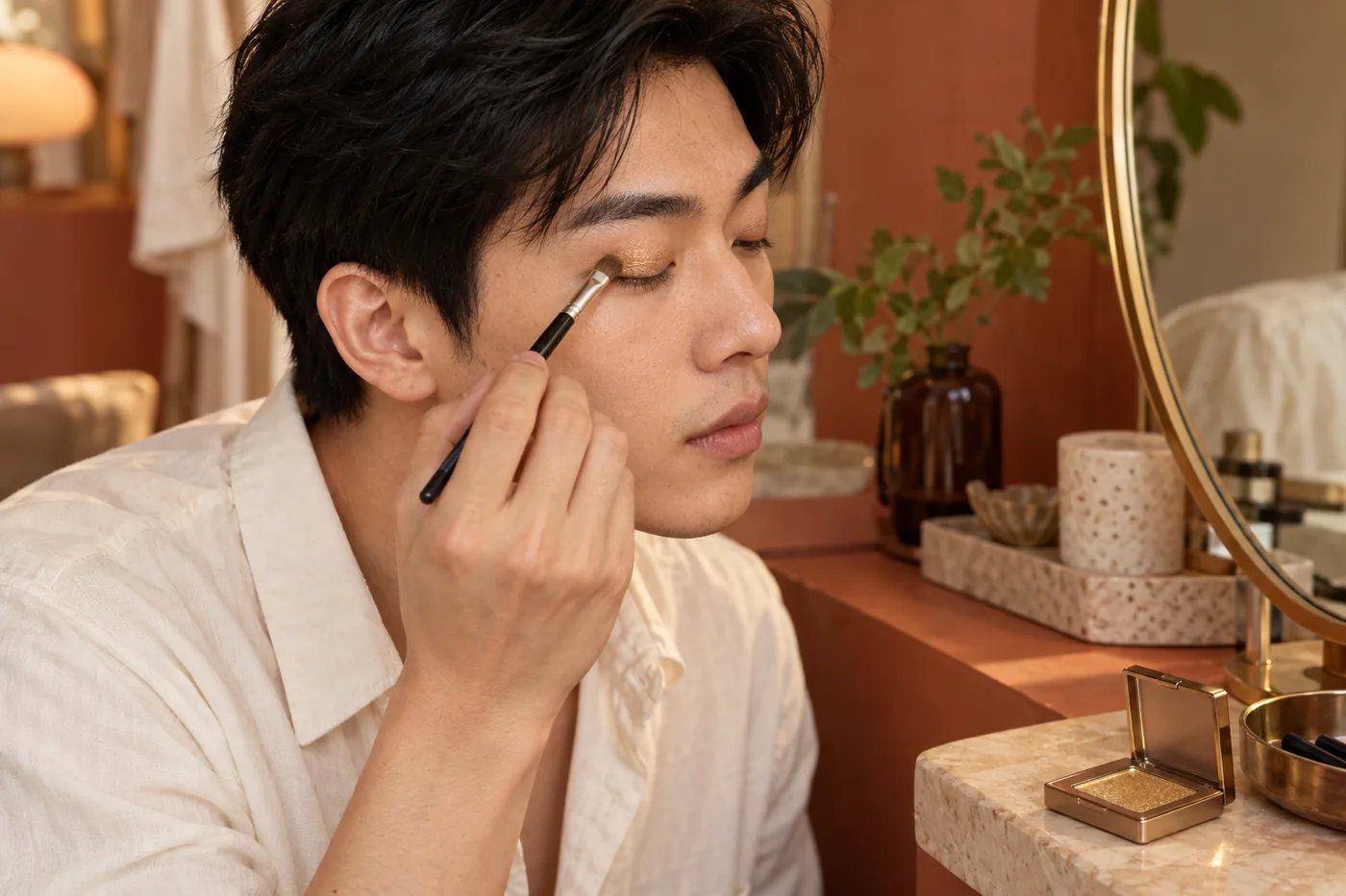
Begin with a modest amount on the external upper-lid area you planned. Use a suitable clean tool and keep it away from the eye opening. Open your eyes between small passes to see where the color remains visible. Do not wet a powder or mix it with another product unless the relevant instructions allow that use.
If you want to try both directions, give each a manageable separate trial rather than repeatedly layering gold over silver. Remove as directed before another application and let comfort determine whether to continue. There is no need to complete both trials in one sitting, especially if removal leaves the area uncomfortable.
Review ordinary light and movement
Look in the kind of light where you will actually wear the makeup. A bathroom spotlight may create a striking reflection that disappears beside a window, while an overhead indoor lamp may make the same product seem darker. Change your viewing angle gently and blink normally. You are checking your real application, not attempting to copy a frozen screen highlight.
Take a reference photograph without deliberately forcing the exposure brighter. Use it alongside the mirror rather than as the sole judge: a camera can clip a reflective patch to white or change the apparent warmth. If you need makeup for photographs, make a separate check with the intended camera and lighting conditions.
Notice comfort and later behavior independently from color. A preferred silver direction is still only a direction if the specific formula feels unpleasant, transfers or gathers. Remove an irritating product and do not keep applying it to satisfy a saved picture. Another appropriate formula or a smaller accent may be a better next experiment.

Adjust one feature without restarting everything
When the result feels too bright, first ask whether the actual colored area is larger or more opaque than planned. You can remove and remake a smaller accent according to the product's instructions. Adding dark shadow around it immediately changes the balance and may hide the original question rather than answer it.
When gold seems too yellow, describe a less yellow direction for a later comparison; champagne and beige descriptions can help, but their labels still vary. When silver seems too pale, a grayer or pewter direction is another possible trial. These are options to inspect, not guaranteed corrections for a skin tone or eye color.
Keep a result you like even if it contradicts the first preview. The physical lid, your expression and the real light supply information the planning image cannot. You do not need to make both metals equally successful or prove that one is universally better. The useful outcome is a choice you can recognize and repeat.
Save a practical color note
Record the selected direction, placement and actual product separately. For example: “muted gold, center of upper lid, small amount; review with navy collar in window light.” Add whether the shine stayed comfortable and whether later wear changed the appearance. This is more actionable than saving only an edited portrait with no application information.
Keep one real photograph with the relevant lighting note and the two planning ideas if they still help. Next time, start from that evidence rather than rebuilding a full collection. If the occasion or outfit changes, reconsider that context while keeping the earlier observation as a reference, not a permanent rule.
The final choice between gold and silver belongs to your intended effect and the actual application. Hair Muse can help organize the visual question; MaqAI's guide supplies a comparison structure. Exact shade, formula behavior, oxidation, texture, skin response, comfort, wear and the final result must remain matters for the real product and your own check.