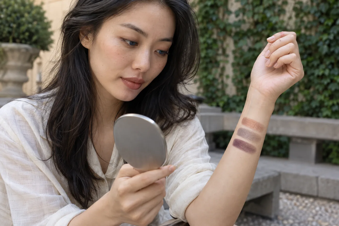
Eye color
Copper, taupe or plum? Free eyeshadow test for blue eyes
Compare three useful color families on one steady portrait, identify the effect you prefer and verify it with real powder in the light you actually use.
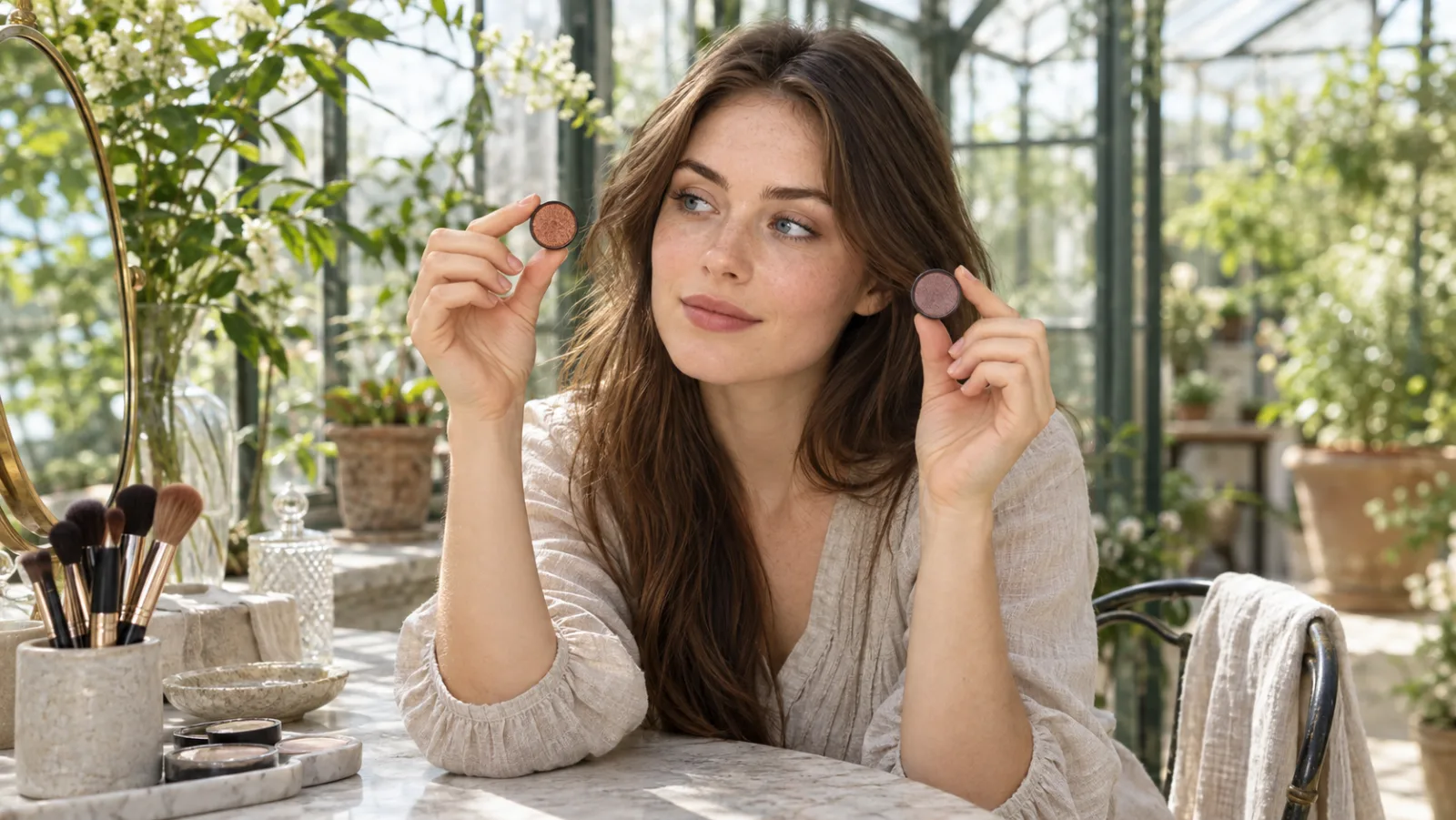
A free eyeshadow test for blue eyes should answer a practical question, not hand you a rigid rule: do you prefer warm contrast, quiet definition or a cooler frame around your iris? Copper, taupe and plum are useful starting families because they create noticeably different relationships with blue, yet each can be softened, deepened or muted. Eye color matters, but so do skin undertone, hair, brow depth, clothing, lighting and the amount of contrast you enjoy. The goal is to find a direction you want to wear, not a supposedly universal winner.
MaqAI can organize the first visual comparison when you keep the experiment controlled. Start with one clear portrait, change only the eyeshadow family, save no more than two finalists and then test those directions with real makeup. A preview cannot prove an exact shade, pigment base, formula, oxidation, texture, fallout, creasing, sensitivity, wear or final result. Its useful job is narrower: help you describe a preference such as muted medium copper with a satin center, then take that specification into daylight and onto your own moving eyelids.
Choose the effect before choosing a color
Begin by naming what you want the eye makeup to do. Warm copper and peach can place obvious contrast beside a blue iris. Taupe can add shadow and definition without becoming the main event. Plum and mauve can create a cooler, more romantic frame while still separating from blue. None of those effects is inherently better. Decide whether the look is for an ordinary daytime routine, an evening, a photograph or a specific outfit, because the useful level of intensity changes with the context.
Set boundaries for depth, finish and placement before you compare. A pale matte taupe cannot be judged fairly against a deep metallic copper and a smoky blackened plum. Choose light, medium or deep; then keep all three options similarly matte, satin or softly luminous. Use approximately the same lid area and edge. When depth, reflection and shape remain close, color family becomes the clearest reason one version feels brighter, quieter or more dramatic.
Treat familiar color advice as a hypothesis. The color wheel explains why orange and blue create strong contrast, but makeup is more complicated than two pure chips. Copper can lean brown, peach, rose or gold; blue eyes can appear gray, green or vivid depending on light; and skin changes the apparent saturation of powder. The University of Florida color overview is useful for understanding complementary contrast, but your controlled comparison decides how much of that contrast you actually enjoy near your face.
Review the University of Florida explanation of complementary color contrast
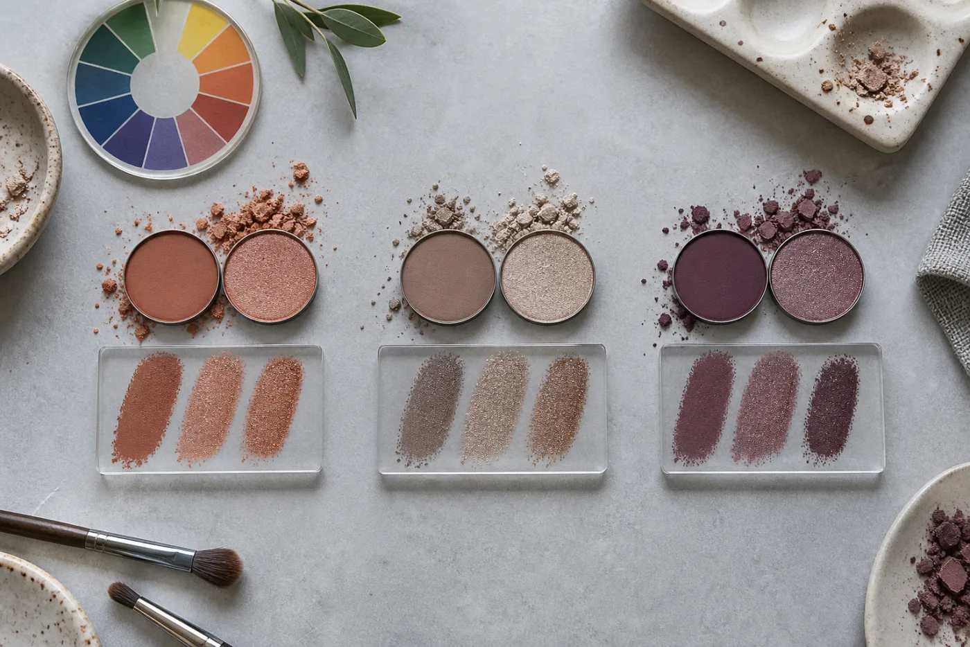
Read copper, taupe and plum as color families
Copper is the most directly contrasting family in this test. A muted copper or peach brown can make blue look clearer without requiring a bright orange lid. The important controls are saturation and warmth. If a copper appears rusty, red or strongly metallic against your complexion, reduce the intensity before rejecting the whole family. A thin satin wash may produce the contrast you wanted while a dense foil version overwhelms the eye and changes the test into a finish decision.
Taupe sits between brown, gray and sometimes mauve. It often works when you want the eye socket to look softly defined rather than visibly colorful. Warm taupe provides a little complementary warmth; neutral taupe follows natural shadow; cool taupe can echo gray in the iris. The family is especially helpful as a control because it shows whether you prefer blue eyes to stand out through color contrast or through a restrained frame. Keep it deep enough to be visible but not darker than the other samples.
Plum spans dusty mauve, muted berry and deeper purple brown. It can pull out cool, green or gray notes in blue eyes while feeling less expected than copper. Red leaning plums may also emphasize redness around the eye, so evaluate the complete area rather than the iris alone. Compare a muted plum at the same depth as the copper and taupe. If you add black liner only to the plum, the extra definition will choose for you and the color comparison stops being clean.
Build one reliable portrait baseline
Use a front facing portrait in diffuse daylight with the camera close to eye level. Keep both eyes visible, the expression relaxed and hair away from the outer corners. Turn off beauty filters, portrait relighting and colored effects. Start with bare lids or a quiet neutral base, natural brows and the same mascara level for every version. A strong existing liner, false lashes or colored indoor lamp can overpower the difference among copper, taupe and plum.
Save one source and reuse it. Do not take a new selfie for each color. A changed head angle alters the visible lid area; a raised brow changes placement; automatic exposure can brighten one iris more than another. Those photographic shifts can masquerade as a color preference. A tripod or a securely supported phone is useful because it fixes distance and framing. The goal is not a glamorous portrait. It is an honest, repeatable baseline with enough detail around the eyes.
Check the file at normal size before testing. Both eyes should be sharp, highlights should retain detail and the skin should not be pushed strongly orange or blue. If one side is hidden in shadow, move toward softer frontal light rather than editing that side independently. The complete selfie guide covers camera distance and framing in more detail. Fixing the source once saves you from trying to interpret ten polished previews built on an unreliable photograph.

Run the free eyeshadow test for blue eyes in MaqAI
Create three first round directions from the same portrait: muted copper, neutral taupe and muted plum. Keep depth medium, finish satin and placement close to the lash line and mobile lid with a soft edge through the crease. Do not let one version gain a wing, brighter inner corner, stronger mascara, reshaped brow or smoother complexion. If the generated result changes an unrelated feature, do not treat that polish as evidence for the eyeshadow family.
View the whole face at ordinary screen size. Ask whether the eye color becomes the focal point, whether the shadow connects with brows and hair, and whether the color supports the mood you named. Then inspect the eye area for unintended changes. Use specific language instead of pretty or bad: copper feels lively but too bright; taupe defines without changing the mood; plum makes the eye look cooler but competes with facial redness. Specific notes reveal what to adjust next.
Save at most two finalists. A useful shortlist might contain muted copper and cool taupe, not twelve shades separated by tiny digital differences. Record family, approximate depth, saturation, finish, placement and edge. If no option works, change only one control: soften saturation, reduce depth or switch satin to matte while keeping the three families recognizable. This turns the app into a decision tool rather than an endless source of attractive but untestable variations.
One portrait, one placement, one depth and finish: let only the eyeshadow family change in the first round.
Separate iris contrast from the complete face
A color can make the iris look vivid and still feel wrong in the complete palette. Step back and check the relationship with complexion, brows, hair, lips and clothing. Copper may beautifully intensify blue but also repeat warmth in the skin until the face feels too monochromatic. Plum may flatter the iris but ask for a quieter cheek. Taupe may appear less exciting in a crop yet make the full face feel polished and wearable. The intended context decides which response matters.
Keep nearby colors neutral while judging the first round. If one version includes peach blush and another has a cool pink cheek, you are comparing palettes rather than eyeshadow. Once the preferred eye family is clear, run a second, smaller test for coordination. Try the same neutral lip and cheek first, then change just one supporting color if the eye seems disconnected. The existing guide to eye makeup shapes can help you test rounded versus elongated placement separately from color.
Translate the preview into a real eyeshadow plan
Take the finalists to products you already own before shopping. Look for a pan that matches the broad family, value and finish rather than chasing the screen pixel by pixel. Powder seen through a camera and display will not match pigment mixed with your skin, primer and natural lid color. A product can also look pale in the pan and deepen on application. Swatch a thin stripe, let it settle and judge it beside the other finalist in neutral light.
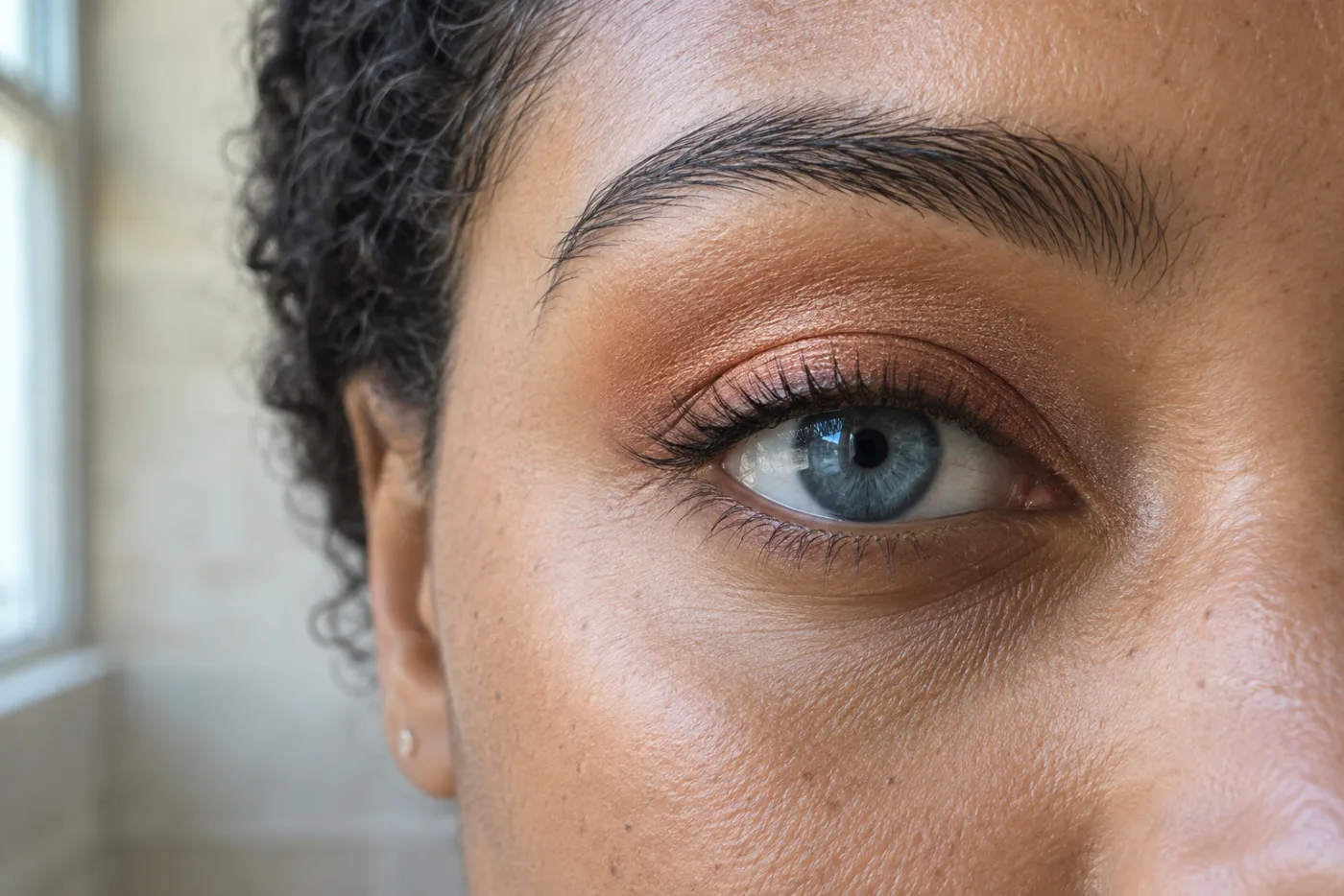
Apply each direction on separate days, or remove the first completely before applying the second. Use the same primer or no primer, the same brush, approximately the same amount and the same placement. Begin with a thin layer; build only if the color family remains too quiet. The detailed copper placement image shows a useful scale: a controlled wash with a softened edge leaves the iris readable. More pigment is not automatically a more informative test.
Keep tools clean and do not share eye cosmetics or applicators. The US Food and Drug Administration advises washing hands, keeping instruments clean, stopping a product that causes irritation and avoiding eye makeup when the eye area is infected or inflamed. Use products intended for the eye area and follow their instructions. If you wear contact lenses or have persistent discomfort, follow professional eye care guidance rather than continuing a color experiment.
Check the finalists in real light and real movement
Review each real application beside a window, in open outdoor shade and in the indoor light where you expect to wear it. Keep the makeup fixed while the environment changes. Copper can become orange under warm bulbs, gray taupe can disappear in low contrast light and plum can deepen toward brown or red. Photograph from conversation distance as well as closer to the eye. The best lighting guide explains how to identify a direction that remains coherent across relevant conditions.
Compare the real result with your written specification instead of demanding an exact match to the generated image. You may discover that a slightly grayer taupe is more elegant, a softer peach works better than metallic copper or a brown plum avoids emphasizing redness. That refinement is a successful outcome. The preview supplied a starting direction; the eye, product, light and wear test supplied the evidence needed to make it practical.
Record a repeatable blue eye eyeshadow formula
Write the winning formula in functional terms. Include color family, depth, saturation, finish, placement, edge, liner and mascara. For example: muted medium copper satin on the mobile lid, soft warm taupe through the crease, no black wing and brown mascara. Or: cool mid taupe matte with a small champagne center and tight lash definition. This record lets you recreate the effect with another palette even when a product is discontinued.
The outcome of the free test is not a permanent rule for blue eyes. It is a small evidence trail showing which relationship worked for a particular look. Revisit it when hair, clothing, glasses, occasion or desired mood changes. Copper, taupe and plum can each be right when their depth and finish serve the context. A good decision process leaves you with fewer unexplained purchases, clearer technique choices and a color brief you can adjust deliberately.