
Complexion makeup
Foundation for olive skin when warm and cool look wrong
Compare undertone direction at one depth, shortlist two shades and check each on your actual jaw and neck.
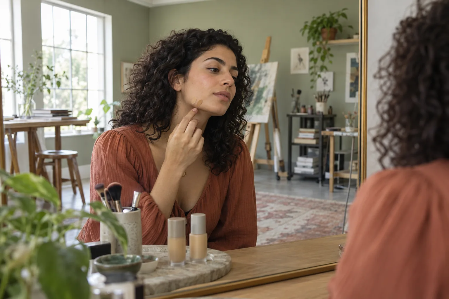
Foundation for olive skin can be frustrating when a shade marked warm turns orange, a cool option reads pink and a neutral bottle seems strangely peach. Going darker rarely solves that mismatch: depth and undertone are separate decisions. Olive describes a muted green, gray or golden cast that may appear in light, medium or deep skin, but it does not dictate one universal foundation shade. The practical starting point is to compare colors of similar depth and ask which unwanted cast each leaves on your face. A label can guide the first shelf search; your jaw and neck make the final call.
This guide starts with the actual mismatch rather than a promise that a digital preview can identify a perfect bottle. Use one clear, unfiltered photo to plan two or three directions, keep coverage and finish comparable, and change only one color variable at a time. MaqAI can help you visualize a shortlist, but its preview cannot prove exact shade, formula, oxidation, texture, lasting power, skin response or the finished result. The last step is always a hygienic product swatch, viewed in the light where you will wear it. You can follow the same comparison without an app by keeping a written shade log.
Foundation for olive skin: separate depth from undertone
Before comparing color families, find your approximate depth: light, medium, tan or deep is a useful shelf filter, not a description of your undertone. Hold several testers beside the lower cheek without painting the whole face. Reject shades that clearly make a light area darker or a deep area pale. Then compare the remaining colors at nearly the same depth. If one stripe is orange and another is pink while both are technically the right lightness, the problem is direction, not whether you need a shade number higher or lower. A muted option may disappear more quietly even if its bottle looks less lively on the counter.
Olive is not a single point on a warm-to-cool line. One person may look golden-olive, another cool and gray-green, and another closer to balanced beige with a subtle green cast. Surface redness from a spot, sun exposure or irritation can cover part of that cast; it does not automatically change the color of your neck. The simple wrist-vein test often collapses these differences into a false answer. Look at several areas of clean skin in steady light, especially the transition from cheek to jaw and neck. If the face is redder than the neck, do not choose a rosy foundation solely to mirror the redness.
Read what orange, pink and gray are telling you
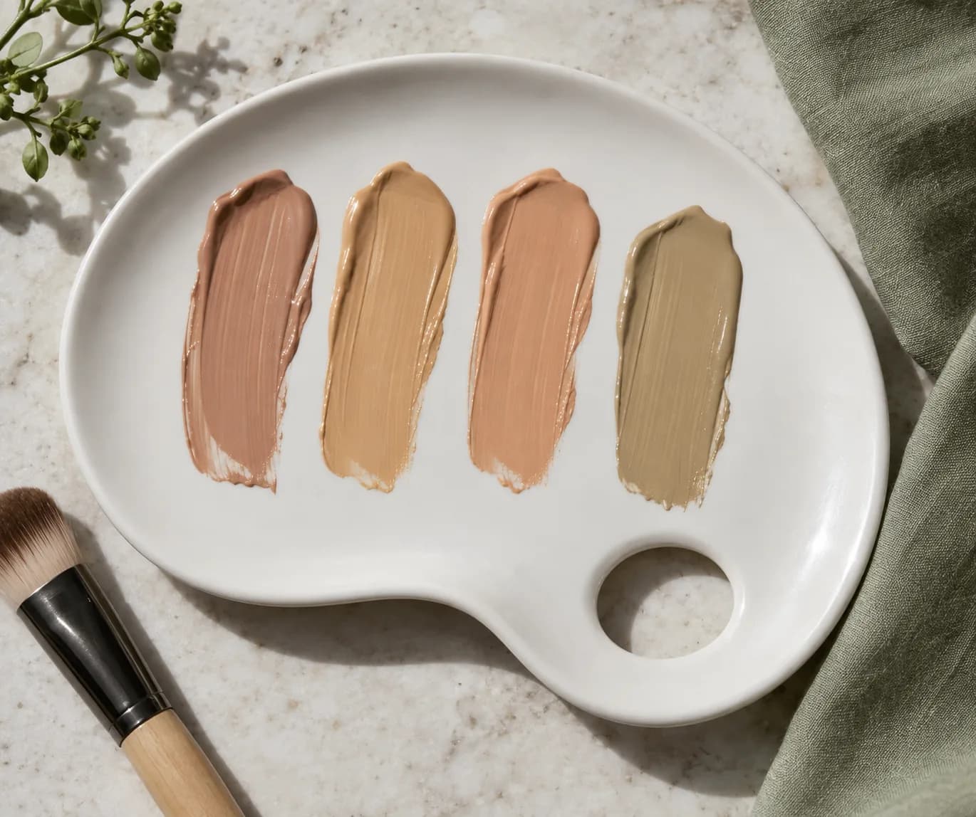
A stripe that looks orange often contains more warm red or peach than your skin can visually absorb. A distinctly pink stripe may be too rosy, even if it was sold as cool and is otherwise close in depth. A flat gray result is harder to read: the shade might be too light, too muted, too cool, or simply much more opaque than the surrounding skin. Do not treat every gray result as evidence that you need a yellower base. Compare against bare skin at the edge of each thin stripe and check the neck, which gives a better continuity test than a face-only selfie.
Take notes in observable terms: 'same depth, orange edge after ten minutes' tells you more than 'bad shade.' Ask whether the mismatch appears immediately or develops after the product settles. If it changes with time, assess the actual formula, skincare underneath and wear conditions rather than assuming every olive foundation will behave the same way. A swatch on the back of the hand is useful for texture but is a poor final shade judge when the hand differs from the face and neck. Apply a thin, separate stripe for each candidate so colors do not mix and obscure the comparison.
Make a stable source photo before using MaqAI
For planning, take one straightforward portrait near a window with indirect daylight. Remove color filters and beauty smoothing, keep your face unobscured and hold the camera at roughly face level. Use the same photo for every preview. If one option is shown under a warm lamp and another under cool outdoor light, you are comparing lighting as much as makeup. A bright white background can also push automatic camera exposure differently from a dark room, so record the conditions. The image need not look glamorous; it needs to be consistent enough to help you compare directions.
Start with the shade family that looks closest to your neck, then compare a slightly more muted and a slightly warmer or cooler alternative at the same apparent depth. Keep finish, coverage and placement constant. Change one variable, save the two most plausible results, and stop before the shortlist becomes a gallery of nearly identical screenshots. If you do not use MaqAI, put two physical swatches beside each other and photograph them in the same spot. Either way, the preview is a planning aid, not a measurement of pigment or a guarantee that a formula will oxidize, blend, feel or wear as pictured.

Shortlist by color, then ask what coverage does
A sheer skin tint can let your own undertone show through; an opaque foundation covers more of it and makes a slight color mismatch easier to notice. Therefore, compare colors within a similar coverage level before deciding that one undertone family wins. Apply each candidate in the amount you would realistically wear. A thick tester stripe may look too dark, too gray or too shiny simply because it has not been spread to a normal film. Likewise, an extremely thin swatch can seem invisible while failing the coverage you actually need. Keep the task narrow: color direction first, then texture and finish.
If you own a foundation that is close but visibly too peach, it can provide a reference, not a command to buy a specific pigment mixer. A small custom mix may work for some formulas, but changing a product can alter its performance, preservation or skin tolerance; follow the maker's instructions and test the mixture on a limited area. It is often simpler to find a better matched ready-made shade than to correct a bottle every morning. Do not mix sunscreen into foundation to adjust color or treat a tinted cosmetic as a substitute for the labeled amount of sunscreen. Keep skin protection and color matching as separate decisions.
Test the finalists on the jaw and neck
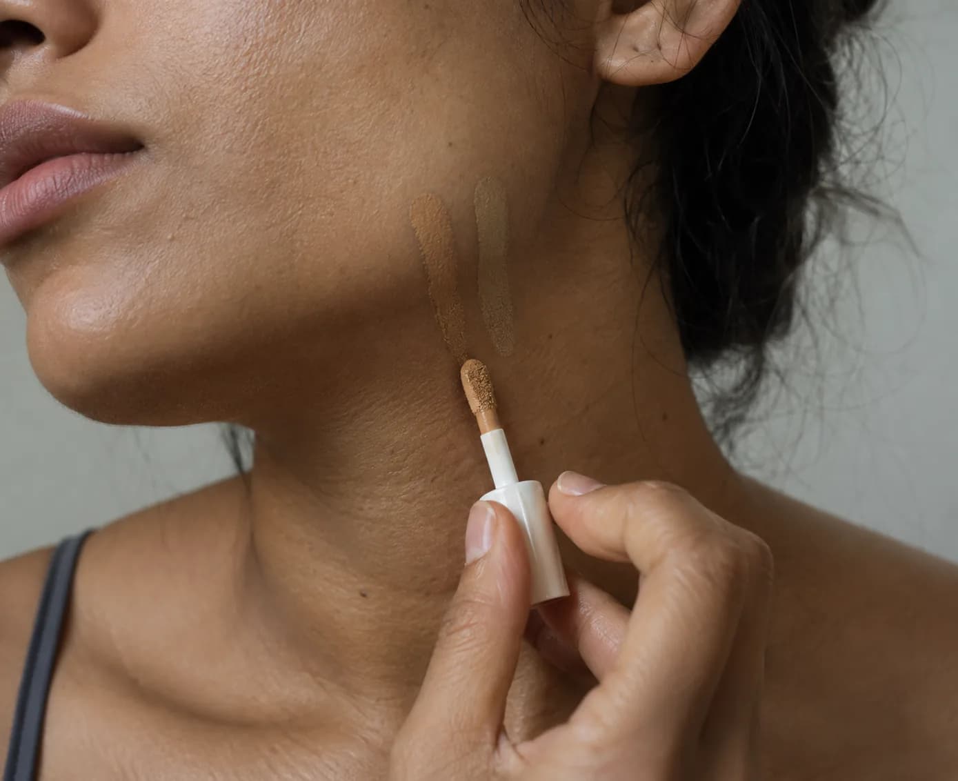
Now put the digital shortlist aside and try the actual products. On clean, comfortable skin, make two narrow vertical stripes from the lower cheek across the jaw toward the upper neck. Leave a small gap between them. Use clean disposable tools or a hygienically handled sample, especially when testing in a shop. Let the stripes sit according to the product's normal use; do not decide from the wet first second. Look straight ahead at conversational distance as well as close up. The better candidate is the one whose edge asks for the least blending where your face meets your neck, not necessarily the prettiest color in the bottle.
Check the areas that matter to you. If the center of the face is more flushed than the jaw, apply a small amount there after the jaw test to learn whether coverage changes the overall balance. If your neck is much lighter than your face, aim for a believable transition rather than forcing either area to an exact single color. A foundation should not erase every natural variation; concealer or local correction can address a small spot without changing the whole base. If both options remain visibly wrong, stop and seek a different shade family. Buying the least bad candidate does not make the undertone match better.
Check daylight, indoor light and time on skin
Move from the shop or bathroom to indirect outdoor daylight, then look once under the indoor light you use most often. Avoid judging in strong direct sun, which can flatten subtle differences and encourage squinting, or beneath colored bulbs that make every neutral look strange. Stand with your face and neck in the same light. If one stripe vanishes outdoors but turns orange at work, note that conflict instead of pretending a single photograph can settle it. Decide which environment matters most for your usual routine. Take one unfiltered reference photo only if the camera represents the colors reasonably; your eyes remain the main comparison.
Give the formula time to settle, then check whether the shade darkens, warms, separates or clings to dry areas. Oxidation is a useful everyday shorthand, but several effects can change the apparent color: the film dries, skin oils emerge, a base layer shifts, or the light changes. Observe what happens with the exact product on your skin rather than assigning a chemical cause from a selfie. Wear and comfort matter alongside color. If a product stings or causes a concerning response, remove it and stop the trial; seek medical advice for a significant or persistent reaction. A beautiful preview cannot overrule a poor physical test.
Choose a usable shade, not a perfect category label
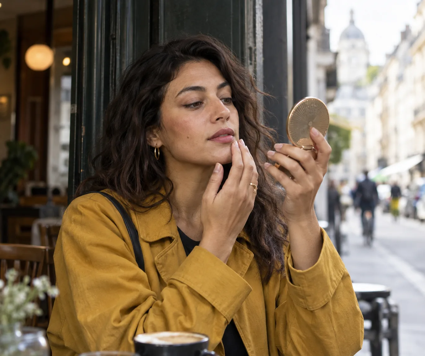
Write down the product, shade name, finish, coverage, lighting and the edge you saw at the jaw. Keep only two finalists. If one blends well in daylight and remains comfortable after wear, it is a practical choice even if the brand calls it neutral instead of olive. If the undertone is right but the depth is slightly off, test the adjacent depth in the same family. If the depth is right but the edge is peach, do not keep changing numbers in that same peach family. This small decision tree saves repeated full-face trials and makes a later purchase easier to assess.
Remember that skin color changes with season, sun exposure and inflammation. The shade that worked last winter may need a fresh comparison, while a changed moisturizer can alter a foundation's finish without changing its bottle color. Our guide to a cakey base addresses the separate problem of heavy-looking texture; a good olive match can still look cakey if too much product is used. The useful result here is a repeatable method: similar depth, one undertone change, one clear source photo, a short preview list, and a real jaw-and-light check. MaqAI helps organize the visual comparison; the product and your skin supply the evidence for the final decision.
Adjust texture if a well-matched foundation still looks heavy