
Eye makeup planning
Eyeshadow for green eyes: three color directions
Compare plum, copper and taupe on one clear portrait, then test the strongest direction with real shadow in the light where you will wear it.

Eyeshadow for green eyes is often reduced to one instruction: wear purple. That can be a useful starting point, but it leaves out the differences between a grey-green iris, a warm green eye with amber flecks and a clear cool green. Skin tone, contrast, finish, clothing and light also change the result. Plum may create an obvious contrast, copper may repeat warmth in the iris, and taupe may define the eye quietly. The better question is not which color is universally best, but which direction gives your own eyes the effect you want.
Use one clear portrait to compare three restrained directions before opening several palettes. MaqAI can help organize a plum, copper and taupe version while the photo, placement and overall look remain stable. Save only the strongest two, then recreate them with real products and inspect them in daylight and your destination light. A preview is a planning aid: it cannot guarantee an exact product shade, formula, oxidation, texture, wear, skin response or final result. Your mirror, eyelid and real shadow make the final choice.
Read the green in your iris before choosing contrast
Stand near a window without direct sun and look at both eyes from normal mirror distance. Green eyes can include grey rims, blue-green areas, amber centers or brown flecks. Note what is visible without trying to assign yourself a rigid color season. Also notice the depth of your brows and lashes. A pale, low-contrast face may need less pigment to make the iris noticeable than a face with dark hair and strong natural definition. Take one neutral reference photo so memory does not exaggerate how bright or dark the eye appeared.
Decide on an effect in plain language: clearer green, warmer gold flecks, softly defined eyes or an evening focal point. This goal matters because colors do different visual jobs. Basic color-wheel contrast explains why red-violet families can separate from green, but cosmetics are muted mixtures rather than pure wheel segments. Adobe's color-wheel guide is useful background for complementary relationships; it does not prescribe a personal makeup shade. Treat theory as a map, then judge the mixed color beside your own skin and iris.
Review Adobe's explanation of complementary color relationships
Compare eyeshadow for green eyes in three directions
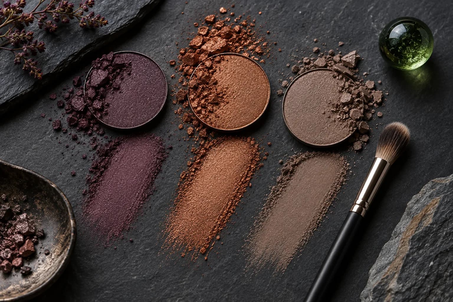
Build three clearly different but equally wearable directions. First, use muted plum or mauve rather than a highly saturated violet. Second, try copper, bronze or a rose-copper with enough brown to blend into the rest of the face. Third, use mushroom taupe, either neutral or slightly rosy, for low-key definition. Keep depth and placement similar. If the plum version is a smoky evening eye while the taupe is a sheer daytime wash, you are comparing intensity and technique as well as color, so the result cannot answer the original question.
Plum often gives green a distinct opposing frame. Copper can draw attention to amber and warm green notes, especially when it catches light. Taupe creates less color contrast but may let the iris remain the most colorful element on the face. None of these outcomes is automatically superior. Clarins' current green-eye guidance also groups plum and violet, copper and bronze, and quiet taupe among useful directions. Use that as evidence that the search has several valid branches, not as a promise that every shade in those families will suit you.
Make one neutral source photo
Face a broad window or another soft neutral light source. Keep the camera close to eye level, hair away from the eyes and both lids visible. Remove colored room light and beauty filters. A mild complexion base is fine, but avoid a strong lip, bright blush or existing shadow that competes with the test. The frame should include the whole face, because an eye color can look balanced in a tight crop yet disconnected from cheeks, lips, hair or clothing. Use a photo you have the right to process and read the in-app disclosure first.
Keep that exact portrait for every MaqAI version. A warmer exposure can make copper appear more harmonious, while a darker crop can make plum look more dramatic; changing the photo would bias the comparison. Start with a neutral baseline, then change only the lid-color family. Keep liner, lashes, brows, complexion and lip as similar as the workflow allows. The generated image will not reproduce every iris fleck or real pigment, but a stable source makes relative differences easier to read than a gallery of unrelated looks.

Change one variable in MaqAI
Create the plum, copper and taupe options at a comparable depth and finish. If possible, begin with soft satin or matte versions, since large glitter particles can dominate the judgment. View the face at the same size and ask three specific questions: Does the iris separate clearly from the lid? Does the shadow remain connected to skin, brows and hair? Does the eye still look like the focal point from conversational distance? Avoid scoring realism alone. A polished render can be attractive while pointing toward the wrong depth or undertone for your real products.
Save a small shortlist of two directions and record the reason for each. For example, plum may make the green edge clearer, while taupe may fit a workday with less visible color. Do not keep ten small variations. A short list leads to a practical product test; a large gallery simply moves the decision to another screen. MaqAI previews cannot certify that a purchased pan will match the display, that shimmer will sit smoothly, or that the formula will last on your lids. Use the comparison to choose a direction, not a guaranteed item.
One portrait, one stable placement, three color families, two finalists and a real-product check.
Translate the preview into a real plum, copper or taupe
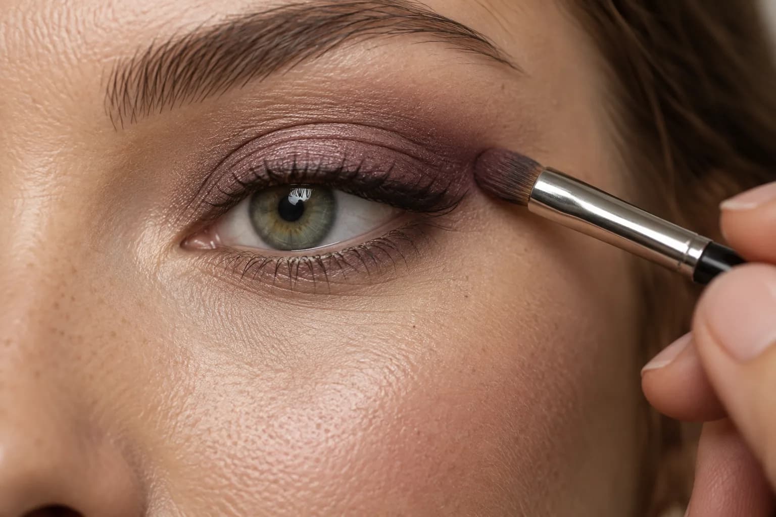
Search your existing makeup first. Swatch candidate shadows on clean skin and compare their undertone and depth, but do not expect an arm swatch to predict the eyelid perfectly. A plum can turn brown on warm skin; copper can become orange under yellow light; taupe can shift purple or grey. Choose the closest color direction rather than chasing a screen match. Apply a thin layer to one eye, blend the edge and look straight ahead. If the lid has a deep fold, place enough color above it to remain visible when the eye is open.
Keep technique simple for the first test. Use the same primer or base, brush type, placement, liner and mascara for each finalist on comparable days. Changing a cream shadow to a dry powder introduces texture and wear as extra variables. If your chosen plum looks bruised, try a browner mauve or confine it to the lash line. If copper overwhelms the iris, reduce the area or shift toward bronze. If taupe looks dull, choose a rosier version or add precise lash definition rather than piling on shimmer.
Adapt placement to the shape visible when your eyes are open
Balance the rest of the face
Once the lid direction works, decide how much support it needs. Plum can pair with muted rose, berry-brown or a neutral cheek, while copper often relates easily to peach, terracotta or warm rose. Taupe leaves room for either a clearer lip or a very quiet face. These are relationships, not mandatory pairings. Repeat a small undertone once, then step back. If eyes, blush and lip are all equally saturated, the iris may lose its role as the focal point even though every individual color seems flattering.
Change only one supporting feature at a time. Keep the eye fixed while comparing two lip depths, or keep lip and eye fixed while adjusting blush. This is where a full-face view is more useful than a macro eye photograph. Hair color, frames, jewelry and clothing also create nearby color. A plum top may amplify a plum lid; a copper earring can make a warm eye look feel intentional. Build balance with what you will actually wear instead of treating the iris as an isolated swatch.
Check daylight, indoor light and wear
Take the two finalists into neutral daylight and the indoor light where you expect to wear them. Look in a mirror, then take one face photo at a consistent distance. Copper may become brighter under warm bulbs; grey taupe may look flatter; a deep plum may close the eye in dim light. If the intended occasion is evening, do not reject a direction based only on a bright-window test. Compare it under relevant light as well. Keep camera processing in mind: a phone may increase saturation or sharpness beyond what you see in person.
Wear each version for several hours with the same base. The color decision is separate from formula performance, but a beautiful direction still needs a product that behaves on your eyelid. Note fading, creasing, transfer and irritation. Stop using a product if it causes discomfort and follow its safety instructions. Adjust placement or formula without rewriting the whole palette. Your winning direction is the one that gives the intended emphasis, connects to the complete face and remains comfortable in the light and duration that matter.

Keep a repeatable green-eye color brief
Write down the useful result in a few lines: iris notes, chosen effect, color family, approximate depth, finish, placement and supporting lip or cheek. Include the real products and lighting that succeeded. A brief such as ‘muted plum, medium depth, outer lid and lash line, soft rose lip’ is easier to repeat than a saved inspiration image with no context. Add the runner-up for a different occasion. Taupe may be the workday option while copper becomes the warmer evening choice; one test does not need to produce a single lifelong answer.
Revisit the comparison when hair color, glasses, wardrobe or preferred contrast changes, using the same controlled method. Green eyes do not require purple, and neutral shadow is not a missed opportunity. The purpose is to identify the relationship you enjoy and can reproduce. MaqAI can narrow visual directions with one clear photo and one variable at a time. The small shortlist saves experimentation; the real shadow, actual light and wear test supply the evidence a generated preview cannot.