
Eyeliner width
Thin or thick eyeliner: compare the line, keep the shape
Compare two upper-line widths on one portrait, keep the shape stable and check your preferred direction with real makeup.
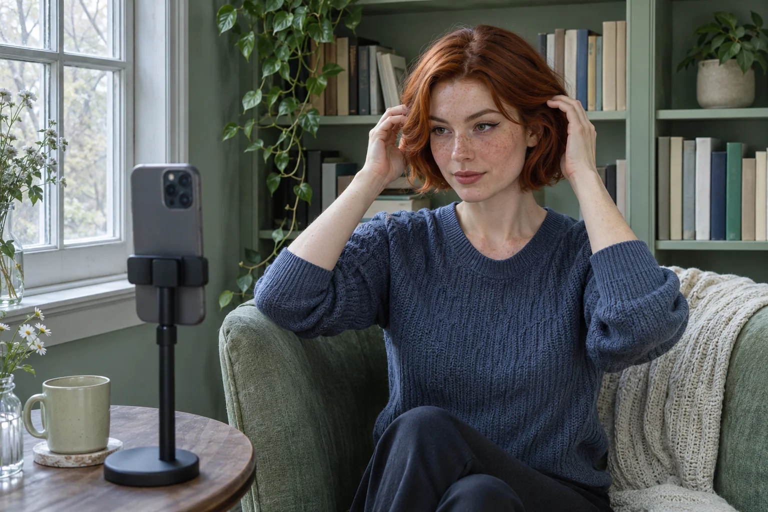
Thin or thick eyeliner can change the balance of a look even when the color and wing stay the same. The confusing moment is often a photograph: a narrow line seems to disappear, so you add more, then discover that the heavier version covers the lid area you wanted to leave visible. Before changing the whole eye look, compare two deliberate widths with the same starting point, endpoint and surrounding makeup. Decide how much visible definition you actually want.
MaqAI publishes this guide for a limited visual planning task. Hair Muse is the app used for the optional photo-assisted workflow; MaqAI remains the website. Keep one clear portrait, change the width of the upper external line only, shortlist two references and test the preferred direction with real makeup. A generated image cannot establish exact dimensions, application skill, product texture, comfort or wear. You can also make this decision using real trials and a mirror without creating a preview.
Thin or thick eyeliner starts with a specific question
Replace a vague request for more dramatic eyes with an observable decision. For example: do you prefer a narrow black line that mainly defines the lashes, or a moderately wider band over the outer part of the upper lid? Keep a familiar short tail if you use one. You are not simultaneously testing a new wing angle, a longer endpoint and a darker shadow. Those changes would make it difficult to explain which element produced the difference you liked.
Describe the result you want in ordinary words before comparing images. Perhaps the eyes should remain softly defined at conversation distance, or the outer line should be easier to notice in an evening photograph. Neither intention creates a universal rule about the correct thickness for a particular face. Your preferred balance, available lid visibility, practical application and real setting matter together. A useful comparison ends with a reason you can act on, rather than an unexplained vote for whichever picture looks more polished.
Define width separately from shape, length and darkness
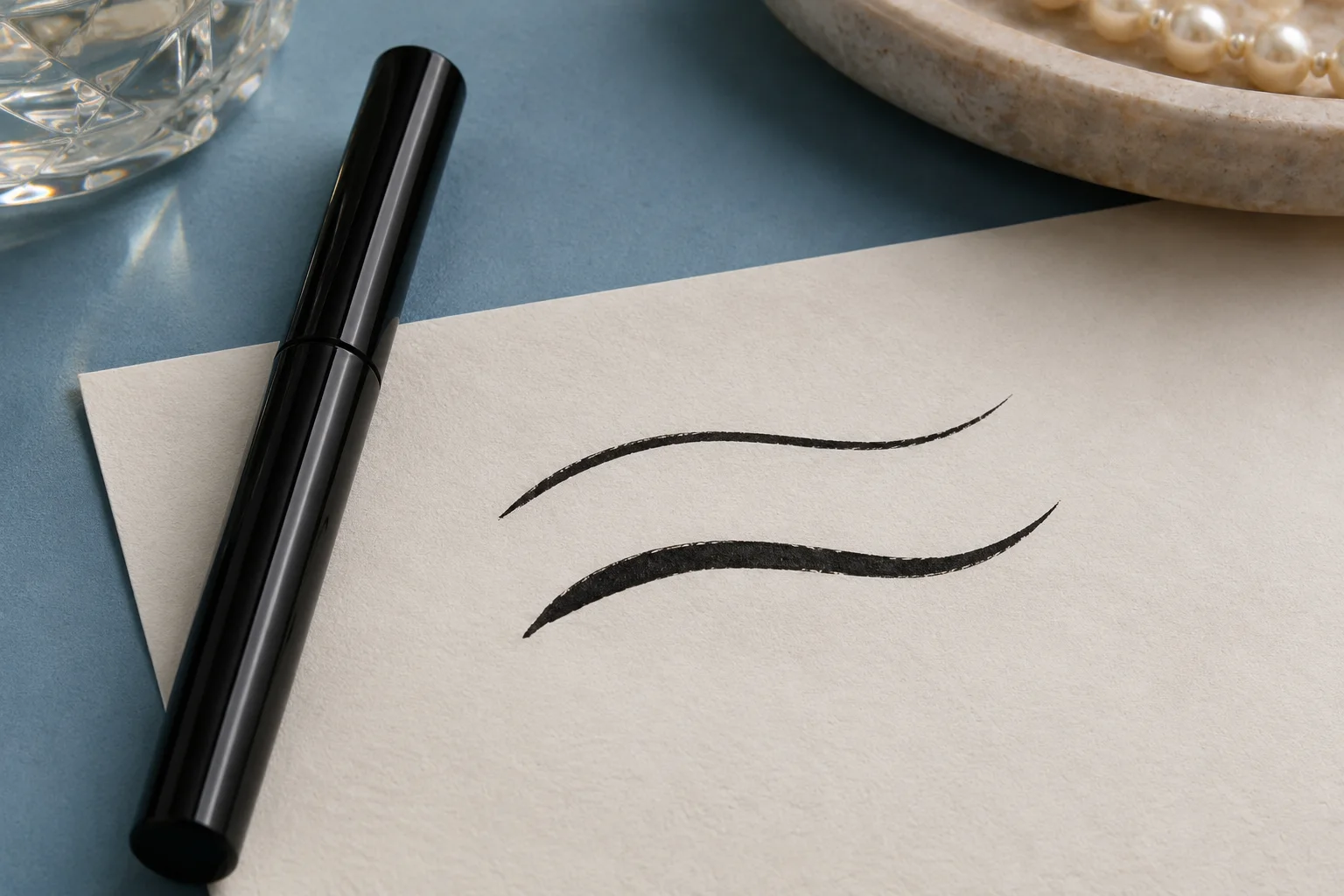
Width means how much area the line occupies above the external upper lash line. It is not the same as length toward the temple, an upward angle, opacity or a blurred smoky edge. Two lines can share an endpoint while differing in width, and two equally narrow lines can suggest different shapes if their tails point in different directions. Keep those distinctions explicit so the experiment does not turn into a general redesign halfway through your review.
Choose a stable baseline you could realistically apply. Keep the inner start, outer end and overall curve the same, with the wider option adding a modest amount above the outer portion rather than drawing a new border everywhere. Do not specify universal millimeter measurements from an image; camera distance and perspective make those numbers unreliable. Our eye makeup shape comparison guide covers broader silhouette decisions if that is actually the unresolved issue. Return to width once the intended shape is clear.
Choose one portrait with eyes comfortably open
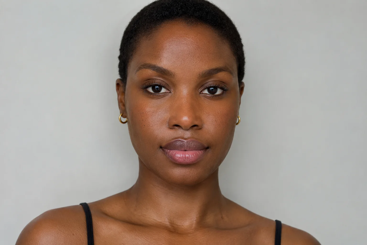
Use a clear front-facing photograph with even light, a relaxed expression and both eyes comfortably open. Avoid an exaggerated raised-brow pose that exposes an amount of lid you do not normally see. A steep downward camera angle or one eye turned away can make the same line appear different before any editing happens. Keep your hair from hiding the outer eye area, and use a camera position that lets you understand the whole face rather than only a magnified eyelid.
Check that you can see the lash area without a deep shadow or a strong reflection across it. Follow the clear selfie preparation guide if your reference image is hard to interpret. You do not need a heavily retouched portrait; smoothing and dramatic filters can obscure the very boundaries you want to assess. Save the original as the reference for both options. If you later change the portrait, treat it as a new comparison instead of mixing it with the old set.
Prepare two references in Hair Muse with a limited brief
Before using an app workflow, review its current notices, available controls and purchase information. Do not assume that a particular account, allowance or processing arrangement applies because another tool uses it. In Hair Muse, use the available makeup workflow to describe the narrow-line option first, keeping the existing face, line shape and surrounding makeup as stable as the workflow permits. Then describe a moderately wider outer upper line with the same color, start, endpoint and finish. The brief is a planning constraint, not a guarantee that every generated detail will stay fixed.
Keep the original beside both references. Do not compare a dark matte line with a shiny blurred line and call the difference thickness. If the images also alter lashes, iris appearance, eye proportions or shadow placement, those changes can overwhelm the intended experiment. Ask for a simpler comparison where possible, or set those images aside. When you cannot obtain a readable pair, switch to a controlled real trial. Repeating generation until one image looks exceptionally flattering is not the same as answering the original width question.
Read the visible lid area before judging close-up neatness
Start with the eyes open as in the original portrait. Look at how much lid area remains visible above each line, especially where the wider outer section sits. Consider whether the line supports the eyes or becomes the first thing you notice. A broader band can be your preferred deliberate emphasis; it does not have to be classified as a mistake. The relevant test is whether that emphasis matches the look you intended when you wrote the brief.
Then inspect the boundaries for interpretation problems. A generated band may appear unusually smooth, change with the lid fold or merge into the lashes in a way that is hard to reproduce. Do not treat that appearance as evidence that the real product will behave the same way. If the narrow reference has more visible skin texture or softer lashes, mentally separate those unrelated details from line width. Keep a short note for each option so a general impression does not replace a clear comparison of the intended variable.
Compare at normal distance with the rest of the face stable
View the whole portrait at a normal size before zooming in. Eyeliner that seems too faint in a close crop may be sufficient when brows, cheeks and lips are visible. Conversely, a wide line that looks striking as an isolated eye detail may become stronger than you wanted in the complete look. Keep those surrounding elements stable while reviewing. Adding lipstick or heavier mascara to balance one option creates another experiment and makes the first result harder to interpret.
Think about the actual setting without treating the preview as a lighting simulator. A quiet daytime look and a deliberate evening line may lead to different preferences, but a generated photograph cannot guarantee visibility under every room light or camera. If glasses are part of the intended look, include a consistent real reference with them rather than assuming an edited frame proves the result. Choose one setting for this decision and save other occasions for later, with their own practical check if needed.
Treat side-to-side differences as observations, not a demand to add more
Your two eyes may show different amounts of visible lid area at rest. A line drawn to the same apparent width on both sides can therefore read differently, especially when the head is slightly turned. Do not solve every difference by thickening both lines repeatedly. First check the original expression, camera angle and position of the existing line. An uneven photo reference cannot establish that your ordinary makeup needs a larger correction on the side that happens to look smaller.
For a real application, aim for a balanced overall impression when both eyes are comfortably open, rather than identical shapes in a very close photograph with the lids stretched. Keep any adjustment local and reassess the whole face. This guide does not diagnose eye or skin conditions or require changing your natural proportions. If the app reference changes those proportions, reject that part of the result. It should help organize a makeup choice, not become a new standard that your actual face must imitate.
Test the preferred direction with a real suitable product
Choose an eyeliner intended for the external eye area and use it according to its instructions with clean personal tools. This comparison does not require applying product to the waterline or between the lashes. Set up a stable mirror and comfortable position, and pause if you cannot see what you are doing. Begin with a manageable narrow application rather than trying to reproduce a broad generated band in one movement. Build a little more width only where the chosen reference calls for it.
Let the product settle as directed, then look with both eyes open at normal distance. Check the real edge, visible lid area, comfort and any transfer during your ordinary movements. A preview cannot tell you how a particular formula dries, feels or wears, and a wider band may take a different effort to apply or remove. Stop if the product causes discomfort and follow its guidance. Do not keep adding layers to force a match with a digital image that may never have represented a physically stable application.
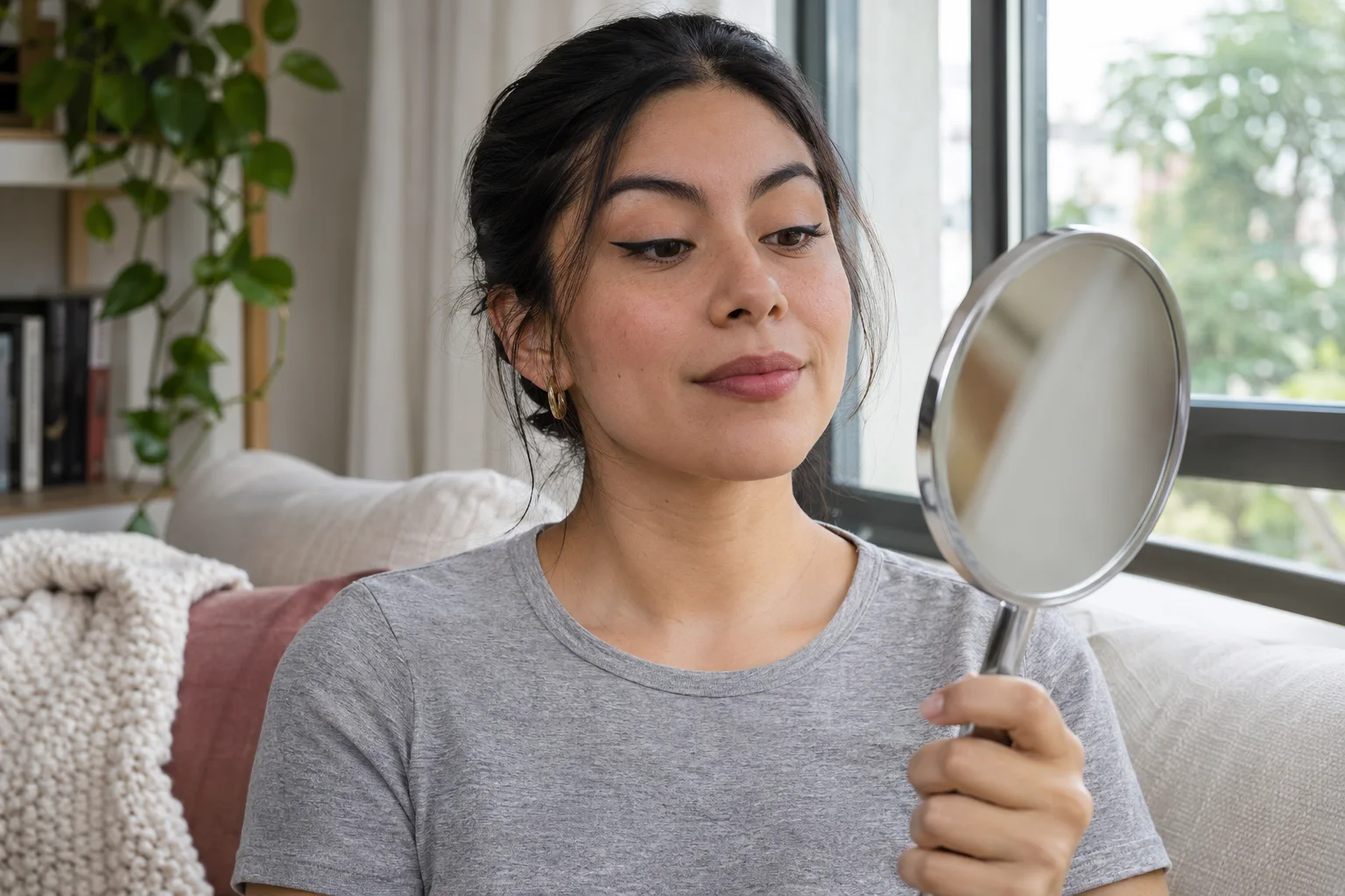
Keep one useful decision and a small record
Choose the narrower direction, the moderately wider direction or neither. Neither is a valid result when both references distract from the actual goal. Record the reason in a simple sentence: the narrow line leaves the lid balance I want, or the wider outer section gives the deliberate definition I prefer. Keep the original, the two readable references and a photograph of the real trial in a small shortlist. Do not save dozens of near-identical versions that make the decision harder to retrieve.
Write down the product used, the part of the line you changed and what the real light and movement check revealed. Retain any mismatch between the preview and actual makeup as useful information, not something to hide. Next time you can begin with that practical reference instead of generating the same comparison again. Width is one adjustable part of eyeliner, and it does not need to settle every future shape or color choice. A clear, repeatable decision for one real occasion is enough to finish this experiment.