
Eye makeup
Pencil vs liquid eyeliner for a softer or sharper edge
Explore two line edges on one portrait in Hair Muse, then check real application, comfort, correction and removal.
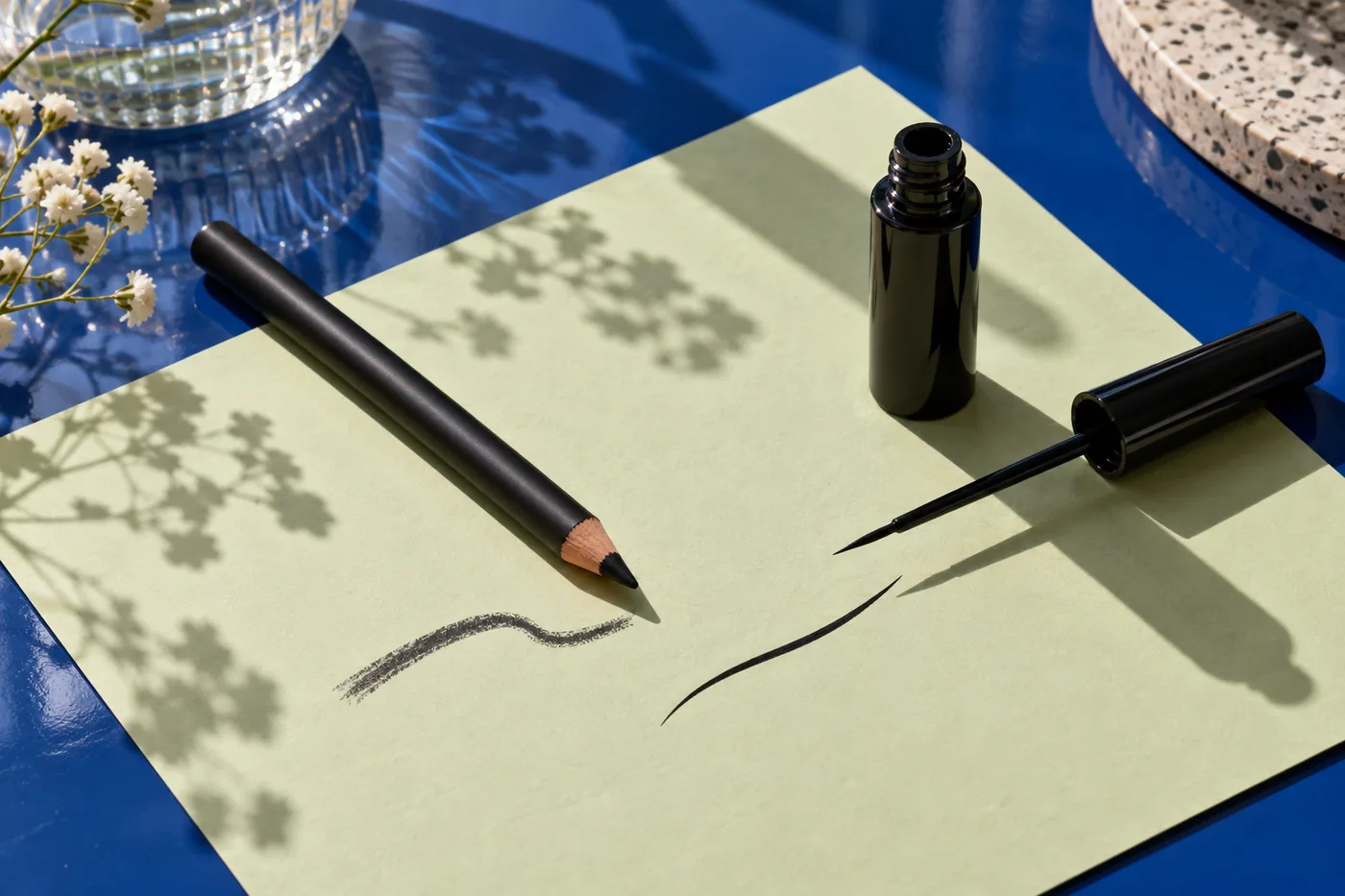
Pencil vs liquid eyeliner becomes a useful comparison when you can name the line you want. Perhaps your current pencil looks broader than expected, or a liquid edge feels too sharp beside otherwise quiet makeup. Start with the boundary rather than choosing a supposedly better product. A softly blended strip and a clearly defined strip can occupy the same place, use a similar color and still change how the whole face reads.
This guide uses one clear portrait in Hair Muse to explore that visual difference, then moves the decision onto actual eye products. MaqAI publishes the guide; Hair Muse is the app used for the planning step. A preview cannot establish how a pencil glides, whether a liquid tip skips, how a formula dries or what your eyes tolerate. The useful outcome is a small, specific shortlist that you can reproduce comfortably, not a verdict that one format wins for everyone.
Pencil vs liquid eyeliner: separate format from effect
An eye pencil transfers pigment from a solid tip; a liquid eyeliner delivers a fluid formula through its applicator. Those descriptions do not settle every appearance question. A carefully sharpened pencil can make a restrained defined line, while a liquid application can be narrow enough to look quiet at normal distance. Some pencils set quickly; others permit more blending. Liquid products also differ in tip, finish and application instructions. Read the particular product before deciding how to use it.
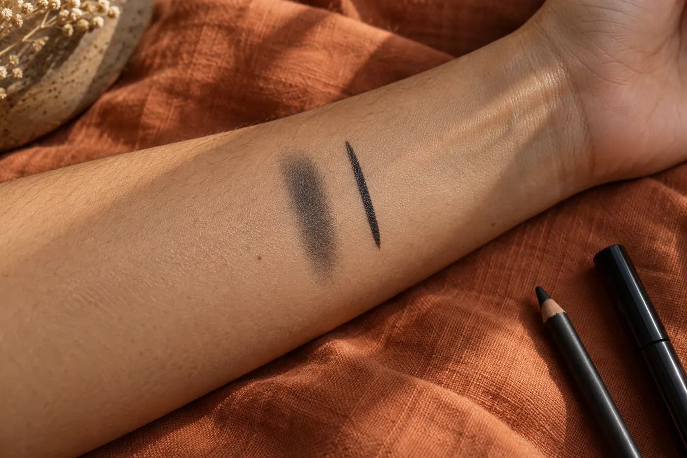
For this comparison, define two visual directions: a narrow line with a softened outer boundary, and a similarly narrow line with a clear outer boundary. Keep pigment color, length and apparent thickness as close as possible. A long black wing compared with a short brown smudge changes several things at once. You would be judging a complete style difference without learning whether the edge itself suits you. Gel pots and shadow-as-liner methods are separate options, but adding them now makes this small decision harder to interpret.
Describe the edge you actually want to see
Look at your familiar makeup from conversation distance before opening a comparison. Ask whether the line should blend into the lash area or remain visibly separate from it. A soft boundary may support a diffused eye look; a defined boundary may give a small line a more deliberate appearance. Neither direction requires a dramatic wing. Write a description such as narrow charcoal line, same short outer end, softer edge. That is more useful than choosing between labels like natural and glamorous, which can mean very different things.
Hold the rest of the face steady. A new cheek color, brighter lips or heavier mascara can make the same line seem stronger or weaker. If you also want to change eye shape, postpone that decision until the edge comparison is finished. The linked eye-shape guide treats footprint and direction as their own variables. For now, leave the outer endpoint where it already feels comfortable. The two reference directions should be close enough that you can explain their difference in one sentence without mentioning a different outfit, expression or color palette.
Prepare one readable portrait
Use an ordinary front-facing portrait with eyes naturally open and the whole face visible. Even light helps you see the lid boundary without a bright reflection hiding it. Keep hair away from the relevant area and use a neutral, relaxed expression. Avoid a beauty filter that changes eye shape or removes the natural surface of the lid. If a heavy existing line obscures the space you want to compare, take another photograph with a simpler starting look rather than asking the preview to reconstruct a hidden boundary.
Choose one photo and retain it for both directions. Changing from a close crop to a tilted selfie can alter apparent line length and lid visibility. This is especially relevant if one eye appears more open in a particular expression: the goal is not to make the eyes identical. Keep the real face as the reference. The portrait-preparation guide linked here explains practical lighting and framing. A source picture is usable when you can distinguish the lashes, the skin just above them and the line’s outer end without continually zooming into a tiny patch.

Compare two edge directions in Hair Muse
In Hair Muse, explore a soft-edged version and a clear-edged version of the same modest upper line. Specify the same pigment direction, short endpoint and approximate width. Treat the images as visual candidates, not simulations of named formulas. Review each against the original portrait. If a result enlarges the eyes, lifts the brows, changes skin texture or replaces the lighting, it does not isolate the boundary you intended to compare. Discard that candidate or restate the request with fewer changes rather than interpreting the whole image as an eyeliner improvement.
Assess the full face before inspecting the detail. Does the softened edge remain visible enough for your purpose? Does the clear edge feel deliberate without overwhelming the rest of the makeup? Keep only two candidates whose difference is readable. Endless variations can turn a modest choice into a search for a perfect face that no real application can reproduce. Save the useful directions with a short note about the edge. If the previews keep changing thickness as well, acknowledge that limitation and make the final comparison directly with products instead of pretending the variable stayed controlled.
Turn the shortlist into a practical product trial
Translate each saved direction into an application instruction you can actually follow. For the softer candidate, that might mean a small pencil line with its outer boundary gently softened only if the product permits blending. For the defined candidate, it might mean short connected liquid strokes at a similarly modest width. The app does not identify which item in your bag will create those marks. Examine the tip, directions, intended eye-area use and condition of the actual products. A dry or damaged applicator is not a fair example of an entire format.
Plan the trial when you can sit still, see clearly and remove the makeup without rushing. Use your own appropriate products and clean tools, and keep this comparison on the outer skin of the upper lid. It does not require lining the waterline. The FDA’s eye-cosmetic guidance supports careful handling, clean instruments, non-sharing and using products intended for the eye area. Stop a product that irritates. Follow its instructions rather than improvising ways to soften or dilute a formula. The generated pictures in this guide illustrate decisions; they are not evidence of a product test or physical performance.
Apply a small line before extending it
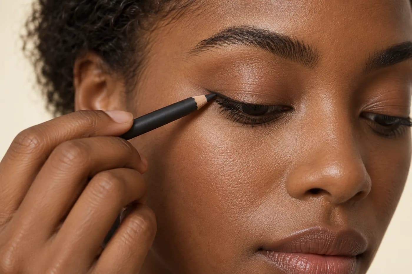
Begin with the minimum length and width needed to judge the boundary. Support your arm in a comfortable position and use a mirror that lets you see without pulling the lid taut. With a suitable pencil, use light short marks instead of trying to force a hard tip across the skin. If blending is permitted, soften a small section with an appropriate clean tool while leaving the footprint narrow. If the product drags or the skin becomes uncomfortable, stop that application. Increasing pressure does not turn an unsuitable formula into a useful comparison.
With liquid, follow the particular applicator’s directions and work in small manageable segments. Let the product settle as instructed before deciding whether a gap needs correction. Repeatedly drawing over a wet or disrupted line can change its width and texture, hiding the difference you meant to study. Keep the tip away from the eye itself. If the first attempt grows thicker than the pencil candidate, record it as an application problem and try again another time. A controlled second attempt is more informative than filling the entire lid simply to conceal an uneven edge.
Check the line with eyes open and in ordinary light
Relax your face, open your eyes normally and look from a comfortable distance. A line that seems substantial on a lowered lid may be barely visible when your eye is open; a small clear edge may already give enough definition. Check both the full face and a closer mirror view, without requiring the result to match the preview pixel for pixel. Move your gaze gently and see whether the chosen footprint remains comfortable and recognizable. The digital image cannot tell you how your particular lid moves or where a real coating might contact another surface.
Repeat the observation in the indoor light where you usually wear makeup and in indirect daylight. Keep the comparison about edge and practical use rather than chasing a difference produced by a lamp or screen. If you trial one format on each eye, remember that natural asymmetry and different hand access can influence the result. Such a trial is an initial observation, not a final ranking. Repeating each candidate on its own day with the same simple routine may make the choice clearer. Note whether a smaller line solves the problem before deciding that you need a different format altogether.

Include correction, removal and later wear
The useful format is one you can apply, correct and remove without a struggle. After an ordinary period of wear, inspect the actual line for movement, gaps or flaking rather than assuming that the preview predicted durability. Note when a change first appears and what you were doing. A corner that becomes thicker during repeated corrections is a different problem from pigment transferring after hours. Record those separately. Do not draw a waterproof or long-wear conclusion from a fresh swatch, a photograph or the general category name.
Use removal directions suitable for the particular eye product and keep handling gentle. Do not repeatedly scrub a stubborn edge simply to finish a comparison; stop if the area becomes uncomfortable. A result that looks appealing but requires corrections you dislike may be a poor everyday fit. Conversely, a small defined line may be manageable once you reduce the width and stop trying to draw it in a single stroke. Choose based on the complete routine you observed. The comparison is allowed to end with your current pencil, your current liquid, a different application approach or no liner on some days.
Keep a repeatable decision instead of a universal rule
Store the two visual ideas beside short notes on actual product, tip, approximate footprint, light and application sequence. Add the first correction you needed and whether removal felt manageable. Separate what the preview suggested from what the real trial demonstrated. For example, softened edge preferred is a visual note; pencil required too much pressure is a product-and-handling observation. Keeping those distinct prevents a disappointing formula from becoming a claim that all pencils are unsuitable, or a flattering generated image from becoming a promise about a liquid product.
Revisit only the unresolved variable. If the clear edge is appealing but too prominent, reduce width before changing color and length. If the softer line disappears, try a slightly clearer boundary before building a wider patch. When an acceptable application repeats comfortably, the decision has done its job. You have a practical direction for the look you want, supported by a small real routine. There is no need to keep generating alternatives once you understand what to apply, where to stop and what the image cannot verify for you.