
Eye line design
Graphic eyeliner: a connected angle or an open shape?
Compare two small line structures on one portrait in Hair Muse, keep color steady and check the chosen design with real eye makeup and natural expression.
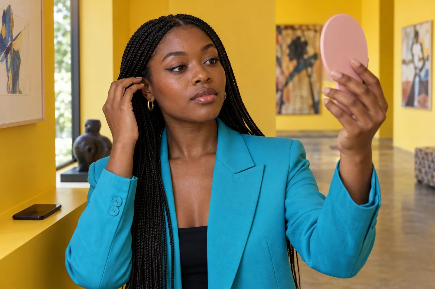
Graphic eyeliner starts with a deliberate line relationship: an angle, a separate stroke or a clear area of bare skin can become the main detail. It does not have to mean a large design covering the lid. Start by choosing whether you want one connected outer shape or a small detached accent, then keep the color and apparent line weight similar while you compare.
MaqAI publishes this guide. Hair Muse is the app for planning a makeup direction on one clear portrait; its previews can help organize two ideas before you try an actual eye product. They cannot establish exact placement on moving skin, formula behavior, texture, comfort or wear. The useful result is a short, readable design brief that you can adapt to your own relaxed eyes, tools and available practice time.
Graphic eyeliner: give the shape one clear job
Describe the feature you want people to notice. It might be a small outer angle that extends the existing upper line, or a short separate mark that leaves visible skin between it and the lid line. “A compact open shape at the outside” is a clearer goal than collecting every striking liner image you see. One recognizable idea gives you a stopping point.
Choose connected versus detached structure as the first variable. Color, shine, thickness, length and lower-eye detail can all change the effect, but changing them together makes it difficult to know what you preferred. A navy connected angle should not compete with a much thicker bright-white detached curve if you are trying to decide about the gap itself.
Keep the scale modest for the first comparison. You can make a graphic choice with a short line and some unpainted skin. A dramatic reference is inspiration, not a requirement to copy its dimensions. Decide what feels appropriate for your own day rather than treating maximum complexity as progress.
Take a portrait with your eyes at rest
Use a current front-facing photograph with both eyes comfortably open and your eyebrows resting naturally. Put the camera roughly at eye level, with even indirect light and no strong lens glare. Include enough of the face to see brows, lids and the surrounding balance. A close crop that hides the outer eye can remove the very space you need to evaluate.
Keep hair away from the area without pulling the skin. Do not raise your brow simply to expose more lid in the photograph: the extra space may disappear as soon as you relax. If the first image is unclear, improve the source once before comparing designs. Changing pose and exposure between alternatives creates another variable.
For glasses, make sure you have a readable source without reflections obscuring the eyes, then include your actual frames in the real application check. Use current in-app disclosures when deciding what to upload. A useful portrait is one you are comfortable using and can read clearly, not a supposedly perfect image that has already changed your features.

Read the line and the open space separately
Look at where a line begins, where it turns and where it stops. Then look at the bare space beside or inside it. In a connected angle, the junction creates a continuous route for the eye to follow. With a detached stroke, the visible gap is part of the design. If that gap closes during normal expression, the worn result may read as a different shape.
Keep these observations descriptive. You do not need to assign your eyes a fixed category before trying an idea. Natural folds, brows and differences between sides can influence the available space without dictating a single permitted style. Note where the detail remains readable with eyes relaxed rather than measuring your face against a rigid diagram.
Zoom out after the close inspection. An elegant tiny gap in a magnified picture may disappear at normal conversation distance. Conversely, a very small separate mark may already provide enough interest in the whole face. Judge both views before deciding that a design needs more lines.
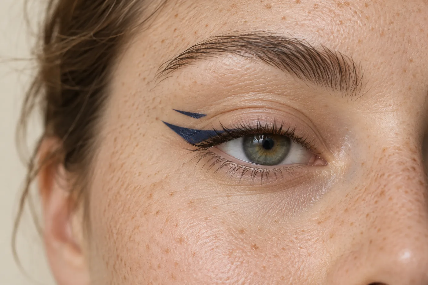
Compare two controlled ideas in Hair Muse
Use the same portrait in Hair Muse for one connected outer angle and one detached outer accent. Ask for similar color, apparent thickness and overall extent. Keep lip color, lashes, brows and shadow steady so that the structure carries the comparison. This is a planning method, not a claim that every generation can lock each detail or reproduce a named physical eyeliner.
Compare the whole face first, then inspect the eye area. If one preview also lifts the brow, smooths away a fold, enlarges an eye or adds extra lashes, do not count that as an advantage of the line shape. Simplify the request or set that result aside. The useful comparison preserves your starting features well enough to make the intended difference understandable.
Save at most two finalists. Name them by structure, such as “short connected angle” and “short detached stroke with a visible gap.” Those notes are easier to translate into a small real trial than a long collection of nearly identical images. You can choose neither if neither answers the original brief.
Choose a version you can actually repeat
Consider the practical route of the tool. Can you place the first point without stretching the skin or holding your eye in an uncomfortable position? Can you see the intended end point in the mirror you normally use? A design that looks appealing in a preview may still require a simpler outline to become manageable on your real lid.
Keep the left and right sides related without demanding mathematical identity. Look at overall direction, visual weight and the amount of visible space with both eyes relaxed. A small natural difference does not require repeatedly thickening the more delicate side. Decide which relationship matters before chasing every tiny variation.
Think about your other planned details separately. Glasses may cover the detached mark; a very full lash style may hide the junction of a connected angle. Check those actual elements after the basic choice rather than changing the whole makeup at once. A smaller design that stays readable can be more useful than an elaborate one you cannot comfortably reproduce.
Try the structure with a real eye product
Choose cosmetics labeled for the intended eye area and follow their directions. The FDA's eye-cosmetic safety guidance supports clean hands and instruments, not sharing eye makeup, stationary application and stopping an irritating product. A craft pen, decorative paint or lip product is not made suitable for the lids by having the right color. This guide does not require drawing on the waterline or inside the eye.
Sit at a stable mirror with good light. Begin with a small external outer-lid mark, pause and open the eye naturally to check its direction. Build short sections only where you can see and control them. Avoid pulling the skin into a different shape merely to make a long uninterrupted stroke easier; the line will be worn after you release it.
For a detached design, leave the intended bare area unpainted rather than filling the space and trying to scrape it out later. Keep tools away from the eye opening. Do not dilute or improvise mixtures to force a cosmetic to draw a finer line. If the desired structure is too awkward with your actual tool, simplify the design or choose an appropriate alternative on another trial.
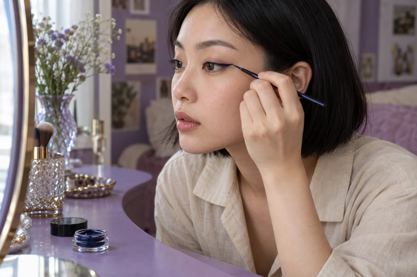
Check blinking, expression and ordinary viewing distance
Look straight ahead with brows relaxed, then blink and use your usual expressions. Notice whether a line hides in a fold, whether a gap remains visible and whether the outline feels comfortable. A change during movement is useful information about this application. It is not evidence that your face is wrong for graphic makeup.
Step back from the mirror and check ordinary room light as well as the light where you applied it. If you wear glasses, put them on and observe the complete relationship. Take one real reference photograph without forcing the exposure or stretching your expression to match the preview. The mirror and photo can answer different questions.
Review later behavior separately from the shape choice. Transfer, flaking, discomfort or a softening edge concern the specific formula and application conditions. A generated picture cannot test those properties. Stop using a product that irritates, and remove it according to its instructions instead of adding more layers to preserve an image.

Correct a small boundary without expanding the design
If one end extends farther than intended, first decide whether a small removal is practical with the product's recommended method. Use a suitable clean tool carefully on external skin, avoiding the eye opening. Allow the area to return to an appropriate application state before trying again. Do not keep rubbing at an uncomfortable patch to obtain a sharper corner.
A common trap is to enlarge both sides after every correction. The line gets thicker, the gap gets smaller and the original brief disappears. Return to the note about scale and structure. Sometimes removing one short section and remaking it is more controlled than covering the problem with shadow or another dark line.
If the detached stroke repeatedly joins the upper line in normal expression, try moving or shortening the accent on a later clean trial, or select the connected version. Treat that as a practical adjustment rather than a failure. Change the structure or position first; save new color, shine and extra decorations for a separate decision.
Save a design brief and a real application note
Keep the chosen planning image with a short description of the structure, intended footprint and visible gap if there is one. Add the actual product, tool and where you started the real line. A note such as “small outer angle; stop before the frame edge” contains more usable information than an attractive photograph with no explanation of its construction.
Record what happened with eyes relaxed and after normal blinking. Include ordinary-light visibility, comfort and any later transfer. Keep the real reference alongside the planning idea so you can distinguish what you wanted from what the formula and your hands actually produced. Start the next attempt from that evidence rather than automatically collecting more previews.
The aim is a repeatable line relationship you enjoy. Hair Muse can organize visual alternatives, while MaqAI provides this comparison structure. Exact shade, precise skin placement, texture, oxidation, formula behavior, skin response, comfort, wear and the final real-world result remain matters for actual cosmetics and observation. A simple graphic detail that works in your day is a complete result.