
Eye color decisions
Eyeshadow for brown eyes: bronze, plum or navy?
Compare three distinct color directions on one clear portrait, then check a short list with real shadow and the light you actually use.
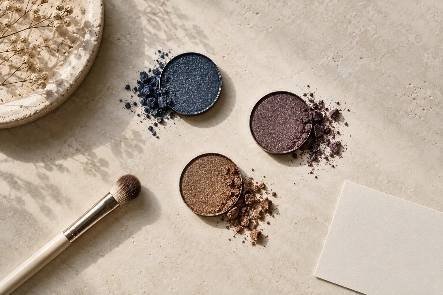
Choosing eyeshadow for brown eyes can feel oddly difficult precisely because so many colors look plausible. A warm brown wash may echo the iris, a muted plum can create a cooler frame, and navy can give a crisp contrast. Yet a search result that simply calls one color best leaves out the brown in your own eyes, your skin, the depth of the shadow, the finish and the room where you will wear it. A pale bronze and a deep navy are not a fair color test; they change intensity as well as hue.
This guide starts with the actual decision: do you want warmth, soft contrast or a defined cool edge? Use one clear portrait to compare those three directions with similar placement, depth and finish. MaqAI can help you visualize the options and save two finalists, but the preview is a planning aid, not an exact product match. A real swatch, careful application and a check in daylight and destination light decide whether a color, texture and formula work on your lids.
Read your brown iris before comparing colors
Stand near a window without direct sun and look at both eyes at normal mirror distance. Light brown irises may reveal amber, gold or olive notes; deep brown irises may look almost black in a dark room yet show warmth in daylight. Notice the ring around the iris and the contrast between the iris, whites of the eyes, lashes and brows. You do not need to assign yourself a season or undertone label. Write down what you can actually see, then choose an effect: warmer reflection, a little separation from the lid, or a sharper evening outline.
The color wheel is useful as a map, not a rule that every brown eye must follow. Brown is a mixture rather than a single pure hue, so a textbook complementary pair cannot prescribe one personal shadow. Adobe's explanation of color relationships helps distinguish a related warm palette from a deliberate contrast, while the mirror tells you whether that relationship serves your face. Keep your usual glasses, hair color and clothing in mind. Those colors sit next to the eyes at conversation distance and can change which lid color appears quiet or striking.
Use Adobe's color-wheel explanation to compare harmony and contrast
Compare eyeshadow for brown eyes in three directions
Begin with one bronze, one muted plum and one navy direction. Bronze repeats warmth and light; choose a soft satin or a brown-based metallic rather than an intense glitter if you want to read the shape of the eye. Plum can sit between warm berry and cool violet. The most useful first sample often includes enough brown or gray to make the edge blend into skin. Navy can be a narrow lash-line accent rather than a blue wash over the entire lid. These are three different jobs, not three candidates for a universal winner.
Keep the comparison fair. Make the shadow coverage about the same size, keep the outer edge in the same place and use comparable depth. If navy covers the whole eye while bronze is a tiny highlight, the result measures placement more than color. Compare satin with satin first; shimmer may draw attention independent of hue. At ordinary viewing distance ask whether the iris remains visible, whether the lid color connects to the rest of the face and whether the effect suits the occasion. You can test brighter or darker versions after choosing the family.
Make one honest source portrait
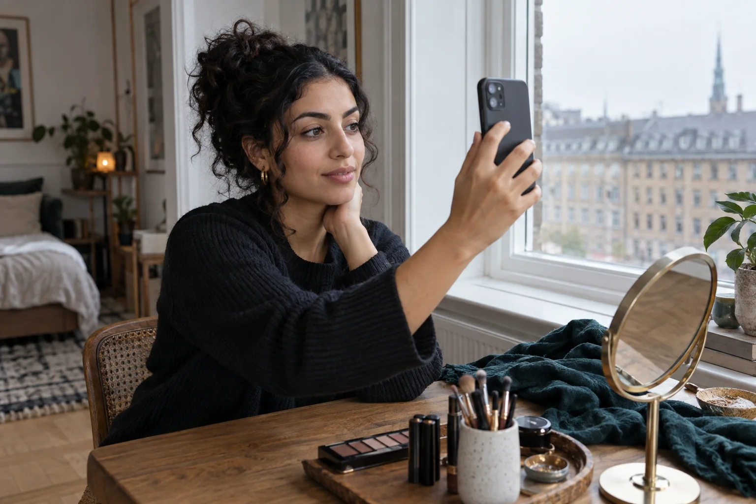
Photograph your whole face with a plain camera setting, soft even light and both lids visible. Face a window or open shade, keep the phone near eye height and let a little space remain around the head. Turn off beauty filters and colored room lights. A source image with strong blue light can favor navy before you have compared any makeup; a yellow lamp can make bronze seem warmer and more flattering. If you already wear shadow, remove it or at least note that it will interfere with a color-only comparison.
Use the same photo for every option. Keep expression, crop, hair, brow, lashes, cheek and lip as stable as the workflow permits. A close crop of one eye is useful for inspecting an edge, but the first decision should use the whole face. An eye can look dramatic in a macro and disconnected from your clothes or lip color at normal distance. Choose a photo you are allowed to process and read the app's information before using it. A stable portrait reduces photographic noise; it does not make a generated shade a laboratory measurement.
Change only the lid color in MaqAI
Make a bronze version, a muted-plum version and a navy version from that same portrait. State the placement once, then keep it constant. For instance, hold a soft upper-lid wash and a fine upper lash-line shape while changing only the color family. Keep the camera view, skin finish, lip, blush and brow unchanged. If an option suddenly has longer lashes or a darker liner, reset it; the extra contrast will unfairly influence the verdict. Compare each image at the same screen size and brightness.
Save no more than two finalists and add one sentence to each: bronze makes the eye feel warmer, plum gives a softer edge, or navy creates a cleaner outline. That reason makes the next physical test possible. Ten slightly different renders are harder to act on than two clearly named directions. MaqAI previews can help organize a visual choice, but they cannot guarantee an exact shade, real pigment opacity, formula behavior, oxidation, texture, wear, eye comfort, skin response or final result. Treat the saved image as a brief for a test, not a purchase instruction.
One portrait, one changing color family, two finalists, then a real lid test.
Translate the shortlist into real shadow
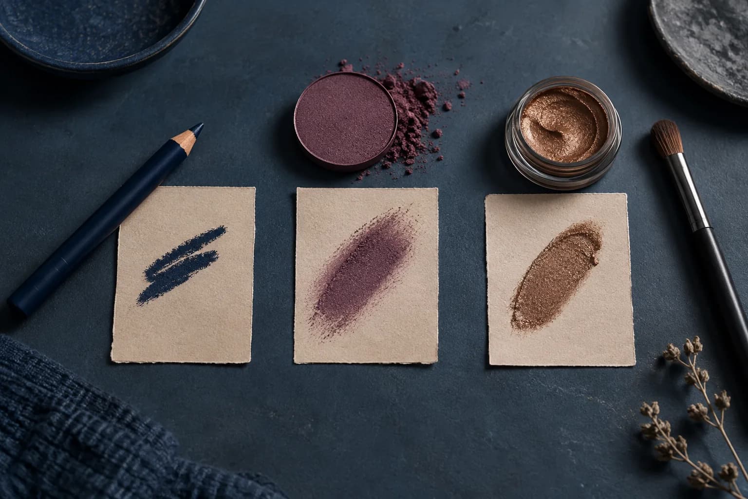
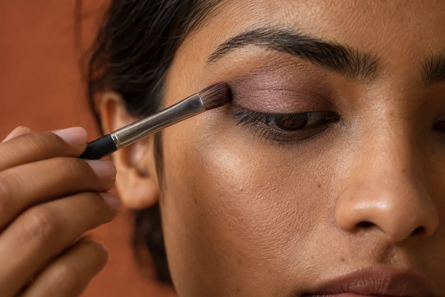
Look through what you already own before buying a palette. A brown-based bronze, gray-plum or ink-blue pencil may be enough to test the direction. Put a small swatch on clean skin to compare temperature and depth, but remember that an arm is not a lid: natural lid pigment, texture and primer will alter the result. Apply one thin layer to one eye with a clean brush, blend the edge and look straight forward. If the color vanishes when the eye opens, move a little of it above the fold instead of simply adding darker pigment.
Test the second finalist on another comparable day with the same base, placement, liner and mascara. Swapping a cream formula for a powder introduces a wear variable, so record that change rather than attributing the entire difference to hue. If bronze looks too orange, try a browner or less reflective bronze. If plum looks bruised, try a grayer, lighter or more brown-based plum. If navy feels severe, reduce it to the upper lash line or soften it with a neighboring neutral. A change in area can save a color direction without changing its basic idea.
Balance color with skin, brows and lips
A lid color does not work alone. Bronze often sits comfortably with warm skin and a restrained lip, but it can also be a warm accent against cool clothing. Plum can echo a berry lip, though repeating both at full intensity may make the face feel crowded. Navy may be clearer when the cheek and lip are quiet. None of these are fixed combinations. Step back from the mirror and judge which feature people will notice first. If the eye color disappears because blush, lip and shadow are all equally strong, reduce one supporting element.
Change one surrounding feature at a time. Hold the chosen eye steady while testing two lip depths, or hold lip and eye while deciding how much cheek color you need. This keeps an outfit decision separate from the original lid-color decision. Jewelry, glasses and scarf color can matter as much as a tiny change in shadow. In a cobalt top, navy may repeat an obvious note; next to a patterned plum scarf, the same lid may feel quieter. A whole-face portrait helps, but a normal mirror in your actual clothing is the better final reference.
Check daylight, destination light and hours of wear
Bring each real finalist to daylight and to the indoor lighting in which you expect to wear it. A bronze satin may catch warm lamps but look subdued under a clouded sky. Plum may lean more red under warm light or more gray in cool light. Navy can look almost black in dim surroundings, so decide whether you still want that defined effect. Hold a compact mirror at a normal distance before inspecting a close photograph. Phone processing can increase contrast and saturation, especially around the eyes.
Wear the test long enough to see what the actual formula does on your lid. Check for creasing, transfer above the fold, patchy fading and discomfort. Those observations do not tell you that a color family is wrong; they may point to formula, base or application. Keep eye products clean, avoid sharing them and stop using any product that irritates the area. The FDA's eye-cosmetic safety guidance is a useful boundary for hygiene and inflamed eyes. A preview does not override an uncomfortable real-product result.
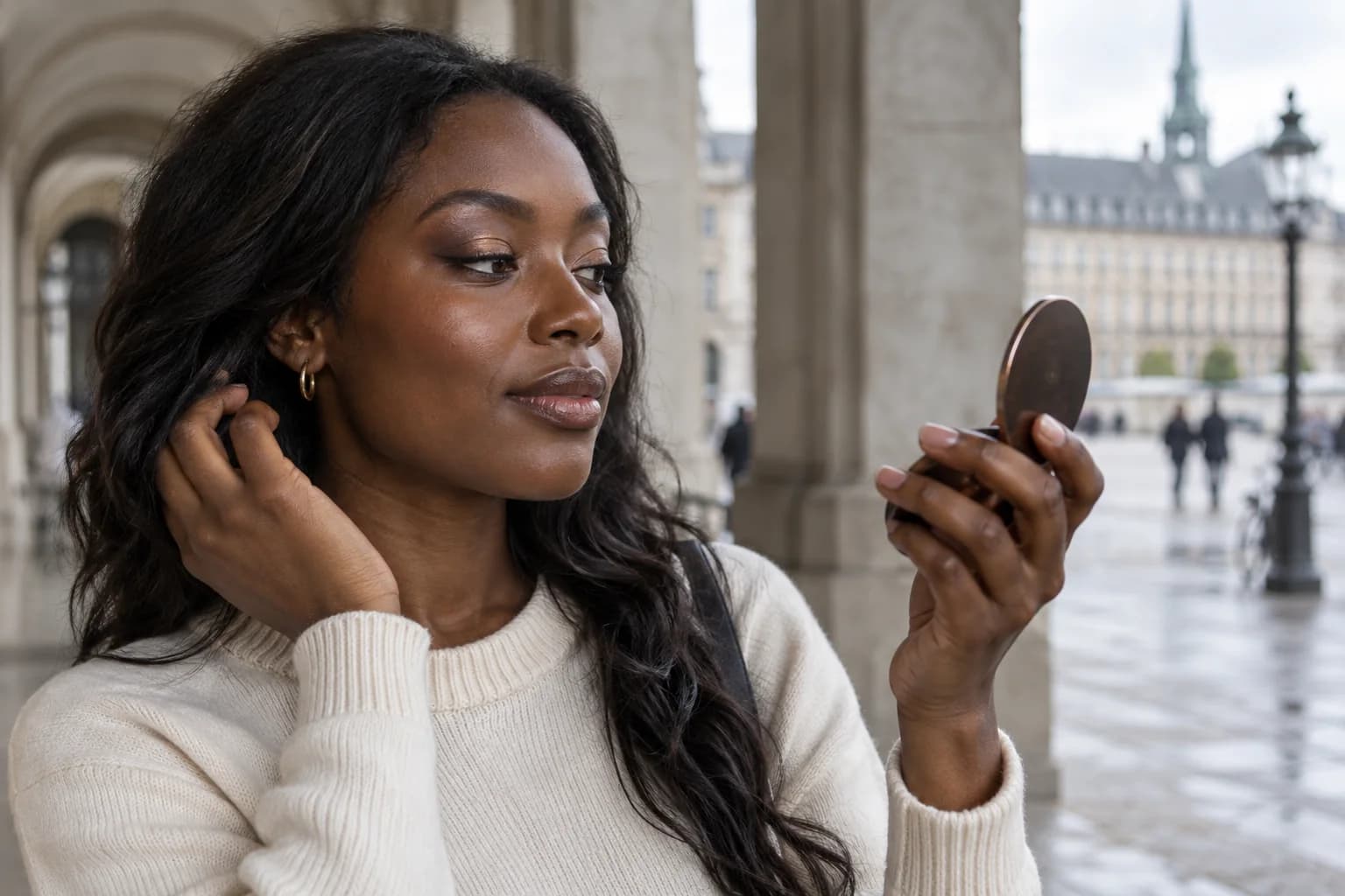
Keep a color note you can actually repeat
Write a compact record: iris depth, desired effect, color family, approximate depth, finish, placement, real product, brush and tested light. A note such as 'brown-based plum, medium depth, outer third, soft upper-lash edge, ordinary indoor light' is more useful than a screenshot with no context. Save the second finalist for another setting. Bronze might be the easiest weekday look while navy becomes the occasional precise accent. A comparison does not need to produce one permanent identity or one rule for all brown eyes.
Revisit the choice when your hair color, glasses, wardrobe, technique or preferred contrast changes. You can also choose a shade simply because you enjoy it; eye color is a starting point, not a restriction. The useful result is a direction you can name, apply and check without chasing an exact digital copy. MaqAI helps narrow the visual possibilities with a clear photo and one variable at a time. The short list prevents random shopping; real shadow, actual light, comfort and wear provide the evidence that completes the decision.